
A candlestick chart plots a stock, index, or any tradable instrument’s price using individual “candles” — each one showing the open, high, low, and close for a fixed period, whether that’s one minute, one day, or one week. Traders read the size, colour, and position of each candle to judge who’s winning the pull between buyers and sellers. You don’t need a paid terminal to start: NSE, BSE, and every global exchange display candles by default on free charting tools, and reading them well is a skill built through repetition, not memorisation.
Table of Contents
Open any stock chart on Kite, TradingView, or Fyers and the first thing you notice is a wall of small red and green rectangles stacked side by side. To someone new to the markets, it can look like decoration sitting on top of a line that’s really just telling you whether a stock went up or down. To someone who has spent real time with it, every one of those rectangles is a compressed argument: buyers pushing one way, sellers pushing back, and the candle is simply where that argument landed by the time the period closed.
This guide covers the actual mechanics of candlestick chart basics — not just what a Doji or a Hammer looks like, but what a candle is built from, why the same pattern behaves differently on different stocks, and a couple of practical checks that matter more than memorising pattern names ever will.
One more thing worth knowing before diving in: this is a genuinely old technique, not a recent trend. Candlestick charting is popularly credited to eighteenth-century Japanese rice trader Munehisa Homma, though the attribution itself is treated as contested by some historians. What’s better corroborated is that the technique reached Western trading desks largely through Steve Nison’s 1991 book on the subject — which is where a lot of today’s candlestick chart basics, as taught in English, ultimately trace back to. None of that changes how you read a candle this afternoon, but it’s a useful reminder that generations of traders have leaned on this exact tool.
The Four Numbers Every Candle Encodes: Open, High, Low, Close
Strip away everything else and a single candle is just four numbers: the open, the high, the low, and the close for whatever period you’ve chosen — a minute, an hour, a day, a week. Say a stock opens a session at ₹500, climbs to an intraday high of ₹512, dips to a low of ₹495, and finishes the day at ₹508. That’s the entire raw material for one candle — this specific set of numbers is a made-up example for illustration, not a real quote from any stock.
The chart draws this visually so you can absorb it in half a second instead of reading four numbers off a table. The thick part of the candle — the “real body” — spans the distance between the open and the close. The thin lines above and below it — the wicks, sometimes called shadows — mark the high and the low, wherever they landed outside the body. Figure 1 breaks this down.
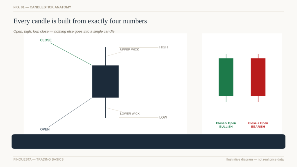
Figure 1 — Every candle you’ll ever look at reduces to these four numbers.
Once you can read a single candle this way, you’ve already absorbed the harder half of candlestick chart basics. Everything from here is really just combinations and context.
Reading the Body and the Wicks
The real body tells you the outcome — where buyers and sellers settled the argument by the close. The wicks tell you how they got there. A long upper wick means price pushed higher during the period but got rejected and pulled back before the close — sellers showed up near the top. A long lower wick means the opposite: price got sold off hard at some point, but buyers stepped in and dragged it back up before the period ended.
A candle with almost no wicks — where the open and close sit close to the high and low — tells you the move was largely one-directional, with very little pushback. A candle with long wicks on both ends and a small body tells you the two sides fought to a draw; price whipped around but ended up roughly where it started.
None of this requires memorising a pattern name. It’s closer to reading body language than reading a rulebook.
One habit worth building early: before you even consider what pattern a candle might belong to, describe it out loud in plain language first — “small body, long lower wick, closed near the high.” Naming the pattern too quickly is how beginners end up seeing Hammers and Dojis everywhere, whether or not the shape actually earns the label.
Bullish vs Bearish Candles: The Simplest Signal You’ll Learn
Here’s the one rule that everything else in candlestick chart basics sits on top of: if the close is above the open, the candle is bullish — usually shown in green or white. If the close is below the open, it’s bearish — usually red or black. Figure 2 lines several of each up side by side so the pattern in the colour becomes obvious at a glance.
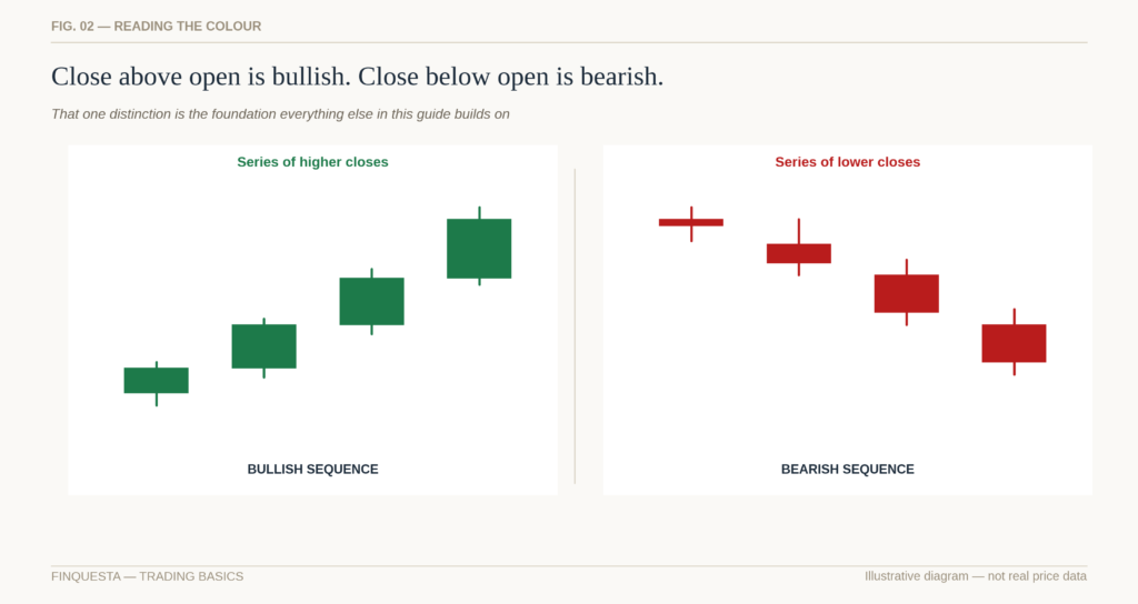
Figure 2 — Colour alone tells you what happened, not why, and not what happens next.
That’s genuinely the whole rule for a single candle. A string of bullish candles usually — not always — means buyers have been in control across that stretch. A string of bearish candles usually means the opposite. The nuance beginners skip is in that word “usually.” Colour alone tells you what happened. It doesn’t tell you why, and it doesn’t tell you what happens next. That’s where most of the real skill in reading these charts actually lives.
Why Most Beginners Misuse Candlestick Patterns
Here’s a hard truth worth hearing early, and one that will save you a lot of wasted study time: no candlestick pattern works the same way every time, on every stock, in every market condition. A Hammer that shows up on a heavily traded large-cap after a broad market sell-off behaves differently from the same-looking candle on a thinly traded small-cap during a quiet, illiquid afternoon. Every script has its own personality — its own typical range, its own volume rhythm, its own reaction to news — and a pattern with a good hit rate on one name can be close to meaningless on another.
This isn’t a reason to ignore candlesticks. It’s a reason to treat every pattern as a probability nudge, not a signal. You will not find a 100%-accurate candlestick strategy, and it’s worth being suspicious of anyone who claims to have one. What you can get, with practice, is a slightly better read on which side currently has the upper hand — and that, compounded across enough decisions over time, is genuinely useful. Momentum, not a memorised shape, is what most experienced chart-readers actually pay attention to first. A recognisable pattern is a prompt to look closer, not a green light to act.
The Most Widely Recognised Patterns in Candlestick Chart Basics
With that caveat firmly in place, it’s still worth knowing the vocabulary, because it gives you a fast way to describe what you’re looking at.
A Doji has an open and close that land almost on top of each other, producing a body so small it looks like a cross or a plus sign. It signals indecision — neither side won convincingly during that period.
A Hammer forms after a decline: a small body near the top of the range with a long lower wick and little to no upper wick. It suggests sellers pushed price down hard, but buyers absorbed that selling and dragged it back up by the close. An Inverted Hammer looks similar but with the long wick on top instead, appearing after a decline and hinting that buyers tried to push higher, even if they didn’t fully hold it.
A Shooting Star looks like an Inverted Hammer but appears after an advance rather than a decline — a small body near the bottom of the range with a long upper wick, suggesting buyers pushed higher during the period but lost control before the close.
A Bullish Engulfing candle is a bullish candle whose real body completely covers the real body of the prior bearish candle — a sign that buyers didn’t just show up, they overwhelmed the previous session’s selling. A Bearish Engulfing candle is the mirror image.
A Morning Star is a three-candle sequence — a bearish candle, then a small-bodied indecisive candle, then a strong bullish candle — often read as a bottoming sequence. An Evening Star is the same shape inverted, often read as a topping sequence.
A Spinning Top has a small body with wicks of similar length on both sides — indecision again, but without the extreme range of a Doji.
Three White Soldiers is a sequence of three consecutive bullish candles, each closing higher than the last and each opening within the prior candle’s body — read as sustained, broadening buying pressure rather than a single burst. Three Black Crows is the bearish mirror image. A Marubozu is a candle with little or no wick on either end — the open sits at the low (or high) and the close sits at the high (or low) — signalling that one side controlled the entire period from start to finish, without any real pushback. These are foundational vocabulary for candlestick chart basics, even if none of them, alone, tells you what happens next.
Every one of these describes a shape. None of them describes a guarantee. Some traders track how often each pattern actually leads to a continued move on the specific stocks or indices they follow — and that figure varies enough from instrument to instrument that quoting one universal win rate for, say, a Hammer, would be misleading rather than helpful.
The Half-Body Hold Rule — An Original Finquesta Framework
This is where a lot of beginner explanations stop — list the pattern, move on. But a pattern is only half the story; whether it holds is the other half, and that’s the part almost no beginner guide spells out as an actual check you can run.
Here’s a simple original Finquesta framework for it, built from a habit many working traders develop informally without ever quite naming it: after a signal candle — a strong bullish or bearish move — look at where the real body of that candle sits, and mark its halfway point. Then watch what the next candle does. If the next candle’s close stays above that halfway mark (for a bullish signal candle), the move has held; buyers defended at least half of their gain, and the signal has some real backing. If the next candle closes back below that halfway mark, treat the original signal with real suspicion — the move gave back more than half of itself in a single period, which is often a sign the initial push lacked real conviction. Figure 3 shows both outcomes side by side.
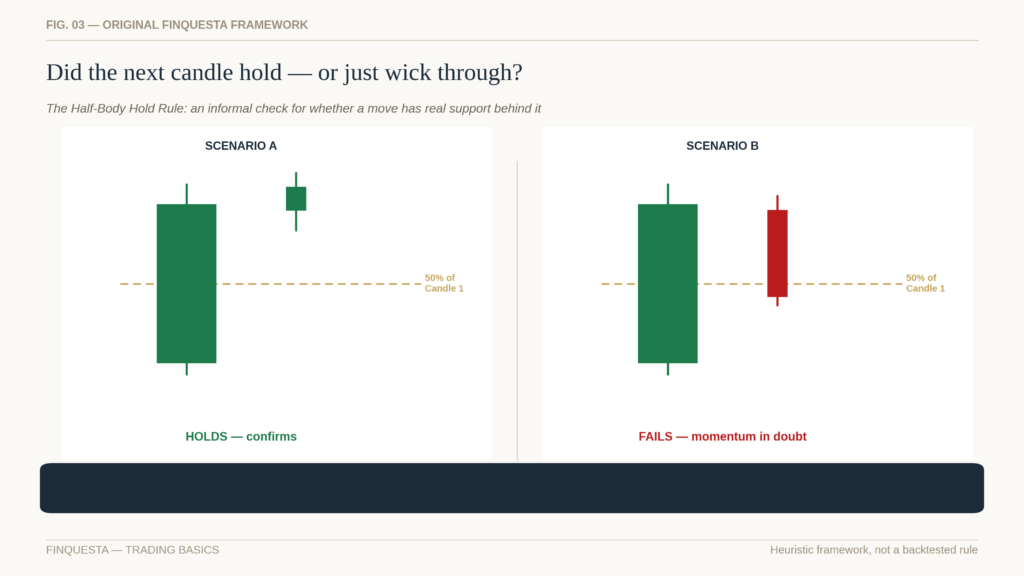
Figure 3 — The same signal candle, two very different follow-throughs.
We’re calling this the Half-Body Hold Rule mainly so it’s easy to refer back to — it isn’t a law of physics, and it hasn’t been backtested here across every instrument and timeframe. If you run your own numbers on it and the results differ from what’s described here, trust your own data over this framework. What it is: a fast, repeatable gut-check that turns “does this candle look promising” into a slightly more objective question you can answer just by watching what the next candle does.
Momentum Isn’t Uniform Across Stocks
Two stocks can print the exact same-looking candle on the exact same day and mean two very different things. A large, liquid, heavily tracked stock tends to have its candles driven by broad participation — a big bullish candle usually reflects real, broad-based buying. A thinly traded small-cap can print an equally large candle on a fraction of the volume, sometimes driven by one or two large orders rather than a genuine shift in sentiment.
This is really the same idea from the previous section, applied more broadly: every script behaves differently, and a rulebook written for one kind of stock doesn’t transfer cleanly to another. Before you lean on any candlestick signal, it’s worth knowing your own instrument’s typical behaviour — its normal daily range, its normal volume, how it has reacted to similar-looking candles in the past. A five-minute chart on an index future and a daily chart on a mid-cap stock are, in a real sense, different languages that happen to use the same-looking punctuation.
This is why experienced traders often keep informal notes on the handful of stocks they follow closely: typical daily range, typical volume, how the stock has behaved around its own past earnings or news events. That kind of instrument-specific memory does more for reading candles well than any universal pattern list, because it tells you what “normal” actually looks like for that particular script before you try to judge what “unusual” means.
The Snapback-Resume Range — An Original Finquesta Framework
Stocks that move quickly in one direction tend to attract a specific kind of behaviour afterward, and it’s worth naming explicitly because it trips up a lot of beginners. When a stock or index stretches somewhere in the rough range of 5% to 20% in a short window — a handful of sessions, not months — it has historically tended to see some kind of pause or pullback before continuing, rather than moving in a straight line forever. Traders sometimes describe this general idea, in its broadest form, as mean reversion, or informally as a stretched elastic “snapping back” toward its average. What’s less often spelled out for beginners is the second half of it: that snapback frequently isn’t the end of the story. If the underlying momentum behind the original move was genuinely strong — driven by a real shift in fundamentals, broad participation, or a structural change in the stock’s story — the original direction often reasserts itself once the snapback runs its course, rather than the move fully reversing into a new downtrend.
We’ll refer to that combined pattern — stretch, snapback, and potential resumption — as the Snapback-Resume Range. Like the Half-Body Hold Rule above, this is a heuristic built from experienced observation, not a backtested statistic, and the exact percentages will vary by stock, sector, and market regime. Treat the 5%–20% figure as a rough zone to watch, not a trigger to act on by itself.
Round Numbers as Psychological Support and Resistance
Markets have a well-documented habit of treating round numbers as if they mean something more than the number itself. On the Nifty 50, that shows up as clustering around levels like 24,000, 24,500, and 25,000 — round, memorable, easy-to-quote figures that traders, options desks, and algorithms all watch simultaneously.
Figure 4 illustrates the idea using stylised, made-up data rather than a live feed.
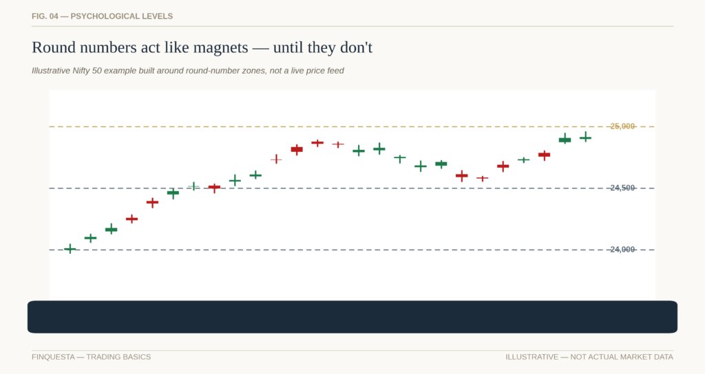
Figure 4 — Illustrative only. Always check the live level before applying this.
Why do round numbers matter at all? Partly psychology — a trader is more likely to set a mental target at “25,000” than at “24,847.” But in Indian derivatives markets specifically, there’s a second, more structural reason: option strikes are listed at round intervals, and open interest tends to build up heavily around round strikes. That concentration of positions can itself influence how price behaves near those levels, especially close to expiry — a dynamic sometimes discussed under the umbrella of “max pain.”
A simple way to use this: before assuming a candlestick signal near a round number means what it would mean elsewhere, ask whether that round number itself might be doing some of the work.
Why Round-Number Sensitivity Varies by Instrument
Not every round number matters equally, and not every stock respects them the same way. An index with heavy options open interest — like the Nifty or Bank Nifty — tends to show more visible round-number behaviour than an individual stock with light derivatives activity. A stock trading at ₹47 doesn’t have the same relationship with ₹50 that the Nifty has with 25,000, simply because far fewer large, round-number-anchored positions sit on top of it.
This is another version of the same underlying lesson running through this whole guide: read the specific instrument in front of you, not a generic rule copied from somewhere else.
Where available, a quick glance at a stock or index’s options chain adds another data point: heavy open-interest build-up at a specific strike is a rough proxy for where the market currently expects, or wants, price to gravitate toward — at least until that view changes.
Volume — The Confirmation Layer Most Beginners Skip
A candle tells you what price did. Volume tells you how much conviction was behind it. The same-looking bullish candle means something very different on unusually high volume versus on a quiet, below-average session.
A useful sizing habit: check what a typical daily move looks like in points for whatever you’re watching, relative to its level. On the Nifty, for instance, a 0.5% move works out to roughly 120 points when the index is trading near 24,000.
A candle with an unusually large body relative to that typical daily move, on unusually high volume, carries more weight than a similarly large body on ordinary or below-average volume — the first looks like real, broad participation; the second can just be a temporary imbalance from a handful of large orders. Figure 5 shows this side by side.
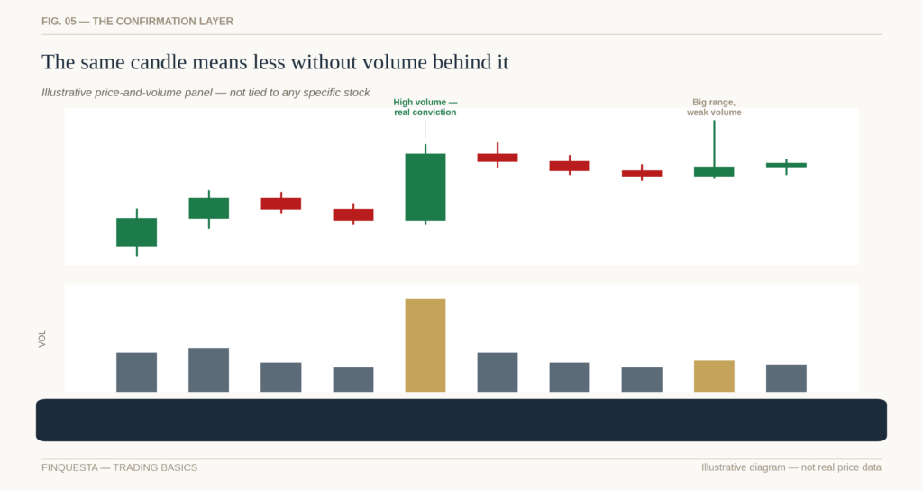
Figure 5 — Same-sized candle, very different story once you check volume.
Volume doesn’t need its own chapter of pattern names. Mostly, it’s a filter: high volume raises your confidence in what the candle is showing you; low volume should lower it.
It’s also worth remembering that volume has its own rhythm through the day. Many Indian stocks see heavier activity in the first and last hour of the trading session, with a quieter stretch around midday. A candle that looks unusually high-volume mainly because it printed during that opening rush deserves a slightly different read than one that stayed heavy right through an otherwise quiet part of the session.
Timeframes Change the Story
The exact same candle shape means something different depending on the timeframe it’s drawn on. A large bullish candle on a 5-minute chart might represent a few minutes of aggressive buying that has no real bearing on where the stock closes for the day. The same-shaped candle on a weekly chart represents an entire week of buyers overpowering sellers — a much heavier signal.
This matters most when you’re deciding how to apply everything covered above. If you’re trading intraday, your “signal candle” and your “confirmation candle” for the Half-Body Hold Rule might both be 5-minute or 15-minute candles, checked within the same session. If you’re a positional or swing trader, you’d naturally look at daily candles instead, and give the setup more time to play out. Applying an intraday mindset to a positional chart — or the reverse — is one of the more common, avoidable mistakes beginners make. Match your candle timeframe to how long you actually intend to hold the position.
It also helps to notice how the same stretch of time compresses as you zoom out. Twenty 15-minute candles roughly cover a single trading session; twenty daily candles cover about a month; twenty weekly candles cover four to five months. None of these is the “correct” zoom level in any absolute sense — they’re different lenses on the same underlying story, and the real mistake isn’t picking the wrong one, it’s forgetting which one you’re currently looking through.
Putting It Together: A Simple Framework for Reading Any Candlestick Chart
Once the individual pieces are familiar, applying candlestick chart basics to an actual chart in real time comes down to running through a short, repeatable sequence rather than hunting for a pattern in isolation:
First, establish the broader trend context before looking at any single candle — is the stock or index in an uptrend, downtrend, or a range? A pattern means something different depending on which of these it appears inside.
Second, read the candle itself — body size, wick length, and colour — the way this guide’s early sections describe.
Third, check whether it matches a recognised pattern name, but treat that as a prompt to look closer, not a conclusion.
Fourth, apply the Half-Body Hold Rule to the next candle before treating the signal as confirmed.
Fifth, cross-check against round numbers and recent volume — both can reinforce or undercut what the candle appears to be saying.
Sixth, make sure the timeframe you’re reading matches the timeframe you actually intend to trade.
Seventh — and this is the step beginners skip most often — size your position for the fact that you’re dealing with a probability, not a certainty, no matter how clean the setup looks.
A Worked Example: Putting Candlestick Chart Basics Into Practice
Frameworks are easier to trust once you’ve seen them applied together rather than described in isolation. Here’s a walk-through using a fully hypothetical stock — call it “Stock X” — to show how the pieces fit. None of the numbers below are real; they exist purely to demonstrate the sequence.
Stock X has been in a clear downtrend for three weeks, sliding from around ₹850 to ₹720. On a Thursday, it opens at ₹705, dips to an intraday low of ₹698, then rallies hard to close at ₹738 — a long lower wick, a solid bullish body, and volume roughly double its 20-day average. Read in isolation, that candle resembles a Hammer: a possible reversal signal after a decline.
Step one, trend context: the stock has been falling for weeks, so a reversal signal here at least makes contextual sense — this isn’t a random bullish candle appearing mid-range, where it would carry far less weight.
Steps two and three, reading the candle and naming the pattern: long lower wick, small real body near the top of the range, closing well above the open — a textbook Hammer shape, appearing exactly where Hammers are supposed to appear, after a decline.
Step four, the Half-Body Hold Rule: the real body runs from roughly ₹705 to ₹738, so the halfway mark sits near ₹721.50. The next day, Stock X opens at ₹740, dips to ₹725, and closes at ₹748. The close stays comfortably above ₹721.50 — the move held.
Step five, round numbers and volume: ₹700 sat just below the recent low, acting as a round-number floor the stock bounced off rather than breaking. Volume on the signal day was roughly double the 20-day average — real participation, not a thin, easily reversed move.
Step six, timeframe: this is a daily chart, and the scenario assumes a positional holding period of a few weeks — the signal and its confirmation are being read on a timeframe that actually matches the intended trade.
Step seven, sizing for probability: even with every box checked, this remains a probability read, not a certainty. A trader following this framework would size the position accordingly — meaningful enough to matter, small enough that being wrong doesn’t do lasting damage — and would define upfront where the idea is invalidated, for instance a daily close back below the ₹698 low.
Notice what this walk-through doesn’t do: it doesn’t promise the stock goes on to make new highs. It simply shows a structured way to move from “this candle looks interesting” to “here’s specifically what would need to be true for me to trust it, and here’s where I’d be proven wrong” — which is the actual, unglamorous work behind good candlestick chart basics.
Common Mistakes Beginners Make When Reading Candlestick Charts
A few mistakes show up more often than any other. Treating a single candle in isolation, without any trend context, is probably the most common — the exact same Hammer means something different at the bottom of a multi-week decline than it does in the middle of a sideways range. Memorising pattern shapes without ever checking whether the next candle actually held is another — this is exactly what the Half-Body Hold Rule is meant to catch. Ignoring volume is a third: a technically “perfect” pattern on unusually thin volume deserves real scepticism. And chasing a candle after it has already fully played out — buying well after a big bullish candle has closed, hoping the momentum simply continues in a straight line — tends to be one of the more expensive habits a beginner can pick up, since it usually means paying up right as the move that already happened runs out of room.
Two more round out the list. Ignoring the broader index or sector when reading an individual stock’s candle is one — a bullish reversal candle means less when the entire sector is falling apart around it on the same day. And dismissing a Doji or small-bodied candle as “nothing happening” is another; a Doji after a strong trend is often more informative than an ordinary trending candle, precisely because it signals that the side previously in control has, at least momentarily, lost its grip.
How to Practice Without Risking Real Money
The fastest way to internalise all of this is repetition against real charts, without real capital on the line while you’re still building the habit. Paper trading — tracking hypothetical trades on live prices without placing real orders — is available on most Indian broker platforms, including Zerodha, Fyers, and Upstox, as well as on charting tools like TradingView. Pick two or three stocks you already know reasonably well, and spend a few weeks simply narrating what you see: this candle’s body sits at roughly the halfway mark of yesterday’s range, on volume that looks about average for this name. Then go back and check what happened next.
This is also the right setting to test the Half-Body Hold Rule and the Snapback-Resume Range for yourself, on the specific instruments you actually plan to trade, rather than taking either on faith from this article.
A simple journal helps more than most beginners expect. For each observation, note the date, the stock, the pattern or setup you thought you saw, whether the Half-Body Hold Rule confirmed it, what volume looked like, and what actually happened over the following few sessions. After thirty or forty entries, real patterns in your own reading — not generic ones from a textbook — tend to emerge: which setups you read well, which you consistently misjudge, and which stocks you’ve genuinely come to understand.
Build Your Own Checklist for Candlestick Chart Basics
A short, personal checklist beats a long memorised list of pattern names. A reasonable starting version looks like this:
- What’s the broader trend right now — up, down, or range-bound?
- What does this candle’s body and wicks actually show, in plain language?
- Does it match a recognised pattern — and if so, which one?
- Did the next candle hold above (or below) the halfway mark of this candle’s body?
- Is volume unusually high, unusually low, or roughly average for this stock?
- Is there a round number nearby that could be doing some of the work?
- Does my timeframe match how long I actually intend to hold this position?
- Am I sizing this as a probability, not a certainty?
Print it, save it, or rebuild it in your own words — the version you actually use consistently will always beat a more sophisticated one you don’t.
Frequently Asked Questions
What is a candlestick chart in simple terms?
It’s a way of showing a stock or index’s price using individual “candles,” each built from four numbers — the open, high, low, and close for a chosen period. The candle’s colour shows whether the close was above or below the open, and its shape shows how much price moved around before settling there. Once that’s second nature, you’ve covered the core of candlestick chart basics — everything else in this guide builds outward from it.
Is candlestick pattern trading reliable?
Not on its own, and not with certainty. Candlestick patterns are probability tools, not guarantees — the same pattern behaves differently across different stocks, timeframes, and market conditions. Most experienced traders use candles alongside trend context, volume, and support and resistance rather than as a standalone strategy. Combining a pattern with the Half-Body Hold Rule and a volume check, both described earlier in this guide, tends to filter out a meaningful share of the weaker, unconfirmed signals.
Can I lose money relying on candlestick patterns?
Yes. No pattern, framework, or heuristic described in this guide — including the Half-Body Hold Rule and the Snapback-Resume Range — removes the risk of loss. Treat candlestick reading as one input among several, size positions accordingly, and never risk more than you can afford to lose.
What is the difference between a bullish and a bearish candle?
A bullish candle closes above where it opened, usually shown in green or white. A bearish candle closes below where it opened, usually shown in red or black. That’s the entire distinction for a single candle — everything else is built from the context around it.
Doji vs Hammer — which is more reliable?
Neither is inherently more reliable in isolation — they signal different things. A Doji signals indecision between buyers and sellers. A Hammer signals a potential reversal after a decline, provided the next candle holds above roughly half of its body. Reliability, for both, depends heavily on the specific stock, trend context, and volume around them, not the pattern name alone.
How many candles should I analyse before making a decision?
There’s no fixed number that applies everywhere, but a single candle in isolation is rarely enough. A reasonable habit is to check the last 10 to 20 candles on your chosen timeframe for trend context, then narrow in on the most recent two or three for the specific signal and its confirmation. Zooming out further — 50 to 100 candles — is also worth doing occasionally, just to check that the shorter-term trend you’re reading actually agrees with the bigger picture.
What is the best timeframe for reading candlestick charts?
It depends entirely on how long you intend to hold the position. Intraday traders typically read 1-minute to 15-minute candles. Positional and swing traders typically read daily or weekly candles. Reading a timeframe that doesn’t match your actual holding period is one of the more common mistakes beginners make.
Do candlestick patterns work the same way on Indian stocks as on US stocks?
The underlying mechanics — open, high, low, close, and the psychology behind them — are the same everywhere candlestick charting is used. What differs are structural details: trading hours, circuit limits, typical volume patterns, and round-number behaviour tied to India-specific instruments like Nifty and Bank Nifty options.
What’s the single most important thing to check before trusting a candlestick signal?
Context. The exact same candle can mean completely different things depending on the prevailing trend, the instrument’s typical volume, and where price sits relative to recent round numbers. Beginners tend to focus on memorising what a candle looks like; more experienced readers focus on where it’s showing up.
Where to Go From Here
If you take one thing from this guide, make it this: open a chart today, pick one stock you already know, and spend fifteen minutes simply narrating the last twenty candles out loud — what the body and wicks show, whether the next candle held, what volume looked like. Do that for two weeks before you let any of it influence a real trade. That’s really what candlestick chart basics comes down to in practice — repetition against real charts, not one more memorised pattern name.