Trading Lessons From the 2008 Financial Crisis: A Data-Backed Look

trading lessons from the 2008 financial crisis

Every generation of Indian investors eventually runs into 2008 in conversation, usually as a cautionary shorthand rather than a specific set of facts: “remember what happened in 2008.” What actually happened, in specific numbers, is worth revisiting directly, because the lessons that hold up aren’t really about predicting the next crisis — nobody reliably does that — they’re about what the arithmetic of 2008 reveals about diversification, leverage, liquidity, and behaviour under genuine stress, lessons that remain just as relevant in calm markets as in turbulent ones.

QUICK DEFINITION The 2008 global financial crisis was a systemic banking and credit crisis, triggered in the United States and transmitted worldwide, that produced a sharp decline across most major equity markets, including India’s, roughly between January and October 2008, followed by a multi-year recovery. This article uses the specific, sourced figures of that decline and recovery as a lens for durable trading and investing lessons, not as a prediction that history will repeat in the same shape. All historical figures are drawn from secondary financial-education sources and flagged for verification against primary data before publication; illustrative material is clearly labelled as such.

What made 2008 a systemic crisis, not a sector-specific one

Most market declines are sector- or event-specific: a regulatory change hits one industry, a commodity price swing hits commodity-linked stocks, an earnings miss hits one company and its close peers. The 2008 crisis was structurally different — it originated in the global banking and credit system itself, the plumbing nearly every other sector depends on to function.

Because the crisis struck the credit system directly, its effects transmitted broadly rather than staying contained: banks became reluctant to lend to each other, let alone to businesses, and that credit freeze rippled into nearly every sector that depends on financing to operate, expand, or simply manage working capital.

For Indian markets specifically, the transmission arrived less through direct exposure to the failed US institutions and more through the broader mechanisms of global risk aversion: foreign institutional investors pulled capital from emerging markets broadly, including India, to shore up balance sheets elsewhere, and global trade and credit conditions tightened in ways that touched the Indian economy directly.

This systemic quality — a crisis in the financial system’s core infrastructure rather than in one sector sitting on top of it — is precisely why 2008 is treated differently from an ordinary bear market in most retrospective analysis, and why its lessons generalise more broadly than lessons from a typical sector-specific downturn.

It’s worth being precise that this article focuses specifically on what 2008 demonstrated about markets and investor behaviour — it is a historical case study, not a forecast, and nothing in this article should be read as predicting the timing, cause, or severity of any future crisis.

That said, systemic doesn’t mean uniform — even during 2008, certain sectors and business models absorbed noticeably more direct stress than others, particularly companies and institutions with the heaviest reliance on short-term wholesale funding or the most direct linkages to the failing global credit chain, while sectors with steadier domestic demand and lower leverage generally fared relatively better, though still far from unaffected.

The timeline of the key global trigger events
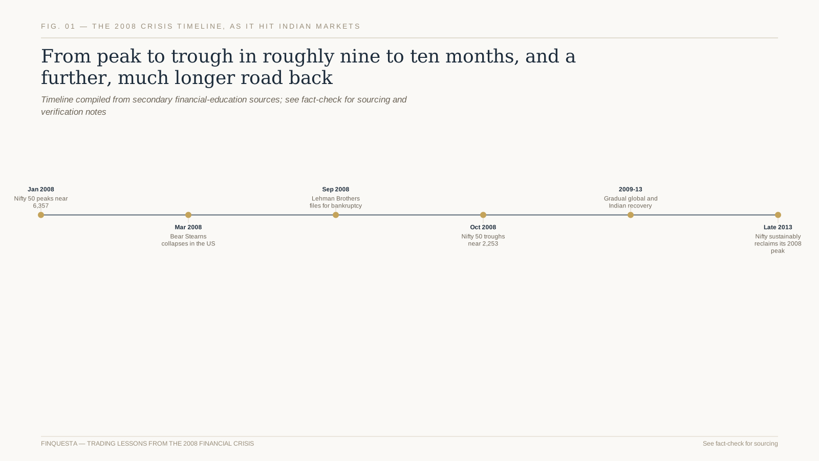
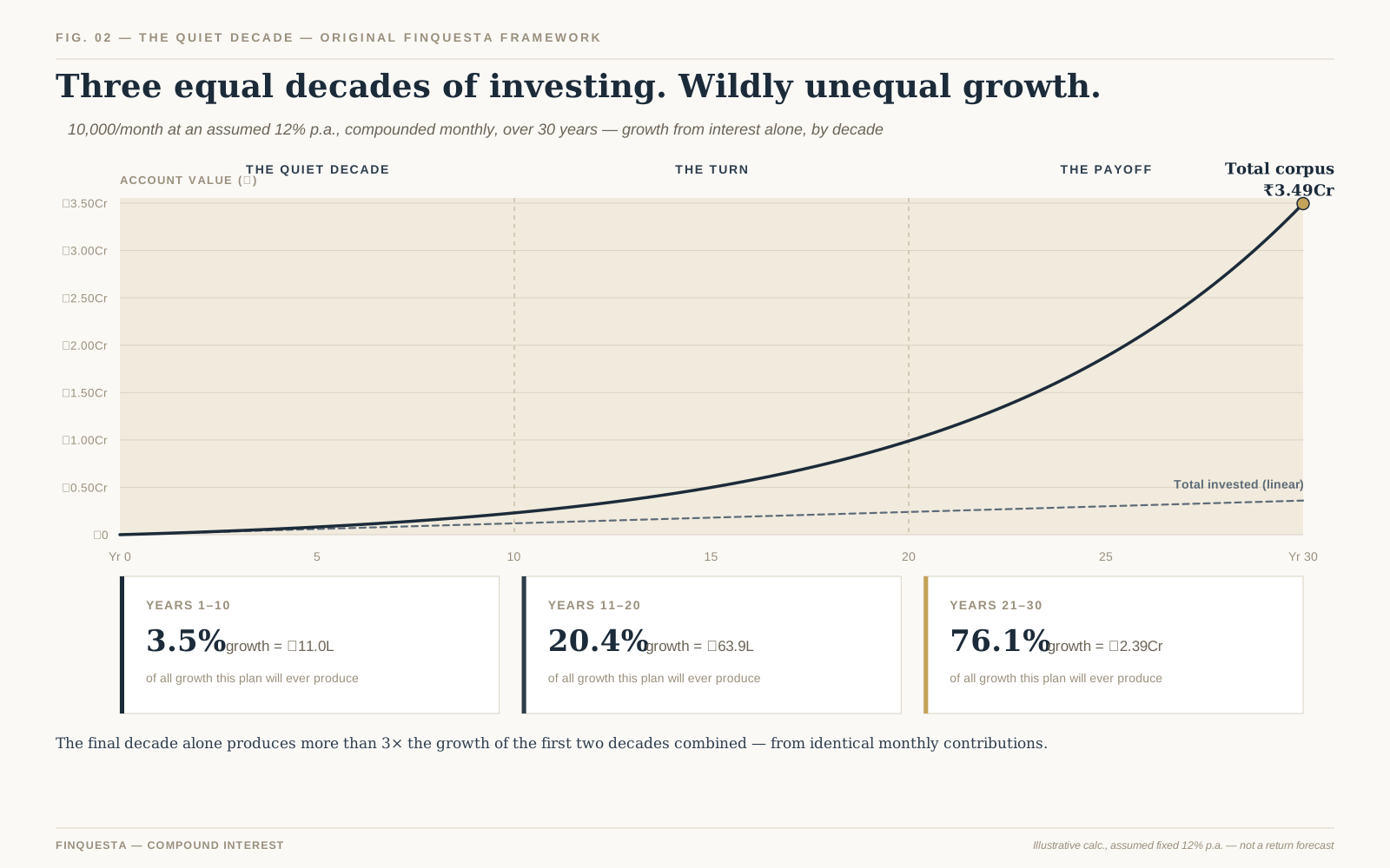
Fig. 01 — From a January 2008 peak to an October 2008 trough, and a multi-year road back

The crisis didn’t arrive as a single event but unfolded over roughly a year, with a handful of specific moments widely cited as its turning points, each worth understanding for how they connect to what Indian markets experienced.

Bear Stearns, a major US investment bank, collapsed and was acquired in a rushed, distressed sale in March 2008 — an early, serious warning sign that the credit stress building in the US mortgage market was capable of threatening large, established financial institutions.

Lehman Brothers, another major US investment bank, filed for bankruptcy in September 2008 — widely regarded as the single most consequential event of the crisis, since it demonstrated that a systemically significant institution could actually be allowed to fail, sharply escalating global risk aversion within days.

Indian markets, per the specific figures covered in the next section, reached their crisis-period low the following month, October 2008, broadly consistent with the global panic that followed Lehman’s collapse, before a slow, multi-year recovery began.

This timeline is a simplified version of a considerably more complex year of events across global markets — it captures the moments most consistently cited in retrospective analysis, not an exhaustive account of everything that happened across 2008’s financial system.

For an Indian retail investor following markets in real time during 2008, the timeline likely felt considerably less tidy than this retrospective summary suggests — information arrived in fragments, initial reactions to each event were often uncertain or contradictory, and the full scale of what was unfolding globally only became clear in hindsight, a pattern common to how most genuine crises are actually experienced as they happen.

How Indian equity markets were specifically hit
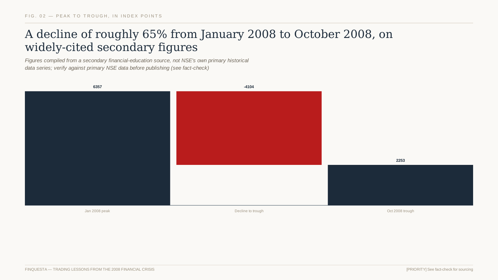
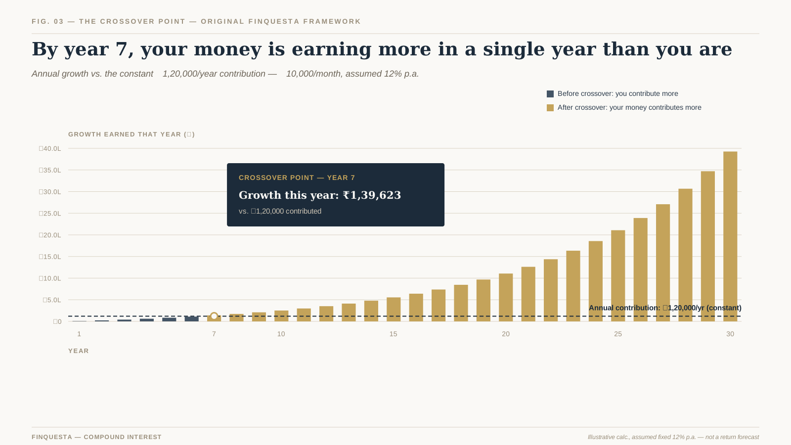
Fig. 02 — A decline of roughly 65% from the January 2008 peak to the October 2008 trough, per secondary sourcing

According to secondary financial-education sourcing compiled for this article, the Nifty 50 peaked near 6,357 in January 2008 and fell to roughly 2,253 by October 2008 — a decline in the broad neighbourhood of 65% over nine to ten months.

Beyond the headline index decline, the same period saw measurable broader economic strain: India’s GDP growth rate slowed from roughly 7.8% to roughly 5.8% around the crisis period, the rupee depreciated to around Rs 49 to the US dollar by October 2008, and exports reportedly declined by around 13% during 2008, according to the secondary sources reviewed for this article.

Foreign institutional investor selling was a significant contributor to the Indian market decline specifically, as global investors broadly pulled capital from emerging markets to address liquidity needs and reduce risk exposure elsewhere in their portfolios, a pattern covered in more depth later in this article’s discussion of liquidity.

It’s worth being explicit that these are approximate, secondary-sourced figures assembled for a general education context, not a precise academic reconstruction — the broad magnitude (a decline in the roughly 60-65% range) is widely and consistently cited, even where exact peak and trough figures vary slightly by source and by which specific date is used.

It’s also worth separating the index-level decline from the considerably wider dispersion of outcomes across individual stocks during the same period — some heavily leveraged or fundamentally weaker companies fell by far more than the headline index figure and, in some cases, never fully recovered even after the broader index reclaimed its prior peak, a reminder that index-level statistics can understate single-stock risk.

The Correlation Convergence

ORIGINAL FINQUESTA CONCEPT — The Correlation Convergence  is Finquesta’s framework for one of the most consistently observed patterns across genuine systemic crises, 2008 included: in calm markets, different asset classes, sectors, and geographies show low or even negative correlation to each other, which is exactly what makes diversification effective under normal conditions. During a genuine systemic crisis, correlations across almost all risk assets tend to converge sharply toward each other — everything falls together — precisely when diversification’s protective effect is needed most and delivers least. This isn’t a flaw in diversification as a concept; it’s a specific, well-documented limitation worth understanding rather than discovering for the first time during an actual crisis.
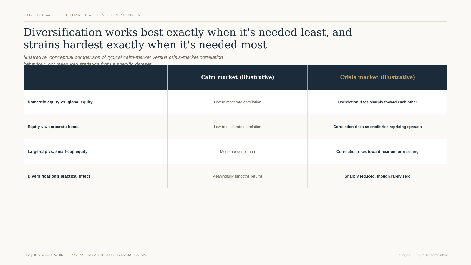
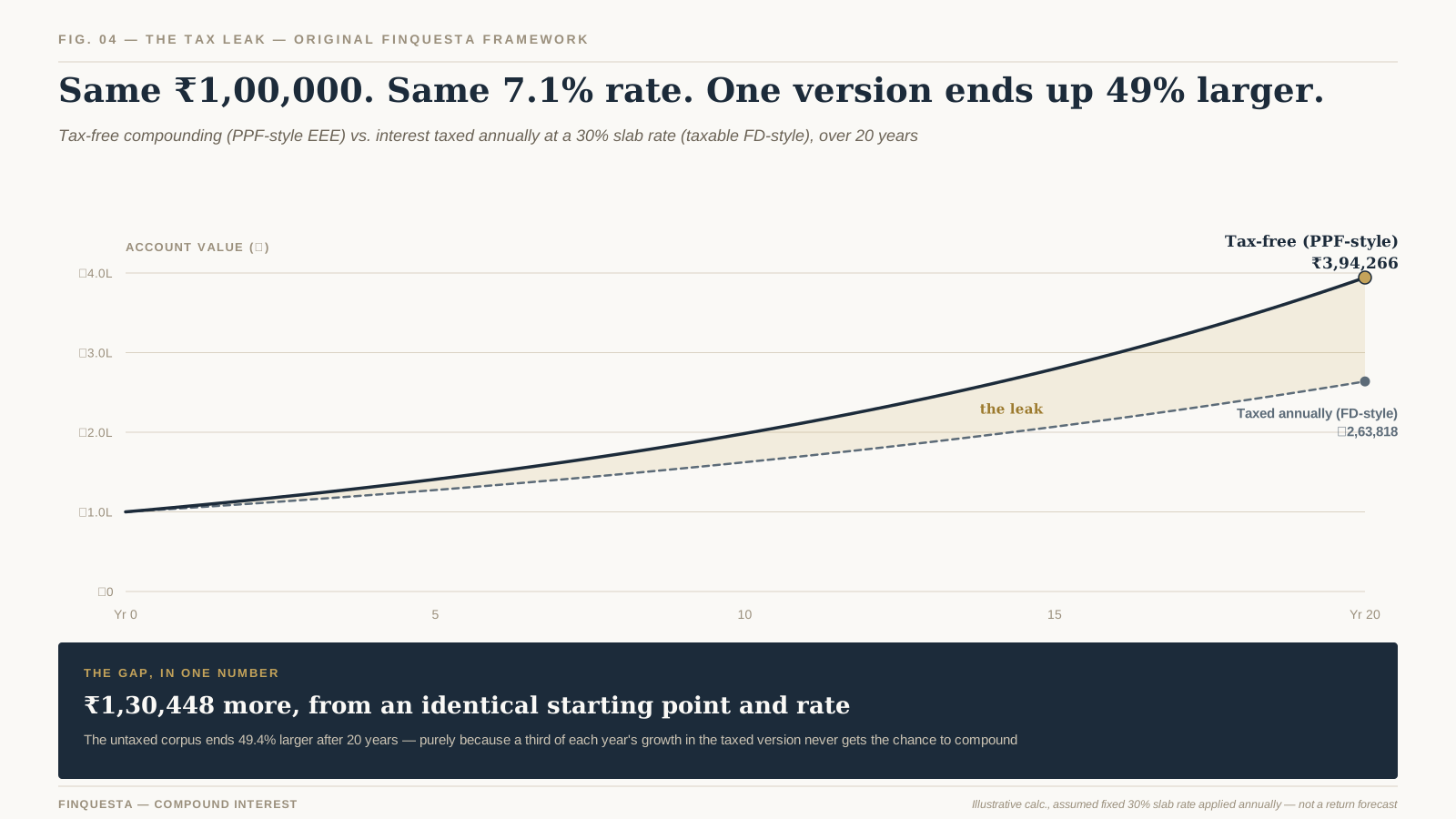
Fig. 03 — Diversification’s protective effect narrows sharply during a genuine systemic crisis

The mechanism behind this convergence is broadly consistent across different crises: when systemic fear rises sharply, investors and institutions facing genuine liquidity pressure tend to sell whatever can be sold, across asset classes and geographies, rather than selectively — the immediate need for cash overrides the more selective reasoning that governs calmer-market decisions.

This doesn’t mean diversification becomes worthless during a crisis — it means its protective effect narrows meaningfully rather than disappearing entirely, and different asset classes still typically decline by different magnitudes even during convergence, just with a smaller gap between them than calm-market correlations would suggest.

This is precisely why a genuinely diversified portfolio, built with the Correlation Convergence in mind, doesn’t rely on diversification alone as its only risk-management tool — position sizing, cash reserves, and a realistic understanding of how much protection diversification actually provides during the worst-case scenario all matter alongside it.

It’s worth internalising this pattern specifically before it’s needed, rather than during an actual crisis, since discovering for the first time that your “diversified” portfolio is falling almost as a single unit is a considerably worse moment to first learn this lesson than reading about it here.

The Liquidity Mirage

ORIGINAL FINQUESTA CONCEPT — The Liquidity Mirage  is Finquesta’s framework for a second, related pattern: in normal market conditions, the ability to sell a position at close to its last-traded price looks like a constant, always-available feature of markets — a background assumption most investors never have reason to question. In a genuine crisis, that assumed liquidity can evaporate exactly when it’s needed most, as bid-ask spreads widen sharply and willing buyers become scarce at anything resembling recent prices, forcing sales at levels meaningfully worse than the last quoted price suggested. The liquidity investors had implicitly assumed was always available turns out, in a genuine crisis, to have been a feature specific to calm conditions — a mirage that recedes precisely when an investor most needs to rely on it.

This pattern showed up across global markets during 2008 in several forms: widening spreads even in normally liquid instruments, forced sales by leveraged institutions needing to raise cash quickly regardless of price, and a general reluctance among market participants to be the buyer on the other side of a stressed seller’s trade.

For an individual retail investor, the Liquidity Mirage matters less in the form of literally being unable to sell — most listed Indian equities remained tradeable throughout 2008 — and matters more in the form of the price actually realised on a forced or panicked sale being considerably worse than a calm-market price would have been.

A leveraged position specifically amplifies the Liquidity Mirage’s impact, since a margin call arriving during exactly this kind of liquidity-stressed period can force a sale at a genuinely unfavourable price, with no ability to wait for conditions to normalise — a dynamic covered in more detail in the context of margin trading specifically.

The practical lesson isn’t that markets are permanently untrustworthy — it’s that the liquidity available during calm periods shouldn’t be assumed to hold under genuine stress, which has direct implications for how much leverage, and how large a forced-sale-vulnerable position, is prudent to carry at any given time.

What “flight to safety” actually looked like

“Flight to safety” describes the pattern of capital moving from riskier assets toward perceived safer havens during a crisis — government bonds, gold, and cash being the most commonly cited destinations, each for slightly different reasons.

Gold’s specific historical relationship with equity markets during periods of acute stress, including how consistently that relationship has held across different crises and where it has genuine limits, is covered in dedicated detail elsewhere, since it deserves more careful treatment than a brief mention here can provide.

Government bonds, particularly from perceived stable sovereign issuers, also typically see increased demand during a flight to safety, reflecting a preference for capital preservation and predictable, if modest, returns over the higher but considerably less certain returns available from riskier assets during the same period.

It’s worth noting that “flight to safety” assets aren’t uniformly safe in every crisis or across every time horizon — they’re safer relative to the specific risks investors are fleeing in that specific crisis, a distinction worth remembering rather than treating any single asset class as universally, permanently safe under all conditions.

A related, easily overlooked point is that a genuine flight to safety can itself distort prices in the destination assets — a sudden surge of demand for perceived safe havens can push their prices to levels that look expensive in hindsight once the crisis passes, meaning a mechanical shift into “safe” assets purely because a crisis is underway carries its own risk of buying at a temporarily elevated price.

Forced selling and margin calls during the crisis

Leveraged positions faced a particularly severe version of the crisis’s dynamics: as asset prices fell sharply, margin requirements on existing leveraged positions were breached, triggering margin calls that, if unmet, resulted in forced liquidation at exactly the depressed prices the crisis had already produced.

This forced selling itself became a contributing factor to the decline’s severity in some markets and instruments — leveraged sellers forced to sell regardless of price added further downward pressure, which could trigger further margin calls elsewhere, a self-reinforcing dynamic during the most acute phases of the crisis.

This is a specific, historically documented illustration of why margin trading carries materially different risk than unleveraged investing during genuine systemic stress — the forced, price-insensitive nature of a margin-driven liquidation is structurally different from a voluntary decision to sell at a time of an investor’s own choosing.

For an investor evaluating leverage today, 2008’s forced-selling dynamic is a concrete historical illustration worth weighing specifically against the theoretical benefits leverage offers during calmer periods, rather than evaluating leverage’s risk only against typical, non-crisis market conditions.

It’s worth distinguishing forced selling from a deliberate, planned reduction in risk exposure decided in advance — the latter, executed on an investor’s own schedule and judgement, is a normal and often prudent part of risk management, while the former, triggered mechanically by a margin call at the worst possible moment, offers no such choice.

How long recovery actually took vs. how it felt in the moment
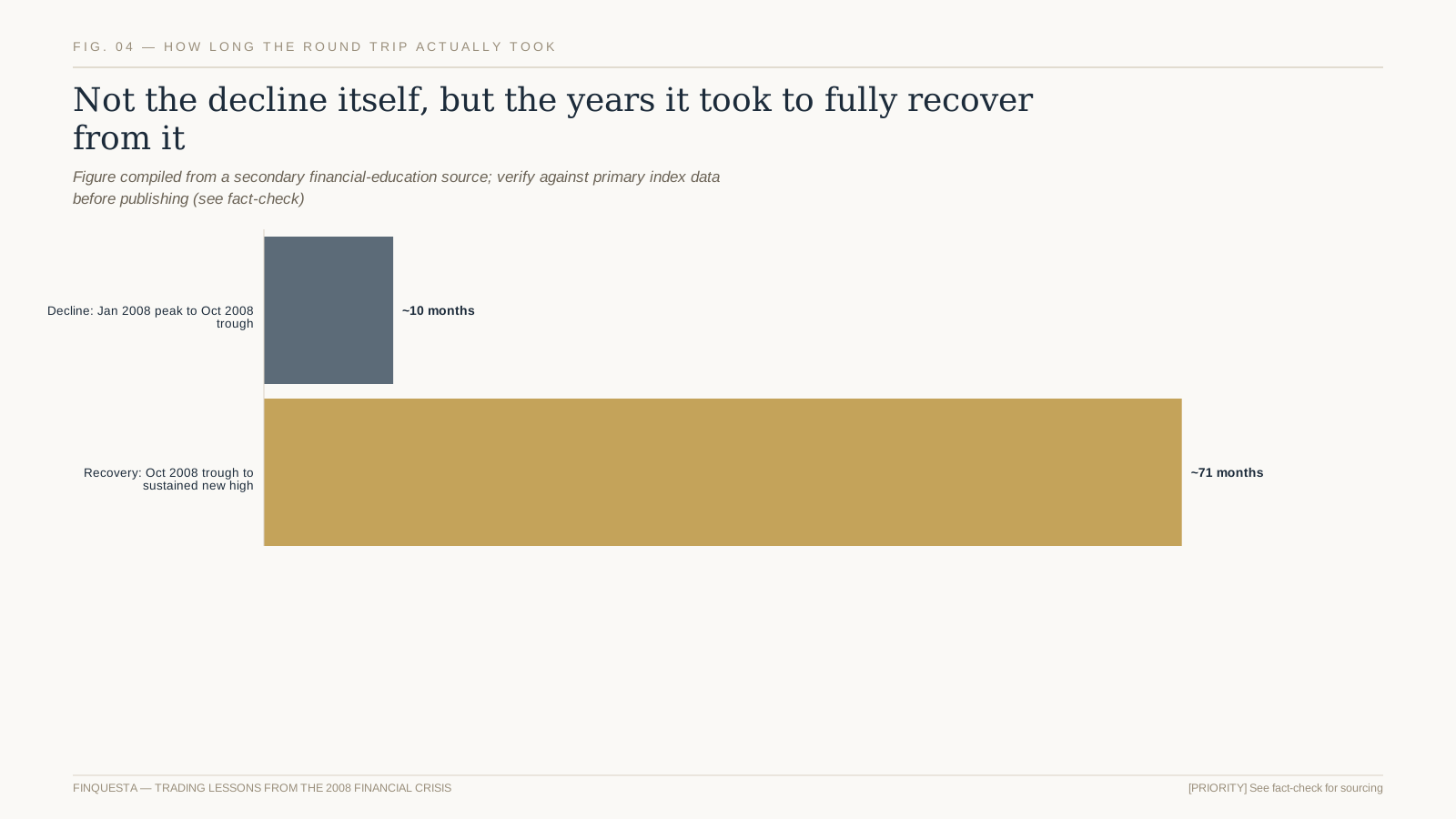
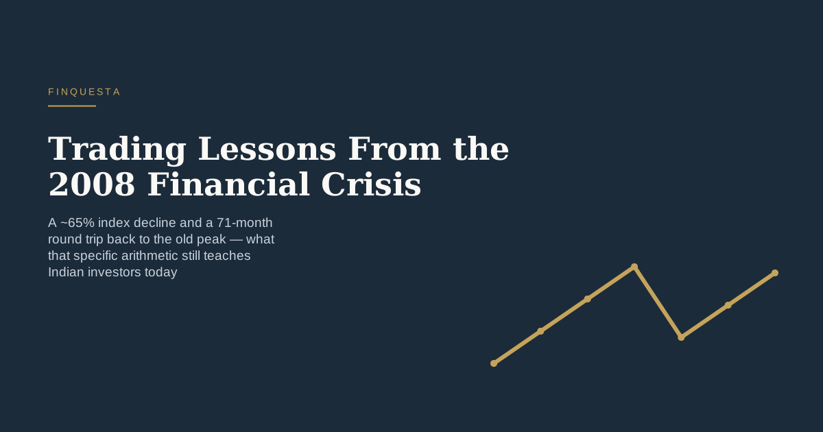
Fig. 04 — Roughly 71 months from the October 2008 trough to a sustained new high, per secondary sourcing

According to the secondary sourcing reviewed for this article, the Nifty 50 didn’t sustainably reclaim its January 2008 peak until roughly late 2013 or early 2014 — a round trip of approximately 71 months from the October 2008 trough, considerably longer than the roughly nine-to-ten-month decline that preceded it.

This asymmetry — a relatively fast, sharp decline followed by a much slower, more gradual recovery — is a pattern that recurs across many, though not all, major market declines, and it has a direct behavioural implication: an investor who panic-sold near the October 2008 trough, then waited for confidence to fully return before re-entering, likely missed a meaningful share of the eventual recovery.

It’s worth being clear that this recovery-time figure describes one specific index over one specific historical period — it isn’t a rule that every future decline will take a similar multiple of the decline period to recover, and this article doesn’t present it as one.

The more durable, transferable lesson isn’t the specific 71-month figure itself, but the underlying pattern it illustrates: recovery from a genuine systemic decline has historically taken considerably longer, and felt far less linear in the moment, than the decline itself — a useful expectation to hold going into any future period of serious market stress.

How 2008 compares to other major Indian market drawdowns

2008 wasn’t the only sharp decline Indian equity markets have experienced in recent decades, and a brief comparison to two other widely cited episodes — the 2000 dot-com-era decline and the 2020 COVID-19 crash — helps place 2008’s specific characteristics in a broader context rather than treating it as a template for every future crisis.

The 2020 COVID-19 crash produced a similarly sharp, fast decline over a few weeks in February and March 2020, including a trading halt triggered by a market-wide circuit breaker, but the subsequent recovery to a sustained new high was considerably faster than 2008’s roughly 71-month round trip — commonly cited at around a year, though this specific comparison figure should be treated as approximate pending verification against primary index data.

The 2000-2001 dot-com-era decline in Indian markets was comparatively more concentrated in technology and IT-services names specifically, reflecting a valuation correction in one sector more than a systemic credit-system failure — a meaningfully different type of crisis from 2008’s broad, cross-sector transmission mechanism.

The practical takeaway from this comparison isn’t a ranking of which crisis was “worse,” but a reminder that decline speed and recovery speed aren’t reliably linked to each other, and that the specific mechanism behind a decline — systemic credit failure, sector-specific valuation correction, or an exogenous shock like a pandemic — meaningfully shapes how the recovery unfolds afterward.

Behavioural mistakes investors made — and keep making

Panic-selling near the bottom is the most commonly cited behavioural mistake associated with 2008, and it’s a genuinely understandable one: the sharpest declines tend to occur precisely when fear and uncertainty are at their peak, which is exactly when selling feels most urgent and holding feels most difficult.

A second common mistake was waiting for “certainty” before re-entering the market — holding out for a clear signal that the worst was over, which by definition only becomes available well after a meaningful portion of the recovery has already happened, since markets typically move ahead of confirmed economic data.

A third mistake, less discussed but equally consequential, was abandoning a systematic investment discipline — stopping SIPs or regular contributions specifically during the downturn, when lower prices were, mechanically, buying more units for the same contribution, precisely the opposite of what panic-driven behaviour led many investors to do.

None of these mistakes were unique to 2008 — broadly similar behavioural patterns have recurred in other periods of market stress, before and since, which is part of why understanding them through a specific, well-documented historical episode like 2008 has value well beyond that one crisis alone.

It’s also worth noting that these behavioural mistakes aren’t a matter of intelligence or sophistication — professional fund managers and institutional desks made broadly similar errors during 2008 in various forms, which is part of why behavioural discipline is better treated as a structural, process-driven problem to design around rather than something solved purely through willpower or market knowledge.

A disciplined SIP investor vs. a lump-sum investor through 2008

An investor who had been running a systematic, regular SIP through 2008, and who continued it without interruption through the decline, was mechanically buying units at progressively lower prices as the index fell — precisely the buy-low behaviour that’s difficult to execute deliberately but happens automatically through an uninterrupted SIP.

A lump-sum investor whose entire investment happened to be made right at or near the January 2008 peak faced a meaningfully different experience — the full capital exposed to the entire decline at once, with the eventual recovery timeline mattering enormously more to that investor’s realised outcome than to the SIP investor’s averaged-in position.

This isn’t a claim that SIP investing eliminates risk or guarantees a better outcome than lump-sum investing in every scenario — it’s a specific illustration of how a systematic, regular contribution pattern behaves differently during a sharp decline than a single, poorly-timed lump-sum entry, purely as a matter of averaging mechanics.

The practical lesson generalises beyond 2008 specifically: uncertainty about market timing is a genuine, permanent feature of investing, not something unique to crisis periods, and a systematic contribution approach is one structural way to reduce a single bad-timing decision’s impact on the eventual outcome.

A third useful comparison point is a lump-sum investor who, rather than investing everything at the January 2008 peak, happened to deploy capital near or after the October 2008 trough — that investor’s realised outcome depended enormously on a timing decision that, in practice, is essentially impossible to make deliberately and reliably in advance, reinforcing why systematic, time-diversified entry is generally preferred over attempting to time a single optimal entry point.

Regulatory and circuit-breaker responses since 2008

Global and Indian financial regulation evolved meaningfully in the years following 2008, with tighter bank capital requirements, closer scrutiny of systemic risk, and refinements to market circuit-breaker mechanisms among the broad categories of change generally attributed, at least in part, to lessons drawn from the crisis.

Circuit breakers — mechanisms that pause trading automatically when an index moves beyond a defined threshold in a single session — existed in some form before 2008 in Indian markets, but the broader global regulatory conversation around market stability mechanisms intensified significantly in the years following the crisis.

It’s worth being cautious about overstating how much any specific regulatory change directly traces to 2008 versus reflecting a broader, ongoing evolution of market infrastructure — this article presents the general direction of post-2008 regulatory tightening as background context, not as a claim that any specific current rule was created solely because of the 2008 crisis.

For a retail investor today, the practical relevance of this regulatory evolution is less about memorising specific rule changes and more about recognising that market infrastructure has continued adapting in response to observed stress events — a reasonable, general expectation, though not a guarantee that any specific future crisis will play out identically to 2008.

None of this regulatory evolution should be read as a claim that systemic crises have become impossible or even meaningfully less likely — tighter rules generally aim to reduce the probability or severity of certain failure modes observed in 2008 specifically, not to eliminate systemic risk from financial markets altogether, which remains a structural feature of any sufficiently interconnected financial system.

What individual investors could and couldn’t control during the crisis

The macro trigger, timing, depth, and duration of a systemic crisis like 2008 sit entirely outside any individual investor’s control — no amount of research, discipline, or skill lets an ordinary retail investor influence when the next credit crisis begins or how severe it turns out to be.

What does sit within an individual investor’s control is decided largely before a crisis ever begins: the asset allocation carried into it, the amount of leverage employed, the size of an accessible emergency cash reserve, and whether a systematic contribution plan is structured to continue automatically rather than requiring a fresh, emotionally loaded decision every month.

Whether to interrupt or continue a SIP during an actual downturn is also squarely within an investor’s control, and 2008 illustrates concretely how much this specific, controllable choice affected eventual outcomes relative to investors who paused contributions near the bottom out of fear.

A useful practical reframe during genuine market stress is to consciously separate what’s actually happening in markets from what remains within personal control — it’s the second category, not the first, that connects directly to a calmer, more disciplined response, and it’s also the only category worth spending decision-making energy on once a crisis is already underway.

How these 2008 lessons apply to portfolio construction today

The Correlation Convergence lesson translates directly into a portfolio-construction principle worth applying today: build diversification with the explicit expectation that its protective effect will narrow during a genuine crisis, rather than assuming today’s calm-market correlations will hold under future stress.

The Liquidity Mirage lesson translates into a leverage and position-sizing principle: size leveraged positions, and maintain cash reserves, with the specific scenario of a liquidity-stressed forced sale in mind, not just the more common, calmer-market scenario where an orderly exit at a reasonable price is genuinely available.

The behavioural lessons translate into a discipline principle: a written investment plan, decided in advance during a calm period, is considerably more likely to be followed during genuine stress than a plan improvised in the moment, when fear is at its highest and clear thinking is hardest to sustain.

None of these principles guarantee protection against every future crisis, since no historical case study can — they represent a specific, well-documented set of lessons worth incorporating into portfolio construction and personal investing discipline, applied prospectively rather than only understood in hindsight.

What hasn’t changed since 2008 vs. what has

Human behaviour under acute financial stress — fear-driven selling, a preference for certainty before re-entering, difficulty maintaining discipline during a sharp decline — appears, based on the broader pattern of market history before and after 2008, to be a durable, recurring feature rather than something regulation or technology has eliminated.

What has changed includes market infrastructure, regulatory oversight, and the speed and volume of available information — investors today have access to real-time data and analysis that 2008-era investors largely didn’t, though it’s worth noting that more information doesn’t automatically translate into better-calibrated behaviour during genuine stress.

It’s also worth acknowledging genuine uncertainty about how a future systemic crisis, if one occurs, would specifically unfold — the broad behavioural and structural lessons from 2008 are reasonably transferable, but the specific triggers, mechanics, and severity of any future crisis remain fundamentally unpredictable in advance.

This combination — durable behavioural patterns alongside evolving market structure — is why studying 2008 specifically remains useful well beyond its own historical moment: the structural details of the next crisis will likely differ, but the behavioural lessons about diversification limits, liquidity assumptions, and disciplined process have a stronger claim to staying relevant.

Taken together, these two categories — durable human behaviour and evolving market structure — argue for a specific kind of humility when preparing for future stress: build a plan that accounts for how you’re likely to actually feel and behave under pressure, rather than a plan that assumes a more purely rational version of yourself will show up when it matters most.

A brief self-check for your own crisis preparedness

None of the lessons in this article require predicting when or how the next period of serious market stress will arrive. They translate into a short, practical self-check worth running against your own current portfolio and plan.

  1. Confirm your portfolio’s diversification assumptions account for the Correlation Convergence, not just calm-market correlations.
  2. Check whether any leveraged positions could survive a genuinely liquidity-stressed forced-sale scenario, not just an orderly one.
  3. Write down, in calm conditions, what you intend to do — and not do — during the next sharp, sustained decline.
  4. Confirm any systematic contributions (SIPs) are set up to continue automatically through a downturn, not requiring a fresh decision each month to keep going.
  5. Revisit this self-check periodically, since portfolios and leverage levels can drift from an original, more conservative plan over time.

None of these steps require forecasting the next crisis’s specific cause or timing. They require applying 2008’s most durable, well-documented lessons to your own current situation, before rather than during the next period of genuine market stress.

None of this is meant to suggest that preparing for a future crisis is primarily about pessimism or constant vigilance — most of the preparation described here is a one-time or periodic exercise, done in calm conditions, that then largely runs on its own through automatic contributions, pre-set allocation limits, and a written plan referred to only when genuinely needed.

HISTORICAL EDUCATION, NOT A FORECAST OR INVESTMENT ADVICE This article is a historical case study of the 2008 financial crisis’s impact on Indian markets, using figures compiled from secondary sources and flagged for verification. It is general financial education, not a prediction of any future crisis, and not personalised investment advice.

Trading lessons from the 2008 financial crisis: frequently asked questions

How much did Indian markets fall during the 2008 financial crisis?

According to secondary financial-education sourcing, the Nifty 50 fell from approximately 6,357 in January 2008 to approximately 2,253 in October 2008, a decline of roughly 65% over nine to ten months. This figure should be verified against primary NSE data before being treated as precise.

How long did it take Indian markets to recover from the 2008 crash?

Per the same secondary sourcing, the Nifty 50 did not sustainably reclaim its January 2008 peak until roughly late 2013 or early 2014 — a recovery period of approximately 71 months from the October 2008 trough, considerably longer than the decline itself.

What is the Correlation Convergence?

It’s Finquesta’s framework describing how correlations between different asset classes, which are typically low in calm markets, tend to rise sharply toward each other during a genuine systemic crisis — reducing diversification’s protective effect exactly when it’s needed most.

What is the Liquidity Mirage?

It’s Finquesta’s framework describing how the ability to sell an asset near its last quoted price, which feels constant during calm markets, can evaporate during a genuine crisis as spreads widen and buyers become scarce, forcing sales at considerably worse prices than expected.

What triggered the 2008 global financial crisis?

The crisis originated in the US mortgage and credit markets and escalated with the collapse of major financial institutions, including Bear Stearns in March 2008 and Lehman Brothers’ bankruptcy in September 2008, which sharply accelerated global risk aversion and market declines.

Did SIP investors do better than lump-sum investors during 2008?

An investor running an uninterrupted SIP through the 2008 decline was mechanically buying more units at progressively lower prices, unlike a lump-sum investor whose full capital was exposed to the entire decline at once. This illustrates averaging mechanics, not a guarantee of a better outcome in every scenario.

What is a common investor mistake seen during the 2008 crisis?

Panic-selling near the market bottom and then waiting for full certainty before re-entering are the most commonly cited mistakes, since both tend to lock in losses near the trough and delay participation in the recovery that follows.

Does gold protect a portfolio during a financial crisis like 2008?

Gold has historically behaved differently from equities during some periods of market stress, though this article covers that specific relationship, including its limits, in dedicated detail elsewhere rather than asserting a simple guarantee here.

How does leverage affect risk during a systemic crisis?

Leveraged positions faced forced margin-call liquidations during 2008, often at severely depressed prices, since the Liquidity Mirage meant an orderly, well-timed exit wasn’t reliably available. This is a specific historical illustration of leverage’s amplified risk during genuine systemic stress.

Is a crisis like 2008 likely to happen again?

This article doesn’t forecast future crises, since their timing, trigger, and severity are fundamentally unpredictable in advance. It uses 2008 as a historical case study for durable lessons about diversification limits, liquidity, and investor behaviour rather than a prediction of what comes next.

What should I actually do differently based on 2008’s lessons?

Build diversification expecting its protective effect to narrow during genuine stress, size leverage and cash reserves with a liquidity-stressed scenario in mind, and write down an investment plan during calm conditions rather than improvising one during acute market fear.

Were Indian markets affected by a crisis that started in the US?

Yes. Indian markets were affected primarily through foreign institutional investor selling, tightening global credit and trade conditions, and broader global risk aversion, even though the crisis’s direct origin was in the US mortgage and banking system rather than in India itself.

Disclaimer This article is for informational and educational purposes only and does not constitute financial, investment, tax, or legal advice. Figures, rates, and regulations mentioned are subject to change; please verify current details with official sources (RBI, SEBI, the Income Tax Department, IRS, or a licensed financial advisor) before making financial decisions. Finquesta may earn a commission from affiliate links in this article at no extra cost to you.
What Is VWAP? The Simple, Complete Friendly Guide (2026)

what is vwap

A trader two desks over keeps buying at prices that look worse than what the trader next to him is paying — same stock, same minute. By 3:30pm, his fills average out cheaper. He wasn’t guessing. He was trading against a number most beginners never look at, and it isn’t complicated once you see where it comes from.

QUICK DEFINITION VWAP (Volume-Weighted Average Price) is the average price a stock has traded at during the current session, weighted by how much volume traded at each price. It resets to zero at every market open, is calculated automatically on virtually every trading terminal, and is used mainly to judge whether an order was filled at a fair price relative to the rest of the day’s activity — not to predict where price goes next.

What is VWAP, and why does it exist?

Every stock trades at dozens or hundreds of different prices across a single session. A simple average of the day’s high and low tells you almost nothing about where most of the actual trading happened. VWAP fixes that by weighting each price by the volume that traded there — a price with ten times the volume counts ten times more.

It was built for institutional trading desks first, not retail traders. A mutual fund that needs to buy a large block of shares can’t dump the whole order in one second without moving the price against itself, so it spreads the order through the day and later checks: did our average fill price beat VWAP? That single comparison is still the industry’s default execution benchmark.

Retail traders adopted it later, mostly as a quick visual cue for intraday bias — price above VWAP is loosely read as the buyers being in control for the session, price below as the sellers being in control. That’s a simplification worth treating carefully, which this article gets to shortly.

This is also the number active traders check first thing when a stock has been halted and reopened, or after an unusually large single print — a fresh VWAP anchored from the reopen, or a clear outlier trade sitting far from the rest of the session’s volume, tells you at a glance whether the broader market has actually accepted the new price or is still fighting it.

The formula behind VWAP

Picture a stock that trades 10,000 shares at ₹100 in the first minute, then 90,000 shares at ₹101 in the next. A simple average of those two prices is ₹100.50. VWAP, weighting by the 90,000-share print, lands at ₹100.90 — much closer to where the real volume actually happened, and a more honest read of where the market really was.

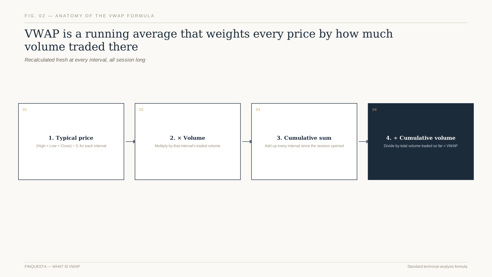
Fig. 01 — VWAP is cumulative price-times-volume divided by cumulative volume, recalculated every interval

For each interval — a minute, five minutes, whatever the chart’s resolution is — the platform computes a typical price (usually high plus low plus close, divided by three), multiplies it by that interval’s volume, and adds the result to a running total. Divide that running total by the running total of volume, and you have the current VWAP.

You will never need to calculate this by hand. Every serious charting platform — from a broker’s own app to TradingView — plots VWAP as a built-in line. What’s worth understanding is not the arithmetic but why it behaves the way it does, which the rest of this article covers.

Notice what the formula does NOT include: it never asks why a trade happened, who placed it, or whether it was a genuine directional bet or a market-maker hedging some other position. VWAP is purely descriptive — a clean summary of where volume actually transacted, with zero opinion baked in about whether that was smart money or noise.

The Anchor Reset — why VWAP starts fresh every single day

ORIGINAL FINQUESTA CONCEPT — The Anchor Reset  names the single most misunderstood fact about VWAP: it has no memory across sessions. Unlike a 50-day moving average, which carries information from weeks ago, VWAP restarts from zero at every market open — so comparing today’s VWAP level to yesterday’s is comparing two unrelated calculations that happen to share a name.

This is precisely why VWAP is an intraday tool by design, not a swing-trading or positional one. A trader who tries to read a multi-day trend into a VWAP line is fighting the tool’s own architecture — there’s a reason charting platforms don’t even offer a meaningful “5-day VWAP” line by default.

Anchored VWAP is the one legitimate workaround, and it’s worth knowing separately: instead of anchoring to the day’s open, a trader manually anchors the calculation to a specific event — an earnings date, a breakout candle, a swing low — and lets VWAP run cumulatively from that chosen point onward. That’s a genuinely different, more advanced tool wearing the same name.

Some charting platforms offer a “previous day’s VWAP” as a static reference line carried into today’s session — that’s a legitimate, deliberately different tool, not standard VWAP pretending to have memory. Know which one your platform is actually showing you before you build a rule around it.

Worth remembering before you rely on any single-session anchor: a stock that gapped up sharply overnight on genuine news has, technically, a fresh VWAP that says almost nothing about where it traded yesterday — which is exactly correct behaviour for a tool meant to describe today, not carry yesterday’s baggage forward.

How institutional desks actually use VWAP

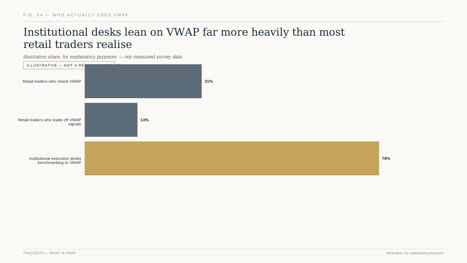
This is worth internalising precisely because it reframes what VWAP is for. It isn’t a crystal ball for where a stock is headed — it’s an accountability tool for how well an order was executed relative to the rest of the market’s activity that same day, a completely different job from prediction.

Fig. 02 — Institutional execution desks lean on VWAP as a benchmark far more than retail traders do

A pension fund or mutual fund placing a large order routes it through a “VWAP algorithm” — software that slices the order into smaller pieces and releases them through the day in proportion to expected volume, aiming to land close to the session’s actual VWAP rather than chase price in one block.

Performance review for that trading desk isn’t “did the stock go up” — it’s “did we beat VWAP.” A buy order filled below VWAP, or a sell order filled above it, is booked as good execution regardless of what the stock did afterward. That single distinction — execution quality versus market direction — is the core reason VWAP exists at all.

This is also why VWAP algorithms exist as a distinct order type on execution platforms rather than just a chart overlay — the desk isn’t looking at the line for a signal, it’s using the underlying formula to schedule an order’s release through the day. The chart line most retail traders see is a side effect of a tool built for a completely different job.

VWAP vs. moving averages — not the same tool

Both tools plot as a single line on a chart, which is exactly why beginners lump them together. But a 20-period moving average and VWAP will visibly diverge on any session with an uneven volume distribution — a heavy opening burst followed by a quiet afternoon pulls VWAP toward the morning’s price far more than it pulls a simple moving average.

Fig. 03 — VWAP and a simple moving average look alike on a chart but answer different questions

A simple moving average treats every closing price as equally important, regardless of whether ten shares or ten million traded there. It also rolls continuously — today’s 50-day average includes data from over two months ago. VWAP does neither of those things, on purpose.

That difference matters most on low-liquidity stocks, where a moving average can be skewed by a handful of thin trades that VWAP would correctly weight as nearly irrelevant. It’s one reason VWAP is considered a cleaner intraday reference on names with genuine trading volume.

A 50-day or 200-day moving average is a positional trader’s tool, telling you about the medium-term trend. VWAP is a same-day tool, telling you about today’s participation. Using them together, rather than picking one, gives a trader both a medium-term compass and a same-day sense of fair value — two different questions, both worth asking.

Reading price above vs. below VWAP

Distance matters too, not just direction. Price sitting a fraction of a percent above VWAP is a near-neutral reading; price sitting two or three percent above it, especially early in the session, is a materially stronger statement about who’s currently in control of the tape.

The common shorthand — above VWAP is bullish, below is bearish — is a reasonable starting heuristic and a dangerous ending point. It describes where the session’s average buyer or seller currently stands relative to price, not where price is going next.

A stock trading well above VWAP in the first hour, then sliding back toward it by midday, is telling a very different story from one grinding steadily higher above VWAP all session. Reading VWAP in isolation, without the shape of the price path around it, throws away most of the useful information.

A stock that opens above VWAP and never looks back all session is showing sustained buyer conviction, worth reading very differently from one that crosses VWAP six times in an hour, which is telling you the two sides are evenly matched and genuinely undecided — the same “above VWAP” label, two opposite stories.

The Fade Zone — Original Finquesta concept for reading extension

ORIGINAL FINQUESTA CONCEPT — The Fade Zone  names the area where price has stretched far enough above or below VWAP that short-term mean reversion becomes statistically more likely — not certain, but more likely. Traders identify it using VWAP standard-deviation bands rather than a fixed percentage, since a stretch that’s normal for a volatile small-cap is extreme for a stable large-cap.

The mistake beginners make with the Fade Zone is treating it as an automatic reversal signal. It’s better read as a caution flag: price this far from the volume-weighted average has moved further than typical intraday participation would suggest, so a continuation from here needs a genuinely new reason — fresh news, a breakout, a block trade — not just momentum carrying it further on its own.

Think of the Fade Zone as a question, not an answer: “has this move already outrun the volume that would normally support it?” Sometimes the honest response is yes, and a pullback follows. Sometimes fresh volume arrives and justifies the extension entirely — which is exactly why this is a caution flag and not a mechanical trade trigger.

It’s worth separating the Fade Zone from a simple “overbought” reading borrowed from an oscillator like RSI. RSI measures momentum over a fixed lookback regardless of volume; the Fade Zone measures distance from a volume-weighted anchor. The two often agree, but when they disagree, the volume-based read tends to be the more session-specific, more current one.

VWAP standard-deviation bands

The exact multiplier — one, two, or a custom value — is adjustable on most platforms, and there’s no single correct universal setting. A more volatile stock or index like Bank Nifty typically needs wider bands to avoid constant false touches compared to a comparatively steady large-cap.

Most platforms let you plot bands one and two standard deviations above and below the VWAP line itself, functioning similarly in spirit to Bollinger Bands but calculated from the session’s volume-weighted distribution rather than a simple moving average — worth comparing directly if you already use Bollinger-style bands elsewhere.

Price touching the outer band doesn’t mean “sell” any more than touching a Bollinger Band does. It means the stock is trading further from the session’s volume-weighted centre than roughly two-thirds of the day’s activity would predict — useful context, not a standalone signal.

Some traders use the first standard-deviation band as a take-profit reference on mean-reversion trades and the second as a stop-loss reference on trend-continuation trades — two opposite uses of the same bands, which only makes sense once you’re clear on which type of setup you’re actually trading in the moment.

Using VWAP for intraday entries on NSE stocks

Combine the VWAP pullback idea with a higher-timeframe check before entering — a five-minute chart pullback to VWAP inside a stock that’s also respecting its daily trend carries more weight than the identical pullback inside a stock fighting its own daily direction.

A common, disciplined approach: wait for price to pull back toward VWAP after establishing a clear directional bias earlier in the session, then look for a rejection candle or volume pickup at that level before entering in the direction of the existing bias — treating VWAP as dynamic support or resistance rather than a standalone trigger.

This works better on liquid, high-volume NSE names — Nifty 50 constituents and other heavily traded large-caps — where enough real participants are actually watching and reacting to the same VWAP line. On thin, illiquid small-caps, VWAP can be distorted by a single large trade and stops being a reliable crowd-behaviour signal.

The first fifteen to thirty minutes after the open are usually skipped by disciplined VWAP traders entirely — early-session volume is thin relative to the rest of the day, so the VWAP line itself is still unstable and swings more with every print than it will once more volume has accumulated behind it.

VWAP in algorithmic execution: VWAP orders vs. TWAP orders

Retail traders rarely need either order type directly — most retail order sizes are too small to move the market meaningfully in the first place, which is the entire problem these algorithms exist to solve. They’re worth understanding conceptually, less so worth seeking out on a typical retail brokerage account.

A VWAP order type, offered by many institutional and some retail-facing broker platforms, automatically slices a large order across the session weighted toward historically high-volume periods — typically the opening and closing windows — aiming to minimise the order’s own impact on price.

A TWAP order (time-weighted average price) does something simpler: it slices the order into equal pieces released at equal time intervals, ignoring volume patterns entirely. TWAP is more predictable and easier for other participants to detect; VWAP is harder to front-run but assumes the day’s volume pattern behaves normally.

A third, less common order type worth knowing exists — Percentage of Volume (POV) — which paces an order as a fixed proportion of real-time volume rather than a pre-set schedule. It’s more adaptive than either VWAP or TWAP orders but requires live volume data to work, which is why it’s mostly an institutional tool rather than a retail one.

Reading common VWAP relationships at a glance

A quick sanity check before relying on any single reading: pull up the same setup on three or four different stocks the same day. If the VWAP relationship tells a consistent story across a genuinely broad set of names, it’s likely reflecting real market-wide behaviour rather than something specific and noisy to one ticker.

The table below is a memory aid for the readings covered so far, not a set of mechanical rules. The same price-to-VWAP relationship can mean different things depending on the time of day, the surrounding volume, and what the broader market is doing — context this table can’t carry, but the rest of the article can.

Price relationshipLoose readWhat to check before acting
Steady above VWAP all sessionSustained buyer controlVolume profile support beneath current price
Crossing VWAP repeatedlyGenuinely undecided sessionWait for a clearer resolution before entering
Touching outer standard-deviation bandExtended, inside the Fade ZoneFresh volume or news justifying continuation
Pinned tightly to VWAP for an hour+Low conviction, low volatilityConsider sitting out until real direction emerges

Common VWAP mistakes beginners make

Most of these mistakes share a root cause: treating a descriptive, backward-looking average as if it were a predictive, forward-looking signal. VWAP is honest about what already happened and silent about what happens next — the mistakes below are mostly variations on forgetting that distinction mid-session.

  • Comparing today’s VWAP level to yesterday’s, forgetting the Anchor Reset means the two numbers share no real connection.
  • Treating a touch of the VWAP band as an automatic buy or sell signal instead of one input among several.
  • Applying VWAP to illiquid, thinly traded stocks where a single block trade can distort the entire line.
  • Expecting VWAP to work as a swing-trading tool when it was built for single-session use.
  • Ignoring volume context entirely and reading only the line’s slope, which defeats the purpose of a volume-weighted tool.

Does VWAP make sense on weekly or multi-day charts?

Some traders track a rolling anchored VWAP from the first trading day of the month or quarter, purely as a big-picture reference for whether the average participant this period is sitting on a gain or a loss — a genuinely useful sentiment gauge, distinct from both standard session VWAP and a VWMA.

The closest legitimate multi-day cousin is a volume-weighted moving average — sometimes labelled VWMA — which applies the same volume-weighting logic over a rolling window like 20 or 50 days instead of resetting daily. It answers a genuinely different question and is worth treating as its own indicator, not “VWAP but longer.”

Standard VWAP, by construction, is a single-session tool — most platforms simply don’t render a continuous multi-day VWAP line, and the ones that do are quietly recalculating something closer to a volume-weighted moving average, a related but different indicator with its own name for a reason.

If your actual question is about a multi-day or multi-week trend, a proper trend-following or moving-average-based approach answers it more honestly than stretching VWAP outside the single-session job it was designed for.

If you only take one habit from this article, make it this: before treating any VWAP signal as meaningful, glance at total volume for the day so far against its typical average. A VWAP relationship built on unusually light volume is a far weaker signal than the identical relationship built on a genuinely active session.

Combining VWAP with volume profile

Reading the two together also helps separate a genuine breakout from a low-conviction one: price clearing VWAP on a volume-profile chart showing thinning activity above is a weaker breakout than one clearing VWAP into a zone the profile shows as historically well-traded and accepted.

Volume profile shows how much total volume traded at each price level through the session, displayed as a horizontal histogram alongside the price chart. Where VWAP tells you the single average price weighted by volume, volume profile shows you the full distribution — including whether the day was genuinely one-sided or split across two competing price zones.

Used together, a trader can check whether price sitting above VWAP is also sitting inside a high-volume node (real conviction) or in a thin, low-volume air pocket (fragile, likely to snap back) — a level of nuance neither tool provides fully on its own.

The high-volume node closest to current price — often called the point of control on a volume profile — is frequently a better support or resistance reference than VWAP alone during the middle of the session, precisely because it captures where the heaviest real disagreement between buyers and sellers has actually settled.

VWAP’s real limitations

A related, often-missed limitation: VWAP treats a buy and a matching sell at the same price as identical, even though one side was aggressive (crossing the spread to get filled immediately) and the other was passive (waiting for price to come to them). Order-flow tools that separate the two exist, but standard VWAP doesn’t make that distinction at all.

It’s also a purely reactive, backward-looking construction — even a real-time VWAP line is, by definition, built from trades that have already happened. Nothing about the formula anticipates news, and a well-informed trader with a genuine information edge will always beat a VWAP-only approach on the specific days that edge matters most.

VWAP says nothing about why price moved — only where the volume-weighted centre of gravity currently sits. A stock gapping up 8% on genuine, verified news and one gapping up 8% on a rumour both show an identical VWAP relationship in the first few minutes, even though the two situations carry very different risk.

It also degrades meaningfully around scheduled events — earnings releases, index rebalancing days, expiry sessions — when volume patterns break from their normal shape and the running average can lag badly behind a genuinely new price regime forming in real time.

VWAP also says nothing useful in the final minutes of a session when volume typically spikes sharply into the close for reasons unrelated to the day’s trend — index rebalancing flows, closing auctions, and same-day options expiry can all distort the last few minutes of the calculation in ways that don’t reflect genuine sentiment.

Risk management around VWAP-based trades

Decide your maximum number of VWAP-based trades per session before the market opens, not while you’re already in one. A tool that’s genuinely useful in moderation becomes a source of overtrading fast once every minor cross of the line starts to look like a new opportunity worth acting on.

Keep a simple trading journal that notes the VWAP relationship at entry alongside the usual entry price, stop, and target. Over a few months, that single extra column often reveals whether your specific setups actually perform better near VWAP, near the bands, or somewhere else entirely — a personal statistic no general article can hand you.

Treat a VWAP-based entry with the same stop-loss discipline you’d apply to any other setup — VWAP tells you about average positioning, not about how far price can move against you before the setup is simply wrong. A stop placed just beyond the relevant standard-deviation band is a common, sensible anchor point.

Position size around VWAP setups the same way you would any intraday trade: a fixed, small percentage of capital at risk per trade, never scaled up because a setup “feels” more reliable than usual. VWAP improves the quality of your reference point — it does not improve your odds enough to justify abandoning position sizing discipline.

Avoid the trap of moving a stop further away “because VWAP suggests it’ll come back.” VWAP describes an average, not a guarantee, and a losing trade that keeps getting more room based on a reference line is one of the fastest ways a small, planned loss turns into a large, unplanned one.

VWAP for options traders

Near-the-money options on a liquid underlying like Nifty are the exception — their price still tracks the underlying’s movement closely enough that the underlying’s VWAP relationship carries genuine, if partial, relevance to how that specific option is likely to behave over the next few minutes.

Options traders on Nifty and Bank Nifty commonly watch the underlying index’s VWAP rather than any individual option’s price, since option premiums move on a mix of the underlying’s price, time decay, and implied volatility — too many moving parts for VWAP’s single-variable logic to apply cleanly on its own.

A common, simple use: treat the underlying trading above its session VWAP as a mild bias toward call-side setups, and below VWAP as a mild bias toward put-side setups — one input into a broader decision that should also weigh strike selection and time to expiry, covered in more depth in a dedicated look at calls and puts.

This is also a reason VWAP is a weaker reference on far-out-of-the-money options specifically: their price is dominated by implied volatility and time decay, and the underlying’s VWAP relationship explains only a small part of the option’s own price behaviour the further the strike sits from the current market price.

Options sellers, rather than buyers, sometimes use the underlying’s VWAP relationship differently again — as a rough guide for where to place a strike when writing a covered call or a cash-secured put, treating VWAP as a proxy for “fair value today” rather than a directional signal at all.

Backtesting a simple VWAP strategy — what to actually check

Before trusting any VWAP-based rule with real money, backtest it across a range of market conditions — trending days, choppy range-bound days, and high-volatility event days separately — since a rule that performs well only in trending conditions will quietly bleed money the rest of the time.

Check the strategy’s performance across at least 50-100 trades, not five or ten good-looking examples cherry-picked from memory. VWAP setups are popular precisely because they’re easy to eyeball as working in hindsight on a handful of charts — a large enough sample is the only honest test.

Paper-trade any new VWAP-based rule for at least a few weeks before risking real capital on it. The goal of a backtest and a paper-trade run isn’t to find a rule that never loses — no honest rule does that — it’s to know your realistic win rate and average loss size before they’re a surprise.

Keep the backtest window recent and relevant — a rule tuned on data from years ago may no longer match current liquidity conditions, algorithmic participation levels, or the specific stock’s current typical volume, all of which have shifted meaningfully across most markets over the past several years.

A simple VWAP checklist before you trade it

  1. Confirm the stock has genuine daily liquidity — VWAP is far less reliable on thin, illiquid names.
  2. Check whether price is inside or outside the standard-deviation bands, not just above or below the line itself.
  3. Look at the shape of the price path leading into the current VWAP relationship, not just the current snapshot.
  4. Cross-check with volume profile if available, to see whether the current level has real conviction behind it.
  5. Set a stop-loss and position size before entering, exactly as you would for any other setup.

Review your last twenty trades, if you’ve been trading a while, and note where price sat relative to VWAP at your actual entries — not in hindsight, but as you genuinely saw it then. Most traders are surprised by the pattern, one way or the other, once they actually look instead of assume.

None of this makes VWAP a strategy on its own. It’s a reference line — an honest, volume-aware description of where the session’s real trading has actually happened, which is a genuinely useful thing to know and a poor substitute for an actual trading plan built around it.

What Is VWAP: frequently asked questions

What is VWAP in simple terms?

VWAP is the average price a stock has traded at during the current session, weighted by how much volume traded at each price level. It resets every day and is used mainly to judge execution quality, not to predict future price direction. Most traders read it directly off their charting platform rather than calculating it themselves.

Is VWAP a leading or lagging indicator?

Lagging. It’s built entirely from price and volume that have already happened, and it smooths out with more data as the session progresses — which is also why it reacts more slowly than raw price in the first few minutes after the open. Treat it as a description of what already happened, not a forecast.

Can VWAP be used for swing trading?

Standard VWAP resets daily and isn’t designed for multi-day analysis, so it’s a poor fit for swing trading out of the box. Anchored VWAP, manually set to a specific starting point like a breakout day, is the closer tool for a multi-day question, and a volume-weighted moving average is closer still.

What is the difference between VWAP and average price?

A simple average treats every trade equally regardless of size. VWAP weights each price by the volume traded there, so a price with heavy participation counts far more than one with a single small trade — a meaningfully different, more representative number, especially on a day with an uneven volume distribution.

Do beginners really need VWAP?

Not on day one. It’s more useful once you already understand basic price action and volume, since VWAP is a refinement of reading volume-weighted behaviour, not a replacement for understanding what volume itself signals in the first place. Learn to read a simple candlestick chart and volume bars before adding VWAP on top.

Is trading above VWAP always bullish?

No. It’s a reasonable default heuristic for session-wide bias, but the shape of the price path, the standard-deviation bands, and the surrounding volume profile all matter more than the simple above-or-below reading on its own. Treat it as one input, never the whole decision.

What is anchored VWAP?

A version of VWAP manually anchored to a specific event — an earnings date, a breakout, a swing low — instead of the market open. It answers “what’s the volume-weighted average price since this specific moment,” which standard session VWAP cannot, since standard VWAP only ever knows about the current calendar day.

Does VWAP work on Bank Nifty and index options?

Traders typically apply VWAP to the underlying index rather than to individual option contracts, since option premiums are driven by several additional factors — time decay and implied volatility among them — that VWAP’s single-variable logic doesn’t capture. Near-the-money contracts on a liquid underlying are the closest exception.

What is the difference between VWAP and TWAP?

VWAP weights order execution toward historically high-volume periods of the session, typically the open and close. TWAP splits an order into equal pieces at equal time intervals regardless of volume patterns — simpler, more predictable, and easier for others to detect, which is exactly the trade-off a large institutional order has to weigh.

Can retail traders access VWAP order types, or only the chart line?

Most retail brokers show the VWAP chart line by default, but VWAP as an actual order-execution algorithm is typically limited to institutional or high-net-worth trading platforms. For most retail order sizes, the chart line for reference is genuinely all you need — the execution algorithm solves a problem retail order sizes rarely have.

Disclaimer This article is for informational and educational purposes only and does not constitute financial, investment, tax, or legal advice. Figures, rates, and regulations mentioned are subject to change; please verify current details with official sources (RBI, SEBI, the Income Tax Department, IRS, or a licensed financial advisor) before making financial decisions. Finquesta may earn a commission from affiliate links in this article at no extra cost to you.
What Is F&O Trading? Risks & Basics Explained [2026]

f&o trading
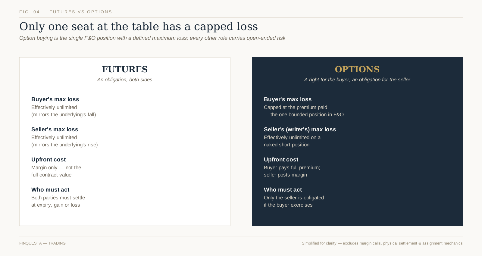
WHAT IS F&O TRADING? F&O trading means trading futures and options — derivative contracts on the NSE and BSE whose value is derived from an underlying stock or index rather than the asset itself. A futures contract obligates both the buyer and the seller to transact at a fixed price on a set date. An options contract gives the buyer the right — but not the seller the choice — to do so, in exchange for a premium. Retail traders use F&O to speculate on price moves or to hedge existing positions, through SEBI-registered brokers, under exchange-mandated margin rules.

Nine out of every ten individual traders who trade F&O in India lose money — and most of them know it and trade anyway. That single fact from SEBI’s own research changes how this topic should be explained. Most F&O guides walk through call options and put options and stop there. This one starts with what actually happens to the people who trade them: what it costs, how the 2024–2026 regulatory overhaul changed the game, and why the buyer of a cheap option is often in a worse position than they think, not a better one.

What F&O actually means, before the jargon

Suresh runs a small logistics business and holds Reliance shares he bought five years ago. He’s not selling them, but he’s nervous about a short-term dip before an earnings call. Instead of selling his shares, he buys a put option on Reliance — a contract that lets him sell at a fixed price if the stock falls, for a small, known premium. That’s hedging: using a derivative to offset a risk he already has.

Priya, a college student with a demat account and a trading app, has no Reliance shares at all. She buys the same put option purely because she expects the stock to drop. That’s speculation: using the same instrument to bet on a price move with no underlying position to protect.

Both trades use the identical contract. F&O itself is neutral — it’s a tool. What determines whether it’s a risk-management instrument or a high-speed way to lose money is who’s using it, why, and with how much capital behind them. SEBI’s data, which this guide covers in detail below, suggests the second kind of trader vastly outnumbers the first among individuals.

How futures contracts work

A futures contract is an agreement to buy or sell a fixed quantity of a stock or index at a fixed price on a fixed future date — and unlike options, both sides are obligated to honour it. If you buy (go “long”) one lot of Nifty futures, you’re agreeing to settle at the contract’s price on expiry day, whether the index has risen or fallen in the meantime.

Three mechanics matter more than the definition itself:

  • Margin, not full value. You don’t pay the full contract value upfront — you post a margin (typically a percentage of the contract’s notional value, calculated by the exchange’s SPAN and exposure margin framework) as security. This is what creates leverage: a relatively small deposit controls a much larger position.
  • Mark-to-market (MTM), daily. Futures positions are settled in cash every single trading day, not just at expiry. If the position moves against you, the loss is debited from your account that evening — you feel the pain in real time, not just on the day you close the trade.
  • Both sides must settle. There’s no walking away. If you’re still holding the contract at expiry, cash settlement happens automatically based on the closing price of the underlying — gain or loss, no choice involved.

Index futures in India (Nifty, Bank Nifty, Sensex) are cash-settled; a small list of stock futures settle by physical delivery of shares if held to expiry.

How options contracts work

An option is a right, not an obligation — but only for the buyer. A call option gives the buyer the right to buy the underlying at a fixed price (the strike price) before or at expiry. A put option gives the buyer the right to sell at the strike price. In both cases, the buyer pays a premium upfront for that right, and that premium is the most the buyer can ever lose.

The seller (or “writer”) of the option is on the other side of that right. If the buyer chooses to exercise, the seller is obligated to fulfil the contract — sell the shares (for a call) or buy them (for a put) at the strike price, regardless of how far the market has moved against them. In exchange for taking on that obligation, the seller collects the premium immediately, whether or not the buyer ever exercises.

Indian index options (Nifty, Bank Nifty, Sensex) are European-style, meaning they can only be exercised on the expiry date itself, not any time before it — unlike some stock options internationally.

The Premium Illusion — why “low cost” doesn’t mean low risk

Original Finquesta concept: The Premium Illusion

A retail trader who buys an option for ₹1,500 often reasons: “my downside is capped at ₹1,500, so this is a low-risk trade.” Technically true — the loss is capped. But that framing hides the real problem: it isn’t the size of the loss that sinks most option buyers, it’s the probability and pace of losing it.

An option’s premium erodes with every day that passes if the underlying doesn’t move in the buyer’s favour — a mechanical effect known as time decay. Near expiry, that erosion accelerates sharply. A trader can be directionally right about a stock and still lose the entire premium because the move happened a day too late or wasn’t large enough to outrun decay. This is a structural feature of how options are priced, not a flaw specific to any strategy.

This is one reason SEBI’s data (covered in Figure 1 below) shows option sellers and institutional, algorithm-driven traders were consistently more profitable than individual option buyers over FY22–FY24: the seller collects the decay that works against the buyer, trade after trade, while carrying the larger — if statistically less frequent — tail risk. Low upfront cost is not the same thing as a favourable trade.

Margin, leverage, and why F&O eats capital fast

Leverage is F&O’s main appeal and its main hazard, and the two aren’t separable. Because you post margin instead of full contract value, a relatively modest account can control a large notional position — which means gains are amplified, but so are losses, on the same capital base.

Illustrative example (not a return forecast): if a trader posts ₹1 lakh in margin to control a futures position worth ₹10 lakh, a 2% adverse move in the underlying — an ordinary daily swing on a volatile day — produces a ₹20,000 loss: 20% of the margin capital, wiped out by a 2% market move. ILLUSTRATIVE — NOT A RETURN FORECAST; actual margin requirements vary by contract, volatility and exchange rules.

Since November 2024, SEBI has specifically added an Extreme Loss Margin (ELM) surcharge on index derivative positions on their expiry day, on top of the standard SPAN and exposure margin, precisely because expiry-day volatility has historically produced the sharpest, fastest retail losses. Margin isn’t a formality — it’s the exchange’s own acknowledgment of how fast F&O positions can move against a trader.

FIG. 01 — 93% of individual equity F&O traders lost money in FY22–FY24, per SEBI’s own study. Source: SEBI, Updated Study on P&L of Individual Traders in Equity F&O (September 2024).

What SEBI’s data actually shows about F&O trading in India

This is the section most F&O explainers skip, and it’s the most important one. SEBI has run two major studies on individual trader outcomes in the equity F&O segment: one published in January 2023 covering FY22, and an updated study in September 2024 covering FY22 through FY24, drawing on data from 15 brokers representing roughly 90% of individual trading volume.

The January 2023 study found that 89% of individual F&O traders lost money in FY22. The September 2024 update found the picture had not improved: 93% of over 1 crore individual traders incurred average losses of about ₹2 lakh each over the three-year period, inclusive of transaction costs. The top 3.5% of loss-makers — roughly 4 lakh traders — lost an average of ₹28 lakh each over the same period. Aggregate losses for individual traders exceeded ₹1.8 lakh crore across the three years [source: SEBI, Updated Study on P&L of Individual Traders in Equity F&O, September 2024].

In sharp contrast, proprietary trading desks and foreign portfolio investors (FPIs) — categories dominated by institutional, algorithm-driven trading — booked gross trading profits of roughly ₹33,000 crore and ₹28,000 crore respectively in FY24 alone, with SEBI noting that the large majority of that profit (96–97%) came specifically from algorithmic execution, not discretionary trading [source: SEBI, Updated Study on P&L of Individual Traders in Equity F&O, September 2024]. The study also found that more than 75% of loss-making individual traders kept trading in F&O despite consecutive years of losses, and that over 75% of individual F&O traders in FY24 had declared annual income under ₹5 lakh.

None of this means F&O trading is impossible to do well — institutions clearly can and do. It means the odds, structurally, favour participants with better data, execution speed and risk systems than most individual retail accounts have access to. That’s a starting fact, not a scare tactic, and it should shape how much capital and confidence any beginner brings to their first trade.

FIG. 02 — Where roughly ₹50,000 crore in individual F&O transaction costs went, FY22–FY24. Source: SEBI, Updated Study on P&L of Individual Traders in Equity F&O (September 2024).

Costs that quietly erode returns

Even a trader who breaks even on price movement can still lose money to costs, because F&O trading involves several charges that apply regardless of outcome. Understanding the full stack matters more here than in long-term investing, because F&O’s shorter holding periods mean costs are paid far more frequently relative to capital deployed.

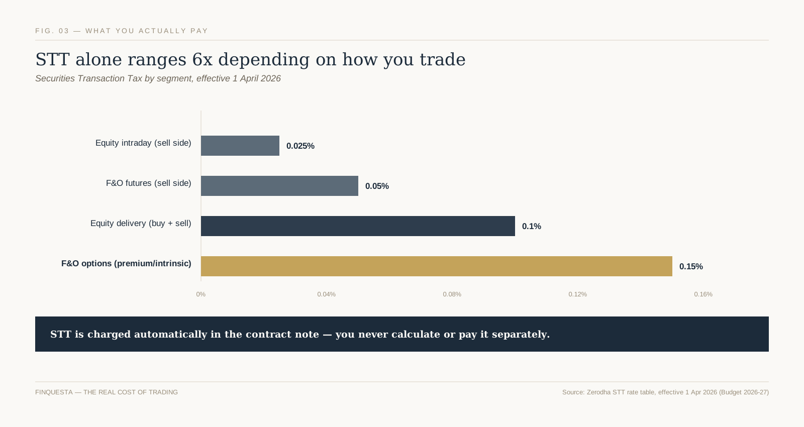
  • Securities Transaction Tax (STT): a direct tax on the sale side of every F&O trade. As per the Union Budget 2026 and effective April 1, 2026, STT on futures is 0.05% of the traded contract value, and STT on options is 0.15% of the premium (and 0.15% on exercise) — both up from the previous rates set in October 2024.
  • Brokerage: a flat or percentage fee charged by your broker per executed order, which was the single largest cost component in SEBI’s FY22–FY24 data at roughly 51% of total individual trader transaction costs.
  • Exchange transaction charges: fees levied by NSE/BSE on every trade, around 20% of the total cost stack per SEBI’s data.
  • GST, SEBI turnover fees and stamp duty: smaller statutory charges applied on top of brokerage and transaction charges, making up the remainder.

SEBI’s study found individual traders spent an average of ₹26,000 each on F&O transaction costs in FY24 alone — money paid out regardless of whether the underlying trade won or lost. Over three years, that added up to roughly ₹50,000 crore across all individual traders combined. A brokerage cost calculator can help you see this stack applied to your own trade size before you place an order.

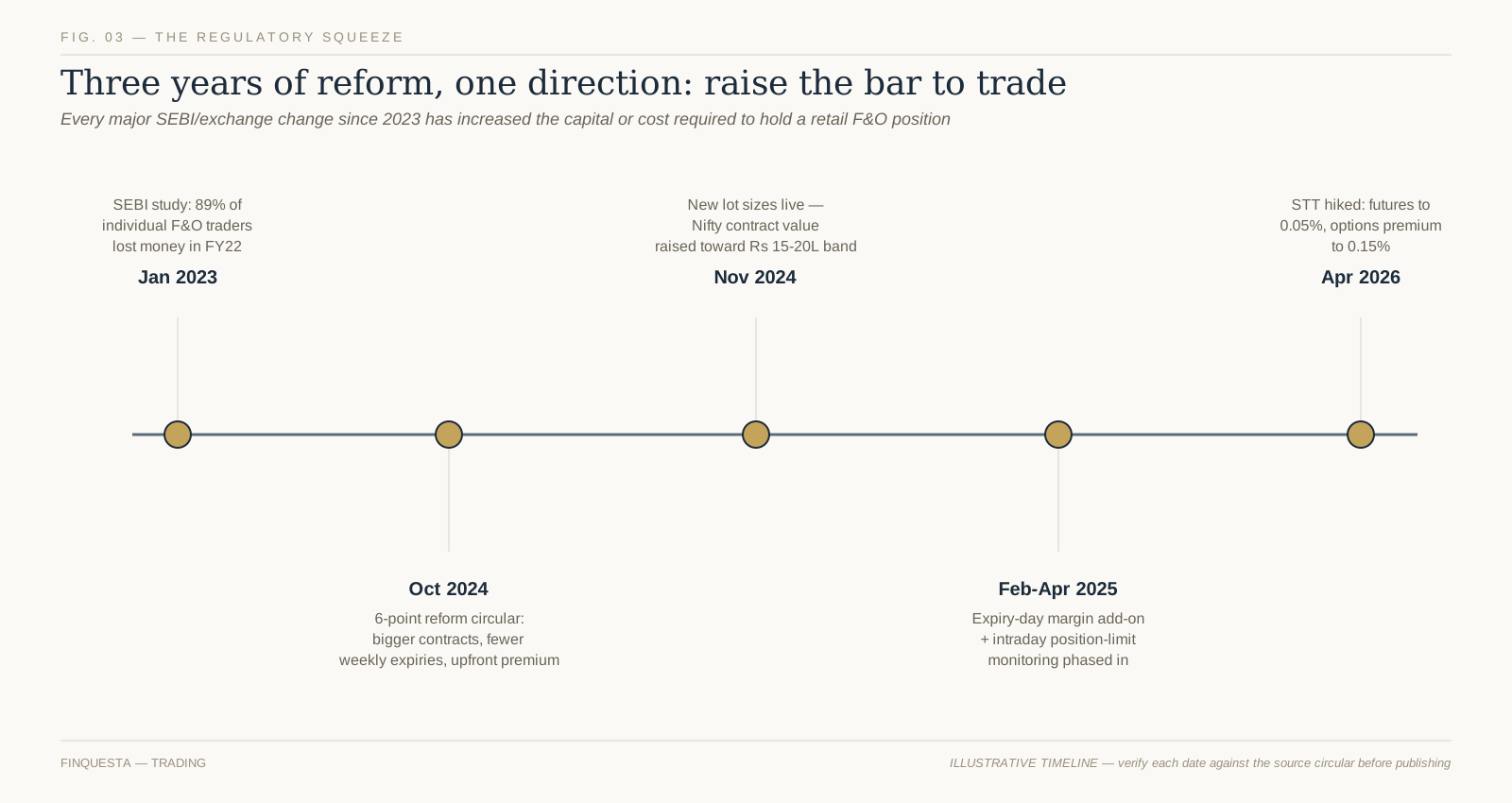
FIG. 03 — Key SEBI/exchange F&O reforms, 2023–2026. Dates and details need confirmation against the original circulars before publishing; see Fact-Check List.

The Contract-Size Squeeze — what the 2024–2026 reforms actually changed

Original Finquesta concept: The Contract-Size Squeeze

Following its loss-rate findings, SEBI introduced a series of reforms through 2024 and 2025 specifically aimed at reducing speculative, low-probability trading by individual participants, and the Union Budget 2026 added a further cost-side change on top. Taken together :

  • Contract value raised: the minimum value of a new index derivative contract was raised from roughly ₹5–10 lakh to a ₹15–20 lakh band — the first such revision in nine years — which pushed lot sizes higher (for example, Nifty’s lot size rose from 25 to 75 units in the November–December 2024 transition).
  • Weekly expiries rationalised: exchanges were limited to offering weekly expiry contracts on only one benchmark index each, ending the previous situation where several indices expired on different days of the same week.
  • Extra margin near expiry: an additional Extreme Loss Margin now applies to index derivative positions on their expiry day, when historical volatility — and retail losses — have been highest.
  • Upfront premium collection and tighter position monitoring: option buyers must pay their full premium upfront (removing a leverage loophole), and exchanges now monitor position limits intraday rather than only at day’s end, phased in through April 2025.
  • STT increase: effective April 1, 2026, the Union Budget raised STT on futures and options, adding a further cost-side deterrent on top of the volume-side changes above.

The name for this pattern — The Contract-Size Squeeze — describes what these changes mean in practice for a retail account with a fixed amount of capital: instead of spreading that capital across several smaller positions, a trader is now pushed toward fewer, larger, more concentrated ones simply to meet the new minimum contract values. The stated intent was to raise the bar to trading altogether; one side effect is that the trades an under-capitalised account can still afford are now bigger relative to that account, not smaller — which is worth understanding before assuming “SEBI made it safer” means “my trade is now lower-risk.” Read our full breakdown of how SEBI’s margin framework applies contract-by-contract.

FIG. 04 — Simplified comparison of maximum loss by position type. Excludes margin calls, physical settlement and assignment mechanics.

Futures vs options — how the risk profile really differs

The two instruments are often bundled together as “F&O,” but they carry meaningfully different risk shapes, and the difference matters more than most beginner guides let on.

A futures position — long or short — has, in practical terms, open-ended risk in both directions: a buyer’s loss grows as the underlying falls, a seller’s loss grows as it rises, and neither side has a built-in cap. An options buyer is the one position in the entire F&O universe with a genuinely bounded maximum loss: the premium paid, and nothing more, because the buyer can simply choose not to exercise a contract that has moved against them. An options seller, by contrast, takes on the mirror image — collecting a limited, known premium in exchange for open-ended obligation risk if the position moves sharply against them, particularly on uncovered (“naked”) positions.

This is why “I’m just buying an option, so my risk is limited” is true in isolation but incomplete in practice — the Premium Illusion covered earlier explains why a capped-but-likely loss can still be a poor trade, and why a trader who moves from buying options to selling them is taking on a materially different, larger-tailed risk, even though the premium collected looks like “free money” upfront.

Common F&O strategies beginners hear about

Beyond outright buying or selling a single contract, traders combine futures and options into structured positions. These are explained here for what they mechanically are, not as a recommendation to use any of them — each carries its own risk profile, cost structure and margin requirement, and suitability depends entirely on an individual’s capital, risk tolerance and market view.

  • Covered call: an investor who already holds the underlying shares sells a call option against them, collecting the premium as extra income, in exchange for capping their potential upside if the stock rallies past the strike.
  • Protective put: an investor holding shares buys a put option as insurance against a decline — similar in spirit to Suresh’s hedge earlier in this guide — paying a premium for downside protection.
  • Spreads (e.g., bull call spread, bear put spread): buying one option and simultaneously selling another at a different strike, which typically reduces both the cost of the position and its maximum profit potential, while also capping the maximum loss compared to an outright naked position.

Every one of these still carries the underlying dynamics covered above — margin, time decay, and transaction costs on each leg of the trade. A three-leg spread pays transaction costs three times over, which is worth factoring in before assuming a “hedged” strategy is automatically a low-cost one.

Taxation of F&O trading in India

Under Indian income tax law, profit or loss from F&O trading is treated as non-speculative business income, not capital gains — a distinction that surprises many beginners who assume it would be taxed like equity delivery trades. This means F&O income is added to your other income and taxed at your applicable income tax slab rate, and it must be reported using ITR-3, not the simpler ITR-1 or ITR-2 forms used for salary or capital-gains-only filers.

Turnover for F&O trading, for tax purposes, is calculated as the absolute sum of all profits and losses across trades — not net profit — which means a trader with many small wins and losses can cross a tax-audit turnover threshold even with a modest net result. Whether a tax audit is required depends on this computed turnover relative to limits set under the Income Tax Act, which are periodically revised.

This section is general information, not tax advice specific to your situation — F&O tax treatment has enough moving parts (turnover computation, audit thresholds, presumptive taxation eligibility) that a chartered accountant familiar with trading income is worth consulting before filing, especially in your first year of F&O activity.

Who should — and shouldn’t — trade F&O

This isn’t a recommendation either way; it’s a framework for the questions worth asking honestly before your first trade.

  • Capital you can lose without consequence: given SEBI’s data on how often individual traders lose, and given the raised contract-value minimums since 2024, F&O now requires meaningfully more capital per position than it did two years ago. Money needed for near-term expenses or emergencies doesn’t belong here.
  • A specific view or a specific risk to hedge: the clearest, most defensible use cases in SEBI’s own framing are hedging an existing position (like Suresh) or acting on a well-researched, time-bound view — not habitual, undirected trading.
  • Willingness to track a position daily: unlike a long-term equity or mutual fund holding, an open F&O position — especially near expiry — can require active daily attention because of mark-to-market settlement and time decay.
  • Honest accounting for costs, not just price moves: as Figure 2 shows, costs are certain and payable regardless of outcome. A trading plan that only models price direction, and ignores STT, brokerage and exchange charges, is modelling an incomplete picture.

If most of these don’t clearly apply to you yet, that’s useful information, not a verdict — building market experience through smaller, longer-horizon instruments first is a legitimate path toward F&O, not a consolation prize.

Before you place your first F&O trade

  • Read your broker’s risk disclosure document in full — SEBI requires brokers to provide this before enabling F&O trading on your account, and it’s written specifically to cover the mechanics this guide has walked through.
  • Calculate your actual margin requirement and worst-case loss for the specific contract and lot size you’re considering, using your broker’s margin calculator — not a rough estimate.
  • Total the full cost stack — STT, brokerage, exchange charges, GST — for your position size before placing the trade, not after.
  • Decide your exit plan (both profit-taking and loss-limiting) before you enter the trade, not while you’re watching the position move.
  • Start with position sizes small enough that the raised, post-2024 lot sizes don’t push you into a single trade that represents an outsized share of your total trading capital.

Frequently asked questions

What is F&O trading in simple terms?

F&O trading means buying and selling futures and options contracts — agreements whose value is based on an underlying stock or index. A futures contract obligates both sides to transact at a set price on a set date; an options contract gives the buyer the right, but not the obligation, to do so, for a premium paid to the seller.

Is F&O trading safe?

F&O trading carries substantially higher risk than long-term equity or mutual fund investing, largely because of leverage, time decay on options, and short holding periods. SEBI’s own study found 93% of individual F&O traders lost money over FY22–FY24. It isn’t inherently “unsafe” as a tool — institutions use it for hedging every day — but for most individual retail traders, the historical outcomes have skewed heavily toward losses.

Can I lose more than my capital in F&O trading?

It depends on the position. An options buyer’s maximum loss is capped at the premium paid — they cannot lose more than that. A futures position (long or short) or an options-selling position, however, carries open-ended risk that can, in volatile conditions, exceed the margin initially posted, potentially triggering a margin call for additional funds.

What is the difference between futures and options?

A futures contract is a mutual obligation — both the buyer and seller must transact at the agreed price on the expiry date. An options contract gives only the buyer a right, which they can choose not to exercise, while the seller remains obligated if the buyer does exercise. This is why futures carry open-ended risk on both sides, while an options buyer’s risk is capped at the premium paid.

Futures vs options — which is riskier?

It depends on which side of the trade you’re on. Buying an option is the one F&O position with a defined maximum loss (the premium). Selling an option, or taking either side of a futures contract, carries open-ended risk. So “futures vs options” isn’t a single riskier-or-safer comparison — it’s really four distinct risk profiles: futures buyer, futures seller, options buyer, and options seller.

How much capital do I need to start F&O trading?

This depends on the specific contract, its current lot size, and the prevailing margin requirement, all of which change periodically — index contract minimum values were raised to a ₹15–20 lakh band from November 2024, pushing typical lot sizes and margin requirements higher than they were previously.

Is F&O trading considered gambling?

Legally and structurally, no — F&O contracts are regulated financial derivatives with legitimate hedging uses, unlike gambling. Behaviourally, SEBI’s own data raises the concern directly: the regulator found that over 75% of individual traders who lost money in F&O kept trading despite consecutive years of losses, a pattern that overlaps with how compulsive, high-frequency betting behaviour is often described, even though the underlying instrument is a legitimate one.

How is F&O trading taxed in India?

F&O profit or loss is treated as non-speculative business income under Indian tax law, added to your other income and taxed at your income tax slab rate, and reported via ITR-3. Turnover for audit purposes is calculated as the absolute sum of profits and losses across trades, not the net result.

Disclaimer This article is for informational and educational purposes only and does not constitute financial, investment, tax, or legal advice. Figures, rates, and regulations mentioned are subject to change; please verify current details with official sources (RBI, SEBI, the Income Tax Department, IRS, or a licensed financial advisor) before making financial decisions. Finquesta may earn a commission from affiliate links in this article at no extra cost to you.
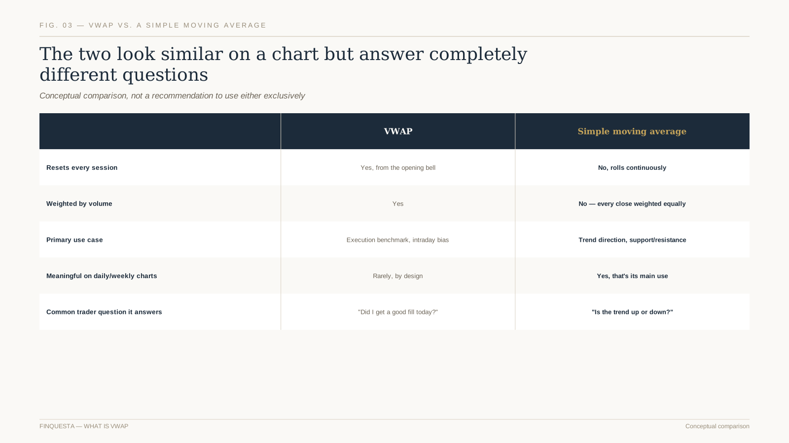
Emergency Fund: How Much You Actually Need [2026]

emergency fund
WHAT IS AN EMERGENCY FUND? An emergency fund is money kept in an easily accessible account, separate from everyday spending, meant to cover a genuine income loss or unavoidable expense without relying on debt. Anyone with recurring expenses needs one — salaried employees, freelancers, and business owners alike — though the right amount varies sharply between them. Most advisors suggest starting with a small buffer, then building toward three to six months of essential expenses. The money belongs in a liquid, low-risk account — a savings account, sweep-in fixed deposit, or liquid fund — not equities or anything that can lose value right when you need it.

Meera runs a freelance graphic design studio out of Bangalore. In a good month she bills somewhere between ₹70,000 and ₹1,20,000 — enough to live well, save a little, and not think too hard about the gap between her best month and her worst one. Then a long-standing client restructures its marketing budget, two other projects get shelved in the same week, and her income for the next quarter drops to almost nothing. She isn’t broke. She has investments, no debt, and a healthy credit score. What she doesn’t have is cash she can spend today without selling something or asking someone. That gap — between being financially fine on paper and being able to actually pay this month’s bills — is exactly what an emergency fund exists to close.

Ask most people how big that fund should be, and you’ll get the same answer everywhere: three to six months of expenses. It’s not wrong. It’s also not specific enough to be useful. A salaried employee with health insurance and a working spouse needs a different number than a freelancer with one big client. This piece exists to turn “three to six months” into an actual number for your situation, and to be honest about what that number should and shouldn’t include.

What the Numbers Say About Who’s Actually Prepared

It’s worth pausing on the scale of the gap before getting into the framework, because it explains why this topic never stops being relevant. Bankrate’s 2026 Annual Emergency Savings Report, based on a national survey fielded in December 2025, found that only 47% of Americans said they had enough liquidity to cover a $1,000 emergency expense (source: Bankrate, “Bankrate’s 2026 Annual Emergency Savings Report,” bankrate.com, published February 4, 2026). Nearly a quarter of respondents — 24% — reported having no emergency savings at all, and only 46% had enough to cover even three months of expenses, despite 85% saying they’d need at least that much to feel comfortable.

emergency fund

FIG. 01 — The Preparedness Gap

The US Federal Reserve’s Survey of Household Economics and Decisionmaking, covering 2025 and published in May 2026, tells a similar story from a different angle: 63% of adults said they could cover a $400 surprise expense using cash or its equivalent, and 55% had specifically set aside enough to cover three months of an income loss (source: Board of Governors of the Federal Reserve System, “Report on the Economic Well-Being of U.S. Households in 2025,” federalreserve.gov, May 2026).

Both figures were essentially unchanged from the year before — this isn’t a one-year blip, it’s a persistent, structural gap between the standard advice and what people actually have set aside.

The picture looks similar in India, if less thoroughly surveyed. A 2025 survey of 1,720 users by Indian savings platform Stable Money found that nearly half — 47.4% — had saved less than a tenth of the emergency fund they’d calculated they needed (source: Stable Money, “Emergency Fund Gap” case study, stablemoney.in, 2025).

None of this means the three-to-six-month guidance is wrong. It means most people never arrive at a number that feels both correct and achievable enough to actually hit — and that’s the gap this article is built to close.

What Actually Counts as an Emergency (and What Doesn’t)

Before sizing the emergency fund, it’s worth being precise about what it’s for, because it only works if it’s protected from everyday scope creep. A genuine emergency has three features: it’s unplanned, it’s necessary, and delaying it would cost you more than paying for it now. A job loss fits. A medical bill fits. A car or bike repair that’s the difference between getting to work and not fits. A wedding gift, a flash sale, a trip that came up, or a phone upgrade do not — however real the desire to spend on them might feel in the moment.

This distinction matters because Bankrate’s same 2026 survey found that among people who’d tapped their emergency savings in the past year, 80% used it for essentials — an unplanned bill, monthly rent or utilities, or day-to-day costs — while a smaller share, under one in five, used it for non-essentials like a vacation or discretionary shopping. The fund holds up as a safety net precisely because most people, most of the time, use it the way it’s designed to be used. The moment it becomes a backup shopping budget, the number you calculate below stops meaning anything.

A useful gut check: if you can delay the expense a month without real consequence, it’s not an emergency yet — it’s a decision. If delaying it creates a cascading cost (a late fee, a missed diagnosis, a lost client), it qualifies.

Two edge cases that often get miscategorized in both directions: an annual insurance premium is not an emergency, even though it’s large and arrives once a year, because it’s entirely predictable and belongs in the regular budget instead. A sudden, necessary vet bill or a family member’s urgent medical cost, on the other hand, usually is one, even though nobody would have listed it as a line item in advance.

Why “Three to Six Months” Isn’t Wrong — Just Incomplete

Nearly every bank, robo-advisor, and finance blog converges on the same range, and for good reason: three to six months of expenses covers the length of a typical job search for a stable, in-demand role, without being so large that building it feels pointless. The trouble is that the range hides two very different numbers inside it, and almost nobody tells you which end applies to you.

The rule also tends to get applied to the wrong base number. Several major sources — Chase, Ally, and Fidelity among them — are careful to specify that the multiplier should apply to essential expenses, not your full salary or current lifestyle spending. That’s the right instinct, but “essential” is still a fairly blunt cut. Rent counts as essential, obviously — but does your full grocery budget count the same way a bare-bones one would? Does your gym membership? Most calculators don’t go far enough to answer that, which is where the next two sections come in.

The Stability Score: A Faster Way to Size Your Emergency Fund

Original Finquesta framework

Instead of guessing whether you’re a “three month person” or a “six month person,” the Stability Score turns the decision into simple arithmetic. Start at a base of three months, then add for each factor below that applies to you:

  • Income source: Salaried at an established employer, +0. Salaried but the role is fully commission-based or highly cyclical, +2. Self-employed, freelance, or gig-based, +3.
  • Number of income earners in the household: Dual income, both stable, +0. Single income, +2.
  • Dependents: None, +0. Children, aging parents, or anyone else financially reliant on you, +1.5.
  • Insurance coverage: Adequate health insurance and, if you have dependents, term life cover, +0. Gaps in either, +1.5.
  • Re-employment speed in your field: Roles that are typically filled within weeks (high-demand, transferable skills), +0. Roles with long hiring cycles, niche specializations, or senior-only openings, +2.

Add the applicable points to the base of three, and round to the nearest whole month. A salaried employee in a dual-income household, insured, in a fast-hiring field, lands at exactly three months — the low end of the standard range, and correctly so. A single-income freelancer supporting a child, with an insurance gap, lands closer to nine or ten. Both are “following the three-to-six-months rule” in spirit; only one of them is actually protected.

emergency fund

FIG. 02 — The Stability Score

The score deliberately doesn’t go below three months for anyone, even someone who scores zero on every factor, because unexpected expenses (as opposed to income loss) can hit even the most stable household, and three months is a sensible floor for that alone. It also doesn’t have a hard ceiling — if your factors keep adding up, that’s useful information, not a flaw in the framework.

The Expense Floor: What Your Number Is Actually Multiplying

Original Finquesta framework

Once you know your target number of months, the next question is: months of what, exactly? Most people multiply their number by their full current monthly spending, which inflates the target and makes it feel out of reach. The Expense Floor method fixes this by splitting spending into three tiers before you multiply anything.

Tier 1 — The Floor. What you cannot avoid paying even in a genuine crisis: rent or EMI, utility connections, insurance premiums, minimum debt payments, and a bare-bones grocery budget. This is the number that should actually get multiplied by your Stability Score.

Tier 2 — Reducible essentials. Costs that continue but could be cut hard for a few months without real harm: your full (rather than bare-bones) grocery spend, transport, phone and internet plans, and similar recurring costs. Worth tracking, but not the number to size your fund against.

Tier 3 — Discretionary. Dining out, entertainment, subscriptions you’d cancel without much thought, shopping, and travel. This tier effectively disappears the day an emergency starts, which is exactly why it shouldn’t inflate your target.

emergency fund

FIG. 03 — The Expense Floor

The gap between Tier 1 and your full current spending is usually larger than people expect — often a third or more of the total — which means a fund sized against the Floor, rather than against everything you currently spend, is both more accurate and considerably faster to reach. This doesn’t mean Tiers 2 and 3 don’t matter; it means they belong in your monthly budget, not in the emergency-fund target.

A Quick, Worked Example: Sizing One Emergency Fund End to End

Back to Meera. Her current monthly spending, all in, runs about ₹95,000. Applying the Expense Floor: her Tier 1 (rent, a health insurance premium, utilities, minimum EMI on a laptop loan, and bare groceries) comes to roughly ₹52,000. Tiers 2 and 3 — the rest of her groceries, transport, subscriptions, and the dining and shopping she’d happily cut for a few months — make up the remaining ₹43,000.

Her Stability Score: self-employed and fully variable income (+3), single income with no other earner in the household (+2), no dependents (+0), an insurance gap since she’s never bought term cover (+1.5), and a field — freelance design — that hires reasonably fast for good portfolios (+0). Base of 3, plus 6.5, rounds to roughly 9–10 months.

Nine and a half months against a Floor of ₹52,000 is about ₹4.9 lakh — a real number, and still a large one, but noticeably more achievable than nine and a half months against her full ₹95,000 in spending, which would put the target above ₹9 lakh. The framework doesn’t make the number small. It makes the number honest, and honest numbers are the ones people actually save toward.

Figures in this example are illustrative and constructed for demonstration only — they are not survey data or typical-case averages.

How Much Emergency Fund You Need, By Situation

For a faster read, here’s how the Stability Score tends to land across common situations. Treat these as starting estimates, not a replacement for running your own numbers above.

SituationTypical rangeWhy
Salaried, dual income, no dependents, insured3–4 monthsLowest-risk combination; two incomes rarely fail at once
Salaried, single income, no dependents, insured4–5 monthsOne point of failure, but no dependents to protect
Salaried, single income, with dependents6–8 monthsOne point of failure, and the cost of that failure is higher
Freelance, commission-based, or gig income6–10 monthsIncome variability is the dominant factor regardless of household structure
Business owner (business is the income source)9–12 monthsThe “job” and the “employer” are the same entity — no separation between the two risks
Near-retirement or retired, drawing down savings12–24 monthsSequence-of-returns risk means a market downturn plus a cash need can compound badly

Where Priority Should Sit: Emergency Fund vs. Debt vs. Investing

A fair question once the target number exists: should it come before paying off debt, or before investing? Bank rate’s 2026 data shows real people split roughly three ways on this already — 29% prioritize savings, 21% prioritize debt paydown, and 31% try to do both at once. A reasonable sequence, in order:

  1. A small starter buffer first — often cited around $500–$1,000 or roughly ₹15,000–₹25,000 — before anything else, so a minor surprise doesn’t immediately become new debt.
  2. High-interest debt next, credit cards especially. The interest saved by clearing a card charging 30%+ APR almost always outweighs what the same money would earn sitting in a liquid fund or savings account.
  3. Back to the emergency fund, building it to your full Stability Score target.
  4. Investing surplus beyond the fund, once the target is fully met.

The one exception: if your income is unstable enough that a gap could force you into new high-interest debt regardless, building the fund further before aggressively attacking existing debt can be the more defensive move — this is a judgment call based on your own volatility, not a universal override of the sequence above.

Where to Actually Keep an Emergency Fund

The fund needs to be liquid, low-risk, and separate enough from everyday spending that it doesn’t quietly get absorbed into it. Beyond that, the right instrument differs by country.

In India, the emergency fund is typically split across two or three of the following: a plain savings account for instant access, a sweep-in fixed deposit (which auto-converts idle balances above a threshold into a short FD and sweeps them back on demand), and a liquid or overnight mutual fund for the portion you’re less likely to need same-day. Liquid funds are a category of mutual fund — the same wrapper used for far more volatile equity schemes — so if you’re new to how funds work generally, it’s worth understanding the basics first. Bank deposits in India are insured by the DICGC up to ₹5 lakh per depositor per bank, covering both principal and interest combined.

In the US, UK, and other markets, the equivalent split is usually a checking account for instant access, paired with a high-yield savings account or money market account for the bulk of the emergency fund. In the US, standard FDIC deposit insurance covers up to $250,000 per depositor, per insured bank, per ownership category. A CD or fixed-term deposit can hold a small slice of a very large fund, but avoid locking up more than you’re confident you won’t need before maturity — early withdrawal penalties defeat the purpose.

emergency fund

FIG. 04 — Where to Keep an Emergency Fund

Whichever country you’re in, a workable split looks roughly like: one part instantly accessible for genuine same-day needs, and the remainder in something that pays a little more while still settling within a day or two. Don’t let the pursuit of yield push any of it into an instrument that can drop in value or lock you out when you actually need it.

One instrument worth being wary of in either market: cash sitting in a zero-interest current or checking account “for safety.” It’s liquid, but it quietly loses purchasing power every year to inflation — the one risk an emergency fund can’t avoid just by sitting still. The fund doesn’t need to beat inflation, but it should at least keep pace, which a plain non-interest account never will.

Can Part of It Work a Little Harder?

Once a fund grows past six or so months of the Floor, a fair question comes up: does all of it really need to sit in the lowest-yielding option available? For the bottom layer — the portion you might need same-day — no shortcuts. But the top layer of a larger fund, the part you’re unlikely to touch inside a week even in a real emergency, can reasonably sit in short-duration instruments that still prioritize capital preservation: a liquid fund rather than a plain savings account, or in some markets a short-term government treasury bill accessed through a demat and trading account.

The distinction to hold onto: this is about slightly better cash management, not investing. If an instrument can meaningfully drop in value over the holding period you’d need it for, it doesn’t belong in the emergency fund, no matter how good the historical yield looks. Any extra yield is also taxable — as per your income slab in India, or largely at ordinary income rates in the US — so factor that in before assuming a marginally higher-yielding option is meaningfully better; the after-tax gap is often smaller than the headline rate difference suggests.

Money that’s genuinely available for investing — because your full fund target is met and this is surplus — is a separate decision with a different time horizon and risk tolerance, worth planning deliberately rather than folding into the emergency allocation by default.

Building It Without Wrecking Your Monthly Budget

The gap between “I should have an emergency fund” and “I have one” is usually a budgeting problem, not a willpower problem. A workable build sequence:

  1. Set a starter target, not the full number — a small buffer you can hit within a month or two, so the habit starts before the size of the full goal has time to feel discouraging.
  2. Automate a fixed transfer on payday, before the money has a chance to be allocated elsewhere. The amount matters less than the consistency.
  3. Route windfalls in, at least partially — bonuses, tax refunds, gifts, and one-off payments are the fastest way to make real progress without touching monthly cash flow.
  4. Build toward the full Stability Score target, tracking progress in months-covered rather than a raw number, since months-covered is the metric that actually reflects your protection.
  5. Loop back to step 2 after any withdrawal. A fund that isn’t replenished quickly is a fund that will eventually be empty exactly when it’s needed.
emergency fund

FIG. 05 — Building the Fund

None of this requires a dramatic lifestyle change. A fund built from a fixed, automated, unglamorous transfer every payday reliably outperforms one that depends on remembering to “save what’s left” — because for most households, on most months, there isn’t anything left by design.

How Often to Recalculate Your Number

A Stability Score and an Expense Floor calculated once and never revisited quietly go stale, usually in one of two directions. Life changes shift the Stability Score itself — a new dependent, a job switch into a less stable field, a lapsed insurance policy, or a household going from two incomes to one are each reason enough to rerun the calculation immediately, rather than waiting for a scheduled review.

The Expense Floor drifts for a quieter reason: inflation. Bankrate’s 2026 report found that 54% of Americans say rising prices are causing them to save less for emergencies — and the same rising prices mean the Floor calculated two years ago is very likely understating what three to six months of rent, utilities, and groceries actually costs today. A fund that was correctly sized in 2024 can be meaningfully undersized by 2026 without a single rupee or dollar having been withdrawn from it.

A simple annual habit avoids both problems: recalculate the Expense Floor once a year on a fixed, easy-to-remember date — a birthday, the start of a financial year — and recalculate the Stability Score immediately after any life change, rather than folding it into the annual check. Treat the emergency fund as a number that needs occasional maintenance, not a target that’s finished forever once it’s hit.

Signs You’re Keeping Too Little — or Too Much

Too little shows up as anxiety with a specific trigger: a single unexpected bill derails the month, or a minor repair gets put on a credit card by default rather than by choice. If that’s happened more than once in the past year, the Stability Score above is worth running properly rather than estimating.

Too much is quieter, and easier to miss, because it doesn’t cause visible stress — it just sits there. A fund that’s grown to eighteen months of the Floor for a dual-income, insured, salaried household with no dependents isn’t dangerous, but it is an opportunity cost: money that could be working toward retirement, a down payment, or any other goal, parked instead in an account built for safety rather than growth. If your Stability Score points to four months and your balance covers fourteen, the honest move is to redirect new contributions elsewhere, not to keep stacking cash for its own sake.

The One Rule for Using It Without Guilt

The emergency fund exists to be used. Bankrate’s data shows 37% of US adults tapped their emergency savings in the past year — and for the large majority, that’s the system working exactly as intended, not a failure. The one rule that matters: if it meets the definition from earlier in this piece — unplanned, necessary, and costlier to delay than to pay now — using the fund is the entire point, and there’s no reason to feel like you’ve failed some test by doing what the money was set aside for.

The guilt that sometimes comes with dipping into savings usually points to a different problem: the emergency fund wasn’t clearly separated from other savings goals in the first place, so spending it feels like it’s competing with the vacation fund or the wedding gift fund, even when it isn’t. A dedicated account, even a free one at the same bank, solves this more effectively than willpower does.

After You Use It: Rebuilding, Fast

Replenishment deserves the same automation as the original build, not a vague intention to “get back to it eventually.” The fastest path back: temporarily redirect any other savings automation — investing contributions, a separate goal fund — toward the emergency fund until it’s back to target, then resume the original allocation. This trades a few months of slower progress on other goals for restoring the safety net that protects all of those goals simultaneously.

If the withdrawal was large relative to income, rebuilding in stages is reasonable: get back to the starter buffer first, then work back up to the full Stability Score target, rather than treating the whole gap as one target that has to be hit all at once.

Common Mistakes That Quietly Undermine an Emergency Fund

A few patterns show up repeatedly, and each one is fixable once it’s named:

  • Sizing it against full spending instead of the Floor. This is the single biggest reason people either never start or give up early — the target feels far larger than it needs to be.
  • Keeping it somewhere too easy to spend. A fund sitting inside the same account used for daily spending gets absorbed into daily spending, a little at a time, without ever feeling like a withdrawal.
  • Keeping it somewhere too hard to access. The opposite mistake — locking the whole fund into a long FD or a fund with a multi-day redemption cycle — turns a same-day emergency into a multi-day wait.
  • Never replenishing after a withdrawal. A fund used once and never rebuilt is a fund that only protects you the first time.
  • Treating a large fund as untouchable for anything else. Once the Stability Score target is genuinely met, additional cash sitting idle indefinitely is a missed opportunity, not extra safety.
  • Skipping insurance and calling the fund “coverage” instead. An emergency fund is not a substitute for health insurance or, where dependents are involved, life insurance — it’s a buffer for the gaps and deductibles insurance doesn’t cover, not a replacement for having it.

Frequently Asked Questions

How much emergency fund should I have in India?

Most advisors suggest three to six months of essential expenses — rent or EMI, utilities, groceries, insurance premiums, and minimum debt payments — kept in a liquid fund, sweep-in FD, or high-interest savings account. Salaried employees with stable jobs and adequate health insurance can often stay near the lower end of that range. Freelancers, commission-based earners, and single-income households with dependents are usually better served by six to twelve months. The Stability Score framework above turns this from a guess into a specific number based on your actual situation.

What is the 3 to 6 month rule for emergency funds?

It’s shorthand for keeping three to six months of essential living expenses in an accessible account, so a job loss or income gap doesn’t force you into debt. The rule doesn’t mean three to six months of your salary — it means the bare cost of staying afloat: housing, utilities, food, insurance, and minimum debt payments. It’s a reasonable range for a single salaried earner with no dependents, but it understates what self-employed people, single-income households, and those without insurance typically need.

Is 3 months of expenses enough for an emergency fund?

For some people, yes — typically a salaried employee in a stable field, part of a dual-income household, with health insurance and no dependents. For others, three months barely covers a typical job search. The US Federal Reserve’s 2025 household survey found only 55% of adults had even that much set aside, and that’s treated as a reasonable minimum, not a comfortable cushion. If your income is variable, or you’re the sole earner supporting dependents, treat three months as a floor to build past rather than a finish line.

Can I lose money in an emergency fund?

Not if it’s held correctly. An emergency fund belongs in a savings account, sweep-in FD, or liquid or overnight mutual fund — instruments built to preserve capital, not grow it aggressively. Liquid funds can show very small day-to-day NAV movements, but a fund holding high-quality, short-maturity debt is designed to avoid meaningful losses. The real risk isn’t market loss — it’s keeping the fund somewhere you can’t access quickly, or spending it on non-emergencies so it isn’t there when you need it.

Should I pay off debt or build an emergency fund first?

Most planners suggest a small starter buffer first — often ₹15,000–₹25,000 or $500–$1,000 — before aggressively paying down debt. After that, high-interest debt, credit cards especially, usually deserves priority, since the interest cost typically exceeds what a liquid fund or savings account earns. Once high-interest debt is cleared, shift focus back to building the emergency fund to its full target. The exception is when income is unstable enough that a gap could force new high-interest debt regardless — in that case, building the fund further first can be the more defensive move.

How many months of expenses should a self-employed person save?

Six to twelve months is the typical range, and the exact number depends on how variable the income actually is, not just the fact of being self-employed. Someone with several long-term retainer clients and predictable monthly billing can lean toward six months. Someone dependent on a handful of project-based clients, or working in a field with long sales cycles, should lean toward twelve. The Expense Floor method above helps make even the higher end of that range feel more achievable, since it’s based on bare survival costs rather than full current spending.

What is the difference between an emergency fund and a savings account?

A savings account is a type of bank account; an emergency fund is a purpose — money earmarked specifically for genuine emergencies, which often happens to live inside a savings account, sweep-in FD, or liquid fund. The distinction matters because a general-purpose savings account often holds money for several goals at once — a vacation, a gadget, a gift — which makes it easy to quietly spend down the emergency portion without noticing. Keeping the emergency fund in its own separate account, even at the same bank, makes it far easier to leave alone.

Can I keep my emergency fund in mutual funds?

Yes, but only specific types — liquid funds and overnight funds, which invest in very short-maturity, high-quality debt and are built for capital preservation with same-day-to-T+1 access. Equity funds, hybrid funds, and long-duration debt funds are not appropriate, since their value can drop right when the money is needed most. If a liquid fund is used, treat its redemption timeline — typically one business day, with some schemes offering a small instant-redemption facility within daily caps — as part of the planning, since it isn’t instant the way a savings account is.

Disclaimer This article is for informational and educational purposes only and does not constitute financial, investment, tax, or legal advice. Figures, rates, and regulations mentioned are subject to change; please verify current details with official sources (RBI, SEBI, the Income Tax Department, IRS, or a licensed financial advisor) before making financial decisions. Finquesta may earn a commission from affiliate links in this article at no extra cost to you.
Buffett’s Shareholder Letters: The Best Essential Lessons (2026)

Warren Buffett Letters

For the first time in 60 years, Warren Buffett did not write Berkshire Hathaway’s annual letter to shareholders. He handed that pen to Greg Abel at the start of 2026, telling shareholders in his final Thanksgiving letter that he was “going quiet.” That single fact turns Buffett’s shareholder letters from a running series into something closed and complete.

Warren Buffett’s shareholder letters are the annual messages he wrote to Berkshire Hathaway’s shareholders from 1965 through 2024, plus one final personal note in November 2025. They report Berkshire’s results, but they’re read for something else: a plain-language education in business, risk, and investor behavior, free of the PR polish most corporate filings carry. Anyone can read the full archive on Berkshire’s own website at no cost. Greg Abel writes Berkshire’s letter now — but the 60-year Buffett archive is what most people still mean by “Buffett’s letter.”

Wall Street reads Warren Buffett’s shareholder letters for the numbers. Everyone else reads them for the fourth paragraph, where Buffett usually says the thing nobody else in finance is willing to say plainly. This guide pulls together the lessons from those shareholder letters that actually hold up — not as a highlight reel of quotes, but as ideas you can apply the next time you’re deciding what to buy, what to sell, or whether to panic.

What Are Warren Buffett’s Shareholder Letters?

Every February from 1965 to 2025, a letter signed by Warren Buffett appeared at the front of Berkshire Hathaway’s annual report. It reported the year’s results, but it did something unusual for a corporate filing: it explained the reasoning behind the results, in Buffett’s own words, without a communications team softening the language.

Buffett treated shareholders as business partners rather than an audience to be managed. He wrote about Berkshire’s failures with the same directness as its successes, named his own mistakes by name, and explained financial concepts — float, intrinsic value, owner earnings — in language a first-time investor could follow. That combination is why professional money managers and total beginners have read the same eleven pages every spring for six decades.

The letters are archived and free to read on Berkshire Hathaway’s own website, going back to 1977 in original form. Nothing about accessing them costs money, and nothing in them requires a finance degree to follow.

Why Warren Buffett’s Shareholder Letters Just Became a Complete, Closed Chapter

Context matters here, because it changes what kind of article this actually is. This isn’t a summary of one year’s letter — it’s a look back at the finished set, and the reason the set is finished just happened.

On November 10, 2025, Buffett sent what he called his Thanksgiving letter — a personal note to shareholders and his children, distinct from the formal annual report. In it, he confirmed he would step down as CEO at year-end, handing the role to Greg Abel. He said he would no longer write Berkshire’s annual report or speak at length at the shareholder meeting. He’d keep sending the Thanksgiving letter, he wrote, but the tradition he started in 1965 — one CEO, one voice, one letter a year explaining the business — was over.

Abel became CEO on January 1, 2026. His first annual letter to shareholders, covering Berkshire’s 2025 results, was dated February 28, 2026. He opened it by calling Buffett “arguably the greatest investor of all time,” and used much of the letter to write down Berkshire’s culture and capital-allocation principles explicitly for the first time — something Buffett had mostly conveyed through decades of accumulated example rather than a single stated list.

None of this makes Buffett’s own letters less useful. If anything, it’s the opposite. A 60-year body of work you can read start to finish, from a 34-year-old buying a failing textile mill to a 95-year-old handing the keys to his chosen successor, is a more complete education than any single year’s letter could be. A good starting discipline, before you read a single lesson below: pull up how to actually evaluate a company’s numbers yourself, so the lessons have something concrete to attach to.

Berkshire’s 60-Year Scorecard: What the Numbers Actually Show

Buffett included one table in nearly every letter he wrote: Berkshire’s per-share market value against the S&P 500, year by year, going back to 1965. It’s one of the most audited scorecards in investing, because Buffett published the misses right alongside the wins, every single year, without exception.

Over 1965–2025, Berkshire’s per-share market value compounded at 19.7% a year. The S&P 500, dividends included, compounded at 10.5% a year. That 9.2-point annual gap, held for six decades, is the entire reason a $1 stake in 1965 grew to roughly $60,890 in Berkshire versus roughly $455 in an S&P 500 tracker.

Two things in that table matter more than the headline number. First, Berkshire didn’t win every year — it lost badly in 1974 (-48.7%), 1990 (-23.1%), 1999 (-19.9%), and 2008 (-31.8%), each time in a year the S&P 500 also fell or came close to it. An investor watching only the down years would have seen four separate reasons to quit.

Second, the gap between the two lines didn’t come from avoiding those bad years at all. It came from what happened in the years in between them, which is the actual subject of nearly every lesson in this guide. Skimming past the losing years to get to the compounding is exactly the habit this article is trying to talk you out of.

None of this happened in a vacuum, either. The same discipline that built the scorecard is still visible in how Berkshire deploys capital today: in 2025 alone, Abel’s team added two very different businesses to Berkshire — OxyChem, an industrial chemicals producer, and Bell Laboratories, a family-owned pest-control company whose owner wrote directly to Buffett describing a durable, easy-to-understand business with a strong management team. Neither purchase makes headlines the way a flashy tech acquisition would. That’s rather the point of the whole approach.

Circle of Competence: Buffett’s First Rule for Not Losing Money

In his 1996 letter, Buffett laid out the idea most people now know by a three-word label — circle of competence — though that exact phrase is a later shorthand rather than his own original wording. His own words were plainer: an investor doesn’t need to understand every company, only the ones inside the boundary of what they actually understand. Knowing where that boundary sits, he wrote, matters more than how large the circle is.

Greg Abel’s 2026 letter borrowed a sports analogy Buffett had used for decades to describe the same discipline. Buffett drew inspiration from Ted Williams, the baseball Hall of Famer who divided the strike zone into 77 cells and swung only at pitches in his highest-percentage zone. Williams hit .344 for his career by refusing to swing at anything else. Buffett applied the same logic to companies: wait for the ones you understand well enough to judge, and let the rest go by unswung.

This is where the circle of competence gets misread most often. It isn’t a rule about avoiding complexity — Berkshire owns railroads, reinsurance contracts, and utility infrastructure, none of which are simple businesses. It’s a rule about honesty with yourself, not a rule about difficulty. Buffett passed on internet stocks through the entire dot-com run not because he thought the businesses were too advanced to learn, but because he judged that he couldn’t reliably tell which ones would still exist in ten years.

For an Indian investor scanning a stock screener, the practical version of this lesson is a question, not a rule: could you explain, in three sentences and without jargon, how this specific company will actually make money five years from now? If the honest answer is no, the circle of competence says wait — not never, just not yet, and not on this particular stock until that changes.

The Patience Lesson: Investing to Hold Forever

In his 1989 letter, describing why Berkshire had just bought large stakes in Coca-Cola and Freddie Mac preferred stock, Buffett wrote a line that outlived the specific investments it described: when Berkshire owns part of an outstanding business with outstanding management, “our favorite holding period is forever.”

The line gets quoted often enough that it’s easy to miss what it’s actually claiming. Buffett isn’t saying never sell — Berkshire has sold plenty of positions over the decades, including some he once called permanent. He’s making a narrower claim: the businesses worth owning are worth owning through the discomfort of a bad quarter, a bad year, or in Berkshire’s case, entire bad stretches measured against the index.

Go back to that 60-year scorecard above. Berkshire fell more than 20% in three separate years — 1974, 1990, and 2008 — and each time it went on to post some of its strongest years within the following five. An investor who sold Berkshire stock in early 1975, convinced the -48.7% year proved something was broken, missed a 129.3% recovery the very next year.

The pattern isn’t unique to Berkshire. It’s the mechanical reason patience shows up in almost every durable investing framework, from Buffett’s letters to a plain-vanilla Nifty 50 SIP: most of the compounding happens in a small number of very good years. You only collect them if you’re still holding on the day they arrive, which is a much harder thing to guarantee than it sounds.

Be Greedy When Others Are Fearful — And Vice Versa

Buffett’s contrarian instinct is easy to state and hard to actually practice, which is exactly why it shows up in almost every “Buffett lessons” list you’ll find — usually without an example of what it actually costs to act on it in real time.

Here’s one. In September 2008, with Lehman Brothers days from collapse and the entire financial system visibly seizing up, Berkshire invested $5 billion in Goldman Sachs preferred stock carrying a 10% dividend. Every visible signal in the market that week said retreat. Buffett bought into the panic instead, on terms he’d negotiated because Goldman needed capital and few other buyers were willing to commit it at that specific moment.

The lesson underneath the famous line isn’t simply buy when markets fall. Markets fall often, and plenty of falling markets keep falling for good reason. The lesson is narrower and harder than that: Buffett was only willing to be greedy because he’d already done the circle-of-competence work on Goldman’s underlying business, and the fear in the market that week was about liquidity and sentiment, not about whether the business itself was sound. Contrarian timing without that homework done first isn’t courage — it’s a bet wearing a better story.

Don’t Be a Preening Duck — Judge Yourself Against a Benchmark

In his 1998 letter, reporting on a strong year, Buffett reached for a specific image to warn against a specific mistake: a duck that paddles through a rainstorm and rises with the flood water, then mistakes the rising water for its own paddling skill. He asked shareholders to judge Berkshire’s “duck rating” not by whether it went up, but by how much it went up relative to every other duck on the same pond.

That year, the pond was the S&P 500, and it had risen almost as fast as Berkshire had. This is a harder habit than it sounds, because it cuts both ways. A portfolio up 15% in a year the market is up 25% feels like a win and is actually a loss of relative ground; a portfolio down 10% in a year the market is down 20% feels like a loss and is actually real outperformance.

Most retail investors never build the habit of checking against a genuine benchmark, because checking sometimes tells you your good year wasn’t earned. It was just water.

Bet on the Economy That Employs You

In one of his final traditional letters, Buffett described what he called the American Tailwind: the idea that betting against the country whose growth had done most of the work in Berkshire’s own returns had never once made sense across his 80 years of investing, however loudly any given year’s headlines argued otherwise.

The specific claim in that letter is American. The structure underneath the claim isn’t. Buffett’s point wasn’t patriotism for its own sake — it was that a diversified bet on a large, dynamic, growing economy has historically rewarded patience more reliably than trying to out-guess which sector or which year will outperform next.

For an Indian investor, the same structural logic points toward India’s own growth rather than America’s. A broad-based Nifty 50 or Nifty 500 index fund is a direct, low-cost way to hold that particular bet, without needing to correctly guess which individual company captures the growth first.

It’s worth being precise about what this lesson does and doesn’t say. It isn’t advice to ignore valuation, or to buy any index at any price, at any time. It’s an argument against the specific, recurring mistake of sitting in cash for years because a headline made the near future look uncertain — which, if you check any five-year stretch of financial news, it always does.

The Casino Now Resides in Many Homes: Speculation vs. Investing

In one of his last letters, Buffett drew a line between investing and what markets increasingly reward instead: activity for its own sake. He observed that today’s market participants aren’t more emotionally disciplined than earlier generations were. If anything, the tools for constant trading have moved from a trading floor into everyone’s pocket, and what he called the casino now sits inside people’s own homes rather than a building they’d have to travel to.

The distinction he was drawing matters more now than when he wrote it. An app that makes buying a stock as frictionless as ordering food doesn’t just lower costs — it removes the natural pause that used to sit between an emotional impulse and an executed trade. Buffett’s point wasn’t that trading apps are bad in themselves. It’s that frequent activity isn’t the same thing as good investing, and mistaking one for the other is an expensive way to learn the difference between them.

The Float Multiplier: Why You Can’t Just Copy Buffett’s Returns

Original Finquesta framework.

Here’s the coverage gap in almost every “lessons from Buffett” article: they’ll tell you to hold Coca-Cola forever, and they’ll rarely explain why buying the same stock Buffett bought doesn’t hand you the same result Buffett got. The missing piece isn’t stock selection at all. It’s structural, and it’s called float.

Berkshire’s insurance businesses collect premiums up front and pay claims later, sometimes decades later. In the meantime, that money — the float — sits on Berkshire’s balance sheet. It isn’t Berkshire’s money in an ownership sense; it’s money Berkshire temporarily holds and gets to invest until it’s owed back out. At the end of 2025, that float stood at $176 billion, up from $88 billion just a decade earlier.

Call this the Float Multiplier: Berkshire has spent six decades investing not just its shareholders’ own capital, but a second, enormous pool of money that costs close to nothing to hold and doesn’t have to be repaid on any individual investor’s schedule.

A retail investor who buys Apple, American Express, Coca-Cola, and Moody’s — Berkshire’s four largest holdings, worth a combined $158.6 billion at the end of 2025 — is investing their own capital in the same four companies. They are not investing with a second pool of float sitting alongside it. Copying the stock list copies, at most, half of the actual mechanism.

This isn’t a reason to give up on equity investing — it’s a reason to stop expecting Berkshire’s 19.7% to be a personal benchmark. Even Abel’s own 2026 letter is candid about this ceiling from the inside: at Berkshire’s current size, he wrote, the math of compounding now works against further outsized gains, and the honest goal going forward is steady per-share growth rather than another six decades at the historical rate.

If sheer size works against the $1 trillion company that actually has the float, the comparison was never fair for an individual SIP in the first place. That should be reassuring, not discouraging, once you see why the two numbers were never meant to line up.

The Mistake Ledger: What Buffett’s Biggest Errors Teach You

Original Finquesta framework.

Every “Buffett lessons” article mentions that he admits mistakes. Almost none of them build that habit into something you can actually use yourself. Here’s a working version: four of Buffett’s own admitted errors, in order, each with what it cost and where he said so.

The pattern across all four isn’t the specific mistake — it’s the format of the admission. Buffett didn’t bury these in footnotes or vague language. He named the company, named the number, and named the year, in the same letter format he used to report Berkshire’s wins. That’s the actual transferable habit: not a private promise to never make mistakes, which nobody can honestly keep, but a standing commitment to write down what went wrong, what it cost, and why, on a fixed annual schedule, whether or not anyone asks.

A personal Mistake Ledger doesn’t need Berkshire’s scale to be useful. Once a year — tax season is a natural trigger for Indian investors already gathering financial documents — write down every investment decision you’d genuinely reconsider, what you were thinking at the time, and what actually happened afterward. The value isn’t in the guilt of reviewing it.

It’s in the pattern that emerges after three or four annual entries, which is usually more specific and more useful than “be more careful.” Often it’s something like a recurring tendency to sell winners too early, or to buy only after a stock has already moved — invisible in any single year, obvious across five.

A minimal entry might read: sold a holding in March after a 20% drop, reasoning at the time was fear the decline would continue, and six months later it had fully recovered while the money moved into something that returned less. One sentence, one honest number, no self-punishment attached — just a record you can actually search next year.

What Actually Changes Now That Greg Abel Is CEO

Berkshire shareholders have spent a year absorbing this question, and the honest answer is: less than the headlines suggested, in the parts that matter most to how the company is actually run — and more than zero, in a few specific, named places.

What doesn’t change: Buffett remains Berkshire’s Chairman, in the office five days a week, and Abel’s 2026 letter is explicit that Berkshire continues to draw on his judgment in that role. Berkshire’s decentralized structure — autonomous operating businesses, minimal head-office bureaucracy, managers who think like owners — is the piece Abel’s letter spent the most space defending, quoting Charlie Munger’s own line from 2021 that “Greg will keep the culture.”

What does change: Abel now holds sole capital-allocation authority, a role Buffett held for six decades by himself. Berkshire’s approach to some capital-heavy bets may shift, too — one prominent Berkshire-watcher, quoted in CNBC’s coverage of Abel’s first letter, suggested Abel may prove more willing than Buffett was to deploy Berkshire’s large cash position at today’s rates rather than holding it in short-term Treasuries.

Structurally, the annual letter itself has changed shape. It’s no longer a single founder’s voice reflecting on a year gone by — it’s now a CEO’s letter in a more conventional sense, even with Abel deliberately writing it in Buffett’s spirit and even quoting Buffett directly within it.

Two smaller transitions are unfolding inside the same letter. Marc Hamburg, Berkshire’s CFO for decades, is retiring effective June 2027 and begins handing his responsibilities to successor Chuck Chang in mid-2026. Berkshire also named Mike O’Sullivan as its first-ever General Counsel. Buffett has called Hamburg indispensable to both the company and to himself personally — a reminder that Berkshire’s institutional continuity was never really a one-man operation, even in the decades when the letter carried only one signature.

None of this is a reason to treat Berkshire, or the lessons in its 60-year archive, any differently than before. The letters were never really about one man’s individual stock picks. They were a public record of a specific way of thinking about risk, patience, and honest disclosure — and that record doesn’t get rewritten just because a different person is now holding the pen.

Reading Warren Buffett’s Shareholder Letters as an Indian Investor

Almost everything in Warren Buffett’s shareholder letters was written for an American reader holding American securities, which means the useful move for an Indian investor is translation, not imitation. Three specific gaps are worth naming directly, rather than glossing over.

First, tax treatment. Berkshire pays no dividend and rarely sells, which is itself a tax strategy under the U.S. system — deferring capital gains indefinitely by simply not realizing them. India’s capital gains rules for equity are structured differently, and change often enough with each year’s Union Budget that stating a specific current rate here would go stale fast. Check the current short-term and long-term capital gains treatment for equity directly on the Income Tax Department’s site before making any decision that hinges on holding period.

Second, the specific stocks themselves. Buffett’s four largest U.S. holdings aren’t available to most Indian retail investors without additional cost and complexity: international investment limits, currency conversion, and extra compliance all apply. The lesson worth taking isn’t “buy Apple.” It’s the evaluation process that led there, reapplied to companies actually available on the NSE and BSE.

Third, and most directly useful: Finquesta has already written about the gap between what investors know and what they actually do under pressure, specifically for Indian SIP investors — the tendency to pause or stop a SIP right at the moment a market fall makes it most valuable to keep going.

That behavior gap is the same failure Buffett’s letters warn about, visible in the 1974, 1990, and 2008 rows of his own performance table above. Reading a table of Berkshire’s worst years is a low-stakes way to practice recognizing that feeling before it costs you something in your own portfolio.

Where These Lessons Don’t Translate Directly

A fair account of Buffett’s letters has to include what doesn’t carry over cleanly. This is the section most “Buffett lessons” articles skip entirely, usually because admitting limits is less satisfying to write than admitting genius.

Berkshire buys entire private businesses, not just shares of public ones. A meaningful share of Buffett’s actual edge — the kind described in Abel’s letter as capital deployed with “no financing contingency attached” — comes from being able to acquire whole companies on terms no individual investor can access at all. Circle of competence and patience are genuinely transferable skills. That specific channel of returns simply isn’t, for anyone reading this.

Berkshire’s size is now itself a constraint, not an advantage, by the company’s own admission. Abel’s letter says this plainly: at Berkshire’s scale, the math of compounding works against further outsized growth going forward. A retail investor with a modest portfolio doesn’t share that particular constraint, which cuts both ways — smaller means more flexible, but it also means none of the float, negotiating leverage, or first-call access to deals that make up the rest of Berkshire’s structural edge described in the Float Multiplier above.

And finally, a boundary worth stating outright: this article, like every Finquesta guide, describes how to evaluate an approach. It isn’t a recommendation to buy Berkshire Hathaway shares, any Indian equity, or any specific security, and nothing in it should be read as one.

How to Actually Read an Annual Letter — Yours, Not Just Berkshire’s

The most practical habit in Warren Buffett’s shareholder letters has nothing to do with stock-picking. It’s the discipline of the letter itself: a plain-language, once-a-year account of what happened, what you got right, what you got wrong, and why it happened. Nothing stops an individual investor from writing their own version of one.

Set a fixed date. Buffett’s letters arrived every February without fail, year after year. Pick a date tied to something you already do annually — filing taxes, a birthday, the start of a new financial year — so the review isn’t optional or dependent on your mood that week.

Report the number honestly, first. Write down your actual portfolio return for the year, and the return of a relevant benchmark like the Nifty 50 or Nifty 500 for the same period, before you write anything else. This is the preening-duck check from earlier in this guide, applied to your own year instead of Berkshire’s.

Name one mistake and one thing that worked. Not vaguely — specifically, with the decision, your reasoning at the time, and what actually happened afterward. This is a Mistake Ledger entry in miniature, and it’s the single habit most likely to change your decisions the following year.

Write it down, not just think it. The difference between a genuine annual review and a vague New Year’s resolution is that Buffett’s version existed on paper, was dated, and could be checked against next year’s letter. A note in your phone that you’ll actually reread in twelve months does the same job just as well.

Reread last year’s before you write this year’s. Buffett’s letters gained their power cumulatively — each one assumed the reader remembered the last one’s admissions and promises. Five minutes with your own prior entry, before writing a new one, is what turns a snapshot into an actual track record.

Common Myths About Buffett’s Investing Style

MythWhat the letters actually show
Buffett trades constantly to stay ahead of the marketBerkshire’s hallmark is extremely low turnover — some positions have been held for decades, and Buffett has repeatedly said his favorite holding period is forever
Buying Berkshire stock today recreates Buffett’s historical returnsPast compounding at 19.7% a year reflects six decades of float, deal access, and a smaller starting size — Abel’s own letter says Berkshire’s current scale now works against repeating that rate
Buffett has never made a serious investing mistakeBuffett named and priced his own errors publicly nearly every year, including Dexter Shoe, Precision Castparts, and the original Berkshire textile business itself
Circle of competence means only investing in simple businessesIt means only investing where you can judge the underlying economics — Berkshire owns railroads and reinsurance contracts, neither of which is simple
Buffett is against ordinary people buying index fundsHe has repeatedly recommended low-cost index funds for investors who don’t want to actively evaluate individual businesses themselves

Frequently Asked Questions

What is Warren Buffett’s most famous shareholder letter lesson?

The most quoted line is probably his 1989 remark that when Berkshire owns part of an outstanding business with outstanding management, its favorite holding period is forever. It’s less a rule against ever selling and more an argument for judging businesses by their multi-decade economics rather than their next quarter.

Is Warren Buffett still writing Berkshire Hathaway’s annual letter?

No. Buffett wrote every annual letter from 1965 through the letter covering 2024 results, published in February 2025. He announced in a November 2025 Thanksgiving letter that he was stepping down as CEO and would no longer write the annual report. Greg Abel, Berkshire’s new CEO, wrote the first Abel-authored annual letter in February 2026.

What is Berkshire Hathaway’s average annual return?

Per Berkshire’s own reported table, Berkshire’s per-share market value compounded at 19.7% annually from 1965 through 2025, versus 10.5% for the S&P 500 with dividends included. That historical rate isn’t a forecast: Berkshire’s own 2026 letter notes that the company’s current size now works against repeating it going forward.

Can I read Warren Buffett’s shareholder letters for free?

Yes. Berkshire Hathaway publishes the full archive of annual letters, going back to 1977 in original form, free on its official website, with no signup or payment required.

What is Warren Buffett’s “circle of competence”?

It’s the idea, from his 1996 letter, that an investor doesn’t need to understand every company — only the ones inside the boundary of what they can genuinely evaluate. Buffett has said the size of that circle matters less than knowing exactly where its edges sit.

Should Indian investors copy Warren Buffett’s stock picks?

Not directly. Buffett’s largest holdings are U.S. stocks with different tax treatment, currency exposure, and access requirements for Indian residents. The transferable part is his evaluation process — circle of competence, patience, and judging performance against a benchmark — reapplied to companies actually available on the NSE and BSE.

What was Warren Buffett’s biggest investing mistake?

Buffett named several candidates himself across different letters, including the original 1962 purchase of Berkshire Hathaway as a textile company, and the 1993 Dexter Shoe acquisition, which he called his worst deal in his 2008 letter because he paid $433 million in Berkshire stock that would otherwise have kept compounding for decades.

Who is Greg Abel, and why does he matter to Berkshire shareholders?

Greg Abel became Berkshire Hathaway’s CEO on January 1, 2026, succeeding Warren Buffett, who remains Chairman. Abel previously ran Berkshire’s non-insurance operations and was publicly named as Buffett’s chosen successor years before the transition took effect. His February 2026 letter was the first Berkshire annual letter not written by Buffett since 1965.

What is Berkshire Hathaway’s “float,” and why does it matter?

Float is the pool of premium money Berkshire’s insurance businesses hold temporarily before paying out claims. It stood at $176 billion at the end of 2025. Berkshire invests this money alongside its own shareholder capital, a structural source of its returns that an individual investor copying Berkshire’s stock holdings does not have access to.

How is Buffett’s approach different from just buying an index fund?

Buffett actively evaluates individual businesses within his circle of competence, while an index fund buys the entire market without that judgment. Notably, Buffett himself has repeatedly told most ordinary investors to skip individual stock-picking altogether and buy low-cost index funds instead — advice that sits somewhat apart from how Berkshire itself actually invests its own capital.

Does Berkshire Hathaway pay a dividend?

No. Berkshire has never paid a cash dividend under Buffett’s tenure, and Abel’s 2026 letter confirms the policy continues: the company won’t pay one as long as each retained dollar is reasonably likely to create more than a dollar of market value for shareholders. The Board reviews this policy every year.

What happened to Warren Buffett’s Thanksgiving letter tradition?

It continues. Even after stepping down as CEO and handing off the formal annual shareholder letter, Buffett said in November 2025 that he would keep sending a personal Thanksgiving letter to shareholders and his children each year — a smaller, separate tradition from the annual report he no longer writes.

Disclaimer

This article is for informational and educational purposes only and does not constitute financial, investment, tax, or legal advice. Figures, rates, and regulations mentioned are subject to change; please verify current details with official sources (RBI, SEBI, the Income Tax Department, IRS, or a licensed financial advisor) before making financial decisions. Finquesta may earn a commission from affiliate links in this article at no extra cost to you.
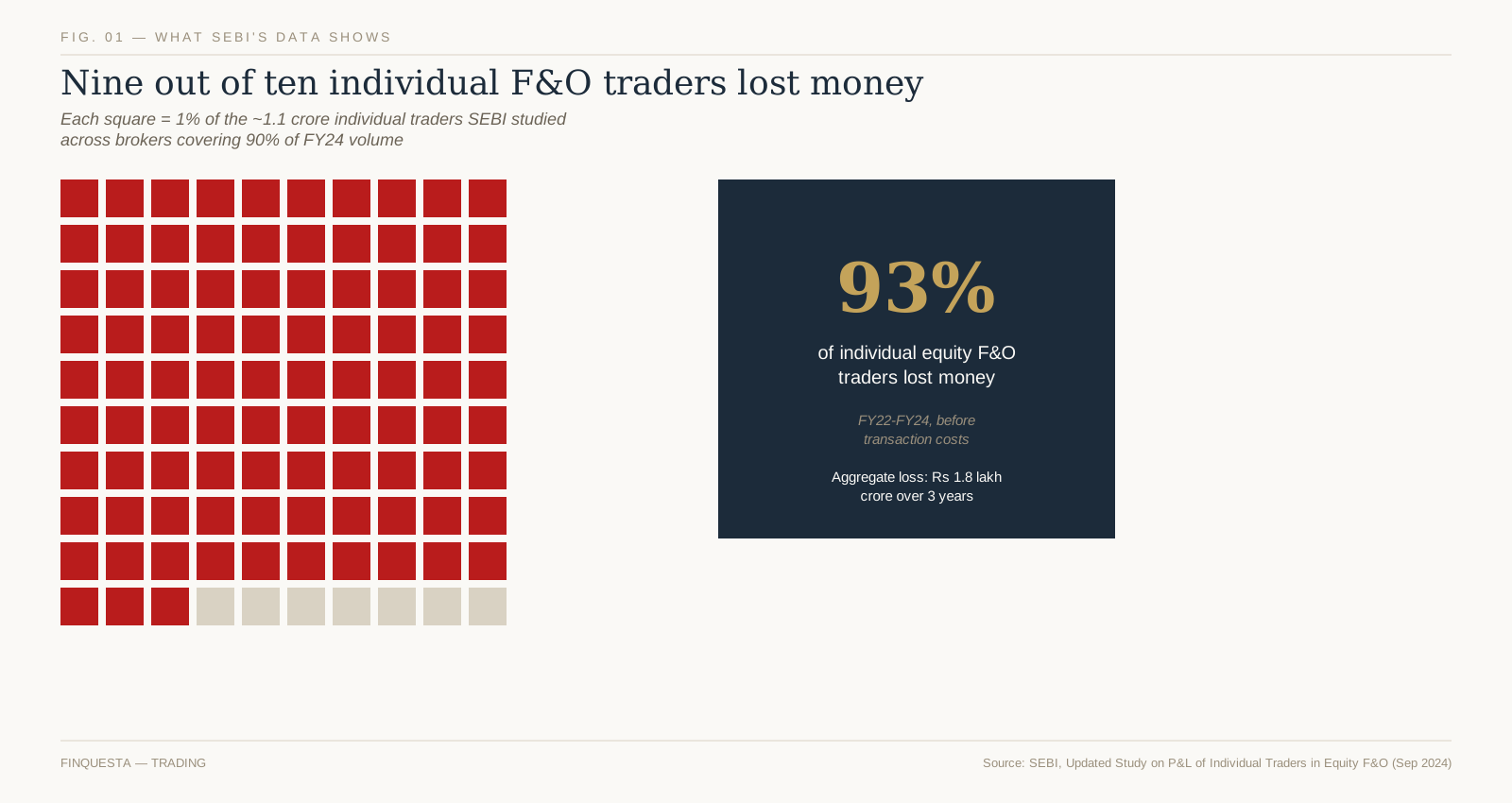
ADX Indicator Explained: Complete Trading Guide (2026)

ADX indicator gauge showing the 0–100 trend-strength scale with no-trend, strong-trend, and very-strong zones

Aakash watched the ADX on his Bank Nifty chart cross above 25 and bought call options within the minute — a strong trend, he figured, was a strong trend. Twenty minutes later he was stopped out, because the ADX had never once told him which way that trend was pointing. That mix-up — mistaking strength for direction — is one of the most common, costly misreadings in technical analysis, and untangling it is the whole point of this guide.

The ADX indicator in one picture: a 0–100 gauge that reads how strong a trend is, never which way it points.

What Is the ADX Indicator?

WHAT IS THE ADX INDICATOR? The Average Directional Index, or ADX indicator, is a technical analysis tool that measures how strong a price trend is, on a scale of 0 to 100. It was developed by J. Welles Wilder Jr. and published in 1978. Traders across stocks, forex, commodities, and index derivatives use it to judge whether a market is trending or moving sideways, typically over a 14-period lookback. On its own, the ADX indicator says nothing about direction — a rising line only confirms that a move, up or down, has real conviction behind it.

The ADX indicator never travels alone. It’s the headline output of a three-line system Wilder called the Directional Movement System, which also includes a Plus Directional Indicator (+DI) and a Minus Directional Indicator (−DI). Those two lines carry the direction; the ADX line carries the conviction. Most charting platforms plot all three together in a separate pane below the price chart.

That separation is exactly what tripped Aakash up. He read “ADX above 25” as “get in,” when the honest translation is closer to “something real is happening — go check the DI lines before you decide what it is.” A trending market and a tradeable market aren’t automatically the same thing, and the rest of this guide is about learning to tell them apart.

Who Created the ADX Indicator, and Why a 1978 Book Still Runs on Every Terminal

J. Welles Wilder Jr. trained as a mechanical engineer at North Carolina State University, then spent years in real estate development before his business partners bought him out in 1972. Public biographical records place his birth on 11 June 1935 in Norris, Tennessee, and his later home in Greensboro, North Carolina. He turned that 1972 buyout into trading capital and a new obsession: could market behaviour be reduced to the same kind of measurable, testable rules an engineer would use on a bridge?

The answer, published in 1978 as a slim, spiral-bound volume called New Concepts in Technical Trading Systems, introduced the Relative Strength Index, Average True Range, Parabolic SAR, and the Directional Movement System that produces the ADX indicator — all in the same book, all worked out by hand with a calculator before spreadsheets existed. Wilder self-published it through his own company, Trend Research, in Greensboro. Four indicators out of one self-published book is not a common batting average in this field.

What’s easy to miss almost fifty years later is how mechanical Wilder’s approach really was. He wasn’t trying to describe markets poetically — he was trying to build a rules-based system an engineer could run without emotion getting in the way, and the ADX indicator was his answer to a specific, narrow question: is there enough directional conviction here to justify following a trend at all. Every major charting platform still ships it as a standard tool, essentially unchanged, because that narrow question never stopped being useful.

The Three Lines Inside the ADX Indicator: ADX, +DI, and −DI

Open the ADX indicator on any charting platform and you’ll typically see three lines sharing one pane beneath the price chart, not one. Untangling what each line is actually doing is the single biggest unlock for using this tool correctly.

The +DI line measures upward directional pressure — how much of recent price movement has come from higher highs. The −DI line does the same job for downward pressure, tracking lower lows. When +DI sits above −DI, buyers have the upper hand; when −DI sits on top, sellers do.

The ADX line is different in kind, not just in colour. It’s built from the gap between +DI and −DI, smoothed over time, so it never tells you who’s winning — only how decisively one side is winning. A market can have +DI comfortably above −DI (a clear uptrend) while ADX sits at 15, because the margin between the two lines is still thin and unconvincing.

Think of +DI and −DI as two boxers scoring points, and ADX as the judge’s read on how one-sided the fight has become. The scorecard (DI) tells you who’s ahead. The one-sidedness reading (ADX) tells you whether it’s worth staying to watch the rest of the fight.

How the ADX Indicator Is Calculated, Step by Step

Fig. 1 — Every bar casts a directional vote: only the larger of the two competing moves survives each period.

The formula looks intimidating written out in full, but the underlying logic is simple enough to hold in your head: only the bigger of two competing price moves counts each period, and everything downstream is that idea, smoothed.

Start with two consecutive price bars. UpMove is today’s high minus yesterday’s high. DownMove is yesterday’s low minus today’s low. Whichever one is bigger — and positive — becomes that period’s Directional Movement; the smaller one is zeroed out entirely, not recorded as a negative number.

Whichever move is larger between the two — and only if it’s actually positive — becomes that bar’s directional movement. When the up-move wins and is positive, +DM takes its value and −DM drops to zero for that bar; when the down-move wins instead, the roles simply flip. A bar can register a +DM or a −DM, but structurally never both — every bar casts exactly one directional vote, or none at all.

From there, +DM and −DM get divided by the Average True Range and multiplied by 100, turning raw price gaps into the normalised +DI and −DI percentages. The DX value is the absolute difference between +DI and −DI, expressed as a percentage of their sum — a single number capturing how lopsided that gap is on any given day. ADX is simply DX, smoothed using Wilder’s own averaging method over the chosen period, traditionally 14.

That smoothing step matters more than it looks like it should, and it’s the subject of a later section — because it’s also the most commonly skipped detail in every ADX explainer you’ll find.

A Worked Example: Calculating +DI, −DI, and DX by Hand

Most ADX indicator explainers show the formula and stop there. Watching it run on real numbers, even over a short illustrative stretch, makes the mechanism concrete in a way the formula alone doesn’t.

DayHighLowClose+DM−DMTR
1101.098.5100.0
2102.599.5102.01.503.0
3103.0100.5101.50.502.5
4102.099.099.501.53.0
5104.5101.0104.02.505.0
6106.0103.0105.51.503.0

Table 1 — Six illustrative sessions used to walk through the +DM / −DM / TR calculation by hand.

Five illustrative sessions, tracked day by day: Day 2 makes a higher high than Day 1, so +DM = 1.5 and −DM = 0 for that day. Day 4 breaks the pattern with a lower high and a lower low than Day 3, so that day −DM = 1.5 and +DM = 0. Every other day in this stretch registers an up-vote, the same one-sided pattern Figure 1 walked through earlier.

Summing the five days: total +DM comes to 6.0, total −DM to 1.5, and total True Range to 16.5. Dividing each directional sum by the True Range sum and multiplying by 100 gives +DI = 36.4 and −DI = 9.1 — this stretch leaned firmly upward. Plugging those into the DX formula, 100 × |36.4 − 9.1| ÷ (36.4 + 9.1), returns a DX of 60.0 for this window.

That DX of 60 describes only these five sessions — it isn’t a finished ADX reading. A real ADX needs a full 14-period run of DX values, smoothed Wilder’s way, before it becomes a usable number, and the Warm-Up Window covered next still applies on top of that. This is exactly why virtually every trader lets software run the calculation rather than doing it by hand daily, but knowing what’s happening underneath the line is what lets you trust, or question, what your charting platform shows you.

The Warm-Up Window: An Original Finquesta Concept on Why Fresh ADX Readings Mislead You

Here’s what almost nobody mentions when they teach the ADX indicator: the number on your screen might not be trustworthy yet, even if the maths is correct.

Wilder’s smoothing technique doesn’t behave like a simple moving average, where old data drops out cleanly after a fixed number of periods. Instead it decays gradually, giving old values a shrinking but never-quite-zero weight forever. Because ADX applies this smoothing twice — once to build +DI and −DI, and again to smooth DX into ADX — StockCharts’ own production notes point out that roughly 150 periods of data are needed before the smoothing effects are fully absorbed and the reading stabilises.

We call this the Warm-Up Window — the stretch of early data over which an ADX reading is technically calculable but not yet reliable, because it’s still carrying the distortion of wherever your dataset happened to start. StockCharts’ notes make the point concretely: an ADX line calculated from only 30 periods of history will not match one calculated from 150 periods on the very same instrument, even though both are “correct” by the formula.

This isn’t a rounding error you can shrug off. It matters most exactly when Indian retail traders are most tempted to check it: a stock that listed six months ago, a newly launched sectoral index, or any instrument where your charting software only has a short price history loaded. A confident-looking ADX reading on thin history deserves real suspicion, not trust.

The practical fix is unglamorous but reliable: load more history than you think you need before you act on an ADX reading, and treat any reading built on fewer than roughly 150 bars as provisional rather than final.

Reading the ADX Indicator Scale: 0 to 100, Zone by Zone

Fig. 2 — Wilder’s 0–100 scale: below 20 is treated as no trend, above 25 as tradeable, above 50 as very strong.

Wilder built the ADX indicator on a 0–100 scale, and the zones traders use today are close to how he originally framed them, refined slightly by decades of collective charting practice.

Below 20, most practitioners read the market as directionless — a range, a chop, a stretch where trend-following systems tend to bleed money on false starts. Between 20 and 25 sits a genuine grey zone: a trend may be forming, but treating it as confirmed this early is how most whipsaw losses happen.

Above 25 is where most trend-following approaches switch on, because the reading now suggests real, tradeable directional conviction rather than noise. Above 50 signals a very strong trend — but strong and tired often arrive together, and a reading up there is as much a caution flag about a stretched move as it is a green light.

None of these thresholds are laws of physics, and treating them that way is the single most common misuse of this indicator. They’re a starting heuristic Wilder built from commodity price data in the 1970s — which is exactly the problem the next section exists to unpack.

The Borrowed Twenty-Five: An Original Finquesta Concept on Why One Threshold Doesn’t Fit Every Market

Fig. 4 — The same “25” sits near the floor of one instrument’s typical range and near the ceiling of another’s.

Every ADX explainer repeats “above 25 means a strong trend” as though 25 were a universal constant, like freezing point. It isn’t. It’s a number Wilder backed into from commodity futures data half a century ago, and different instruments today spend their time in genuinely different parts of the 0–100 scale.

We call this the Borrowed Twenty-Five — the habit of applying Wilder’s original threshold to every chart without ever checking whether that specific instrument’s own ADX history supports it. A trending index future in a strong macro move might spend most of its time comfortably above 25. A quiet, low-beta, range-bound stock might rarely cross into the 20s at all, even during its most “trending” stretches — meaning 25 is functionally too high a bar for it to ever clear.

The fix isn’t a different magic number — it’s a habit. Before leaning on the 25 threshold for a specific stock, index, or contract, look back at where that instrument’s own ADX has actually spent most of its time over the last year or two. If it rarely goes near 25, either the threshold needs recalibrating for that instrument, or ADX genuinely isn’t a useful filter there.

This is exactly why a systematic or algorithmic approach to trend-following — the kind covered in Finquesta’s guide to building rule-based trading systems — usually calibrates its own thresholds per instrument rather than hard-coding Wilder’s original number everywhere.

Rising ADX vs. Falling ADX: The Direction Matters More Than the Level

Most beginners fixate on where the ADX line is sitting right now. More experienced traders watch where it’s going.

A rising ADX indicator reading means the current trend, whatever direction it’s pointed, is picking up conviction. A falling ADX means it’s losing conviction — even if the number is still technically “above 25.” An ADX reading of 22 and climbing is often more actionable than a reading of 30 that’s been sliding for the past week, because the first describes momentum building and the second describes momentum draining.

This is where the level-only reading fails traders most often: a market can sit above the 25 threshold for weeks while its ADX quietly rolls over, and a trader watching only the absolute number never gets the early warning that the trend is fading. Watching the slope catches that shift days before the level alone would.

Reading +DI and −DI Crossovers for Trend Direction

Once ADX confirms real conviction exists, the +DI and −DI lines are what tell you which way to lean.

A +DI line crossing above −DI suggests buying pressure has taken control, and the reverse crossover suggests selling pressure has. On its own, a DI crossover in a low-ADX environment is weak evidence — the two lines cross constantly during a range, throwing off signal after signal that goes nowhere. That’s precisely why experienced traders wait for ADX to confirm strength before treating any DI crossover as meaningful.

The strongest combined read isn’t a DI crossover or a rising ADX — it’s both arriving close together: direction and conviction showing up at roughly the same time, rather than one lagging the other by weeks.

A Real Chart Walkthrough: ADX and DI Together

Fig. 3 — Illustrative walkthrough: the DI lines separate first; ADX confirms above 25 several sessions later.

Picture a stock chopping sideways for two weeks, doing nothing decisive, before breaking into a clean uptrend. Overlaying ADX and the DI lines on that same stretch tells a specific, teachable story.

During the sideways period, +DI and −DI cross back and forth repeatedly, and ADX stays pinned under 20 — the indicator correctly reading “nothing worth trading here” even while price bounces around enough to tempt a discretionary trader into acting anyway. Once the breakout begins, +DI pulls decisively ahead of −DI within the first few sessions.

ADX, true to its nature as a lagging, doubly-smoothed line, doesn’t cross above 25 until several sessions after that DI separation has already happened. That gap between the DI lines settling into a clear order and ADX confirming it isn’t a flaw in the indicator — it’s the indicator doing exactly what a smoothed, conviction-measuring tool is supposed to do. Traders who understand that lag use the DI crossover as an early alert and the ADX confirmation as permission to size up, rather than expecting both to arrive on the same candle.

Best ADX Indicator Settings for Scalping, Day Trading, Swing, and Positional Trades

Trading styleTypical periodWhy
Scalping (1–5 min charts)7–9Faster reaction; accepts more noise
Intraday / day trading9–14Balances responsiveness with reliability
Swing trading (daily charts)14 (Wilder’s original)The most widely tested, most widely charted setting
Positional / long-term20–25Smoother line; fewer whipsaws, more lag

Table 2 — Starting points, not fixed rules. Test against your own instrument before relying on any of these.

Adjusting the period is standard practice across all of Wilder’s studies, the ADX indicator included — traders commonly test values anywhere from single digits up to the low 20s, the same way they would tune an RSI period to a specific timeframe. Shortening the period makes the line more sensitive and faster to react, at the direct cost of more false signals; lengthening it smooths out noise at the cost of more lag. There’s no universally optimal number — only a trade-off that should match how long you actually intend to hold a position.

Scalpers and very short-timeframe intraday traders often shorten the period into single digits to get a faster read, accepting that some of those faster signals will be noise. Swing traders on daily charts generally have little reason to deviate from Wilder’s original 14, which remains the most widely tested, most widely charted version across every platform. Position traders sometimes stretch the period past 20 for a smoother, slower line that filters out short-term wobble entirely.

Whatever period you choose, treat it as a starting point to test against your own instrument and timeframe — per the Borrowed Twenty-Five concept above, the threshold you apply matters at least as much as the period you calculate it over.

Using the ADX Indicator on Nifty and Bank Nifty Intraday Charts

Indian F&O traders lean on the ADX indicator constantly, usually without necessarily naming it — it’s one of the standard filters built into screeners like Chartink, sitting alongside RSI, MACD, and moving average crossovers as a stock-scanning criterion. A scan for “ADX above 25 and rising” is a common way traders narrow a universe of NSE stocks down to the handful actually worth watching on a given morning.

On five-minute or fifteen-minute Nifty and Bank Nifty charts specifically, the Warm-Up Window problem from earlier becomes very real: intraday data resets its context every session, so an ADX reading calculated from only the first hour of trading is exactly the kind of thin-history number this guide has already warned you to treat with suspicion. Many intraday traders wait until well into the session, once enough bars have accumulated, before trusting the ADX reading at all.

Options traders watching Bank Nifty specifically tend to combine ADX with implied volatility context rather than reading it alone, since a “strong trend” reading during an unusually high-IV session can mean something quite different from the same reading on a quiet day. The indicator’s core job doesn’t change — it still separates trending conditions from chop — but what counts as a useful trending reading shifts with the backdrop.

Weekly and monthly F&O expiries add another wrinkle worth flagging. Nifty and Bank Nifty often see compressed, pinned price action in the final sessions before expiry, which can drag ADX down even during what was, days earlier, a genuine trend. Reading that expiry-week dip as “the trend is over,” without accounting for the seasonal compression behind it, is a false read specific to Indian index derivatives that’s easy to avoid once you know to look for it.

The ADX Indicator as a Regime Filter in Systematic and Algorithmic Trading

Most retail explainers frame the ADX indicator as a discretionary tool you glance at before clicking buy. Quant and algorithmic traders tend to use the ADX indicator differently: as a regime filter that switches an entire strategy on or off.

The logic is straightforward. Trend-following systems — moving average crossovers, breakout strategies, Supertrend-based entries — perform well in trending conditions and poorly in choppy, range-bound ones, while mean-reversion systems tend to do the opposite. Rather than running a trend-following strategy at all times and eating losses during its bad regime, a systematic trader can code ADX directly into the entry logic: only take trend-following signals when ADX is above a chosen threshold, and stand aside or switch to a different strategy entirely when it isn’t.

Backtesting this kind of filter properly means testing the ADX threshold itself as a parameter — not assuming 25 is correct just because Wilder used it, per the Borrowed Twenty-Five concept — and being honest about the Warm-Up Window when validating results on any instrument with a short listed history. A regime filter built on an unstable early-window ADX reading will look better in a backtest than it performs in live trading, which is a subtle but common way systematic strategies quietly overstate their own edge.

There’s a specific failure mode worth naming for anyone building a machine-learning classifier on top of a trend-versus-range regime label. If that label was itself derived from an ADX threshold, the model is implicitly learning Wilder’s 1978 cutoff as ground truth, Borrowed Twenty-Five problems included. Testing the label’s sensitivity to the threshold — not just the model’s accuracy against one fixed label — is what separates a genuinely robust regime classifier from one that has simply memorised a single cutoff.

For traders building this kind of rule-based system on Indian markets specifically, Finquesta’s deeper guide to algorithmic trend-following walks through backtesting a filter like this properly, walk-forward validation included.

ADX vs. RSI vs. MACD: What Each One Actually Measures

 ADXRSIMACD
What it measuresTrend strength, not directionSpeed and size of recent price movesRelationship between two moving averages
Scale0 to 1000 to 100Unbounded, centred on zero
Best used forDeciding whether to trend-follow at allSpotting overbought/oversold extremesSpotting momentum shifts and crossovers
Common blind spotSays nothing about directionCan stay “overbought” for weeks in a strong trendLags in choppy, low-volatility markets

Table 3 — Three different questions, not three competing answers to the same question.

These three indicators get lumped together constantly because they all live in a pane below the price chart, but they’re answering three genuinely different questions, and confusing them is a common source of contradictory-feeling signals.

The ADX indicator asks whether a trend exists and how strong it is, without any opinion on direction. RSI asks how fast and how far price has moved recently, which is really a momentum and overbought/oversold question, not a trend-strength one. MACD asks whether two moving averages are converging or diverging, blending a trend read with a momentum read into one line.

A market can show a rising ADX — a genuinely strengthening trend — while RSI sits in an unremarkable middle range for weeks, because a steady, orderly trend doesn’t need extreme momentum readings to stay intact. That’s not a contradiction between the two indicators; it’s each one correctly answering a different question. For a full breakdown of the overbought and oversold mechanics this comparison only touches on, Finquesta’s RSI guide goes deeper — traders who expect all three indicators to agree constantly are usually the ones who end up distrusting all three.

Common Mistakes Traders Make With the ADX Indicator

The single most common mistake is the one that cost Aakash his trade in the opening story: reading a high or rising ADX indicator as a buy signal by itself, with no reference to the DI lines or price direction at all. ADX has no opinion on direction, ever — treating it like it does is the fastest way to get the strength right and the direction wrong.

A close second is chasing the 25 crossover the instant it happens, without waiting for confirmation, in fast-moving intraday conditions where the reading can flicker back below the threshold within a few bars. A third is applying the same 25 threshold to every instrument without checking that instrument’s own typical range, which is the Borrowed Twenty-Five problem showing up in live trading decisions rather than just theory.

A fourth, subtler mistake is trusting an ADX reading calculated on a short price history — a recently listed stock, a fresh contract, or the first hour of an intraday session — without accounting for the Warm-Up Window. The number will display cleanly on the screen either way; only one of those readings deserves your confidence.

A fifth mistake shows up specifically around results and news events: a sudden earnings gap or macro headline can spike ADX rapidly without representing the kind of sustained, tradeable trend the indicator was originally built to describe. A one-day volatility shock and a genuine multi-week trend can produce a superficially similar ADX reading, even though only one of them is what most trend-following strategies are actually designed to catch.

Limitations of the ADX Indicator Every Trader Should Know

Sideways, choppy conditions are where the ADX indicator misleads most often. The line can tick upward on nothing more than short-term volatility inside a range, tempting a trader into reading a new trend that was never really there — precisely the whipsaw pattern this guide has already flagged more than once. Acting on those false starts is a common way trend-following systems bleed small losses repeatedly during a listless market.

The ADX indicator is also structurally a lagging one. Because it’s built from smoothed averages of smoothed averages, it confirms that a trend exists well after that trend has already begun, never before. Traders expecting it to anticipate a move rather than confirm one are asking it to do a job it was never built for.

Finally, ADX is entirely non-directional by design, which bears repeating one last time given how often it trips traders up: a rising ADX during a sharp downtrend is just as “strong” a reading as a rising ADX during a sharp rally. Every limitation on this list connects back to the same root cause — ADX is a measurement of conviction, built from history, and nothing more.

One more mix-up is worth naming, because it’s common even among traders who’ve used both tools for years. Average True Range (ATR) and the Average Directional Index (ADX) are different Wilder indicators measuring completely different things, sharing only an author and the word “Average.” ATR measures how much an instrument typically moves in absolute terms, useful for setting stop-losses; ADX measures how directionally consistent those moves have been. Confusing the two in conversation, or worse, in a coded strategy, is a fast way to build something other than what you intended.

How to Add the ADX Indicator on Popular Charting Platforms

MetaTrader 4 ships the ADX indicator built in as standard, filed under the Trend folder of its indicator library, with no separate download required. TradingView and most Indian broker platforms — including the charting tools bundled into Zerodha Kite and similar apps — ship it as a standard built-in indicator as well, typically searchable by typing “ADX” or “Average Directional Index” into the indicator search box.

Once added, it renders in its own pane below the price chart rather than overlaying the candles directly, which is the expected behaviour — if your ADX appears drawn on top of price itself, it’s very likely a different indicator or a misconfigured overlay setting. Most platforms let you adjust the period (14 by default) and choose whether to display the +DI and −DI lines alongside it, which should stay switched on: the ADX indicator without its DI lines is only telling you half the story.

Frequently Asked Questions About the ADX Indicator

What is the ADX indicator in simple terms?

The ADX indicator is a single number between 0 and 100 that shows how strong a price trend is, regardless of whether that trend is up or down. A reading generally under 20 suggests the market is moving sideways, while a reading above 25 suggests a trend with real conviction behind it. It never indicates direction on its own — for that, you need the +DI and −DI lines that come packaged alongside it.

What is a good ADX value for entering a trade?

There’s no single value that works identically across every instrument and timeframe, which is exactly what the Borrowed Twenty-Five concept above addresses. Many traders treat 25-and-rising as a reasonable starting filter for trend-following setups, while readings above 50 often get read as a mature trend that could be nearing exhaustion. It works best as one filter among several — combined with price action and the DI lines for direction — rather than a standalone trigger. Always check what that specific instrument’s ADX indicator has historically looked like before assuming 25 is meaningful for it.

Is the ADX indicator reliable for intraday trading on Nifty and Bank Nifty?

The ADX indicator can be useful intraday, but it lags more on shorter timeframes because Wilder’s smoothing needs time to stabilise, exactly as the Warm-Up Window concept describes. Many Nifty and Bank Nifty intraday traders shorten the period to roughly 7–10 for faster, more responsive readings, accepting more noise in exchange for speed. It tends to work best paired with price action or a volume-based indicator rather than used alone. Expect more false starts during the opening volatility of a session, while ranges are still forming.

Can I lose money using the ADX indicator alone?

Yes — the ADX indicator doesn’t predict future prices, place trades, or manage risk by itself, and no single indicator removes market risk entirely. It measures trend strength from past price data, which makes it a descriptive, lagging tool rather than a predictive one. How you size positions, place stop-losses, and manage the overall trade matters as much as what any one indicator shows. Treat it as one input into a decision, never the whole decision.

What is the difference between ADX and RSI?

The ADX indicator measures how strong a trend is; RSI measures how fast and how far price has moved recently, which is a different question entirely. A market can show a high ADX — a strong trend — while RSI sits in a normal range for extended stretches, because a steady trend doesn’t need extreme momentum to stay strong. RSI is more commonly used to spot overbought or oversold conditions, while ADX is used to decide whether trend-following makes sense right now. Many traders use both together rather than choosing one over the other.

What is the difference between ADX and the Supertrend indicator?

Supertrend sits directly on the price chart and flips between a buy and sell state, giving a clear directional signal along with a trailing stop level. The ADX indicator sits in a separate pane below the chart and only measures how strong whatever trend exists actually is, without ever flipping to a buy or sell state itself. A common systematic approach uses ADX purely as a filter — only acting on Supertrend’s direction changes when ADX confirms a real trend is present. Finquesta’s guide to building rule-based trading systems covers this combination in more depth.

Does a rising ADX mean I should buy?

No — a rising ADX indicator only means the current trend, whichever direction it’s in, is gaining strength. If the market is falling and ADX is rising, that describes a strengthening downtrend, not a buy signal. Direction has to come from the +DI/−DI lines or from price action itself, never from the ADX line alone. Treating “ADX is rising” as a buy trigger by itself is one of the most common misreadings of this indicator.

What is the best ADX setting for scalping versus swing trading?

Scalpers on very short timeframes often shorten the ADX indicator’s period to around 7–9 for faster, more responsive readings, accepting more false signals in exchange for speed. Swing traders working on daily charts generally stay close to Wilder’s original 14-period setting, still the most widely tested and charted version. Position traders sometimes stretch the period to 20 or beyond for a smoother, slower-moving line. There’s no universally “best” number — it’s a trade-off between responsiveness and reliability that should match your holding period.

Can the ADX indicator predict a trend reversal?

Not directly — the ADX indicator is fundamentally a lagging tool built from smoothed historical price data, so it confirms trends after they’ve developed rather than predicting them in advance. Some traders watch for ADX peaking and rolling over from a high level, often above 50, as a hint that a strong trend may be tiring. That pattern is a caution flag at best, not a reliable reversal signal, and needs confirmation from price action before it means anything actionable.

Where the ADX Indicator Fits in Your Trading Toolkit From Here

The ADX indicator’s whole job is narrower than most traders expect going in: tell you whether the current move has real conviction behind it, and stay silent about everything else. That narrowness is a feature, not a limitation — trying to make it answer questions about direction or timing is what leads to trades like the one that opened this guide.

A reasonable next step is pulling up a chart you already know well and checking where its ADX has actually spent most of its time over the last year, rather than assuming Wilder’s 1978 thresholds transfer over untested. Pair that with a look at how candlestick structure confirms or contradicts what the DI lines are showing, and you have a genuinely combined read — strength from ADX, direction from DI, and context from price action itself — instead of a single line asked to do a job it was never built for.

DISCLAIMER This article is for informational and educational purposes only and does not constitute financial, investment, tax, or legal advice. Figures, rates, and regulations mentioned are subject to change; please verify current details with official sources (RBI, SEBI, the Income Tax Department, IRS, or a licensed financial advisor) before making financial decisions. Finquesta may earn a commission from affiliate links in this article at no extra cost to you.
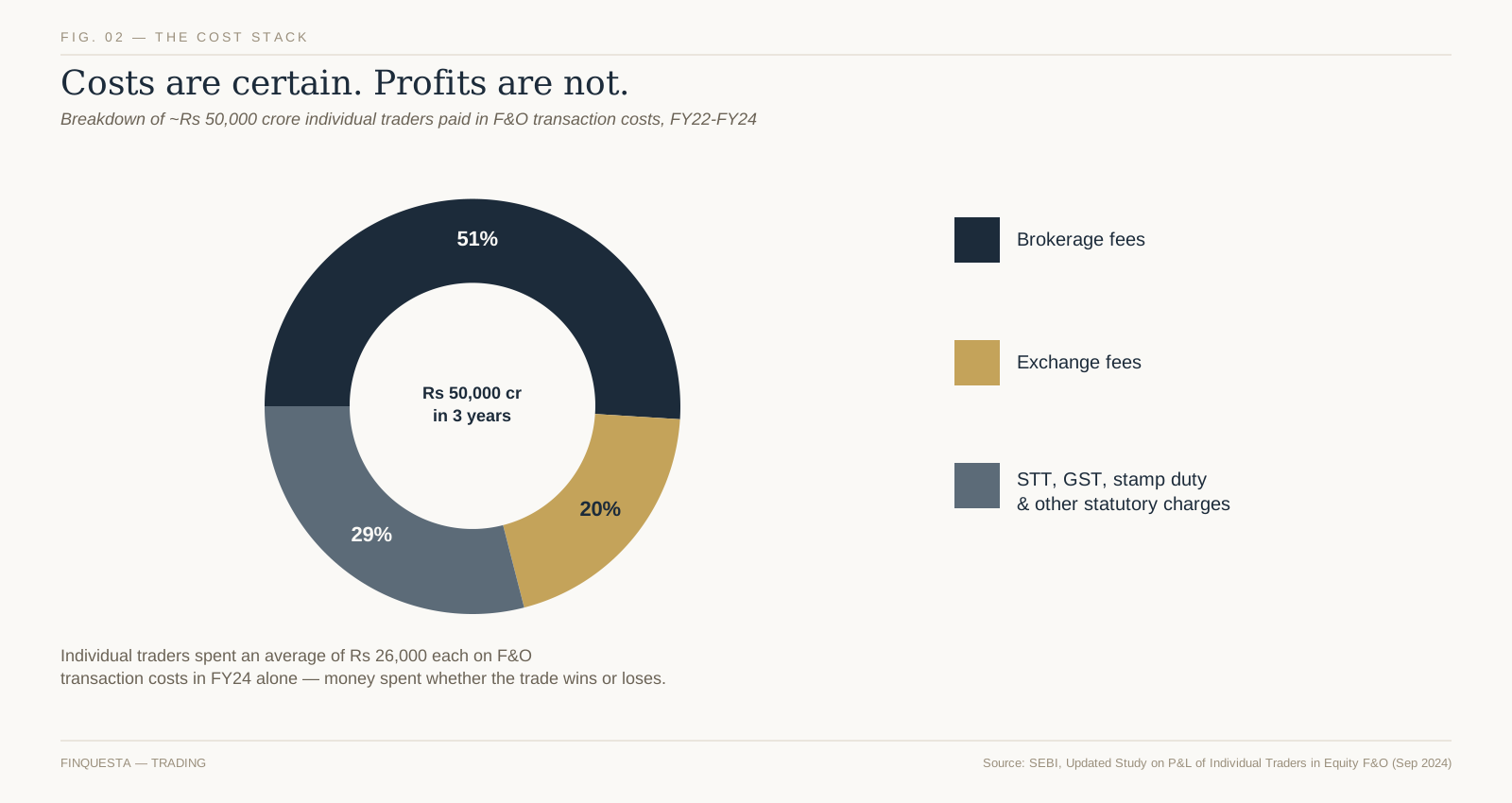
PPF vs ELSS vs NPS: The Complete 2026 Comparison

ppf

Every March, millions of salaried Indians rush to top up PPF, buy an ELSS fund, or push a little extra into NPS before the financial year closes. For a growing share of them — anyone who has already moved to the default new tax regime — that entire ritual now saves exactly nothing, because Section 80C simply doesn’t apply to their return anymore.

PPF (Public Provident Fund), ELSS (Equity Linked Savings Scheme) and NPS (National Pension System) are India’s best-known tax-saving investments, each linked to what was Section 80C — now Section 123 under the Income-tax Act, 2025. PPF pays a fixed, quarterly-declared rate over 15 years. ELSS is an equity mutual fund with a mandatory 3-year lock-in, the shortest Section 123 option. NPS is a market-linked retirement account, regulated by the PFRDA and locked in until 60, offering an extra ₹50,000 deduction none of the others get.

Why “PPF vs ELSS vs NPS” Only Matters If You’re Still on the Old Tax Regime

Before comparing lock-ins or returns, ask a more basic question: does any of this apply to you at all? The new tax regime has been the default since FY 2023-24. Under the Union Budget 2025 reforms — carried forward unchanged into Budget 2026 — a resident individual owes zero tax on taxable income up to ₹12 lakh.

For a salaried filer, the ₹75,000 standard deduction effectively pushes the tax-free line to roughly ₹12.75 lakh of salary. HRA, Section 123 (old 80C), 80D-type deductions, and the NPS employee-contribution deductions are all disallowed under the new regime, which is exactly what makes that threshold matter here.

If your salary sits under roughly ₹12.75 lakh, the government has already zeroed out your tax bill without you lifting a finger. Investing in PPF, ELSS, or NPS for a “tax benefit” that doesn’t exist for you is solving a problem you don’t have — the money would do more for you sitting in whichever of the three actually fits your goals, tax deduction or not.

Above that income level, or if your deductions — home loan interest, HRA, Section 123, medical insurance — are large enough to beat the new regime’s lower slabs on their own, the old regime becomes worth actively choosing (via Form 10-IEA for those without business income), and this entire comparison starts to matter again. That’s who the rest of this guide is written for.

What Is PPF (Public Provident Fund)?

Meera opened her PPF account the year she got her first job offer letter, mostly because her father told her to. Fifteen years is a strange number to commit to at 23, but that’s exactly the point — PPF rewards the version of you that doesn’t touch it.

PPF is a savings scheme run through post offices and most major banks, backed by a sovereign guarantee, currently paying 7.1% per annum for the July–September 2026 quarter. The Finance Ministry has held this rate unchanged since April 2020, most recently confirmed in its June 30, 2026 notification on small savings schemes; it’s reviewed every quarter and can change, though it’s been remarkably stable for over six years.

You can invest between ₹500 and ₹1.5 lakh in a financial year, and interest compounds annually on the lowest monthly balance. The account matures 15 years after opening, not from your first deposit, and at maturity you can either withdraw the full amount, or extend it in blocks of five years — with or without making further contributions during the extension.

A loan against the balance is available from the third year through the sixth year. Partial withdrawal opens up from the seventh financial year onward, capped at the lower of 50% of the balance at the end of the fourth preceding year or the immediately preceding year. Both the interest and the maturity amount are entirely tax-free, regardless of which tax regime you file under.

What Is ELSS (Equity Linked Savings Scheme)?

Rohan did the opposite of Meera. He picked ELSS specifically because he didn’t trust himself to stay invested for 15 years, and three felt survivable.

ELSS is an open-ended equity mutual fund — meaning it invests at least 80% of its portfolio in stocks — that carries a mandatory 3-year lock-in, the shortest of any Section 123 (formerly 80C) instrument. You can invest via SIP or lump sum, and there’s no upper cap on how much you can put into ELSS itself, though only ₹1.5 lakh of it counts toward your deduction in a given year.

Like any equity mutual fund, ELSS is available as a direct plan (bought straight from the fund house, lower expense ratio) or a regular plan (bought through a distributor, with a trail commission built into the cost). The lock-in, tax treatment, and underlying stocks are identical either way — only the expense ratio and whether you get advice alongside the investment differ, which is worth knowing before you assume the two are interchangeable.

Because it’s equity, returns aren’t fixed or promised — they track whatever the fund’s underlying stocks do, for better and for worse. Once the 3-year lock-in ends, gains are taxed as long-term capital gains at 12.5% on anything above ₹1.25 lakh in a financial year, a rate applied the same way regardless of which tax regime you file under, since capital gains taxation sits outside the Section 123/regime framework entirely.

What Is NPS (National Pension System)?

NPS is the odd one out in this comparison, because it isn’t really a tax-saving product that happens to fund retirement — it’s a retirement product that happens to save tax along the way. Regulated by the Pension Fund Regulatory and Development Authority (PFRDA), it invests your contributions across equity (E), corporate bonds (C), and government securities (G), in a mix you choose yourself (active choice) or that shifts automatically toward safety as you age (auto choice).

Since inception, government-sector NPS has delivered an average CAGR of about 9.5%, while non-government-sector asset classes have returned roughly 14% for equity, 9.1% for corporate debt, and 8.8% for government securities, according to Finance Minister Nirmala Sitharaman’s remarks at the September 2024 launch of NPS Vatsalya. Treat these as a long-run reference point, not a promise — markets and fund manager performance both move around a lot year to year.

Your own contribution to a Tier I account is locked in until age 60, with limited exceptions. NPS is also the only one of the three that carries an extra deduction — up to ₹50,000 under what was Section 80CCD(1B), independent of the ₹1.5 lakh Section 123 ceiling — which is the single biggest reason people include it in this comparison at all.

Under auto choice, NPS uses lifecycle funds that start you at a higher equity allocation in your twenties and thirties, then taper equity down and shift toward government securities as you approach 60 — a glide path similar in spirit to a target-date fund, just built specifically around the retirement age NPS assumes for you. Active choice hands you the steering wheel directly, letting you set and rebalance your own E/C/G split, within PFRDA-set limits on how much can sit in equity at any age.
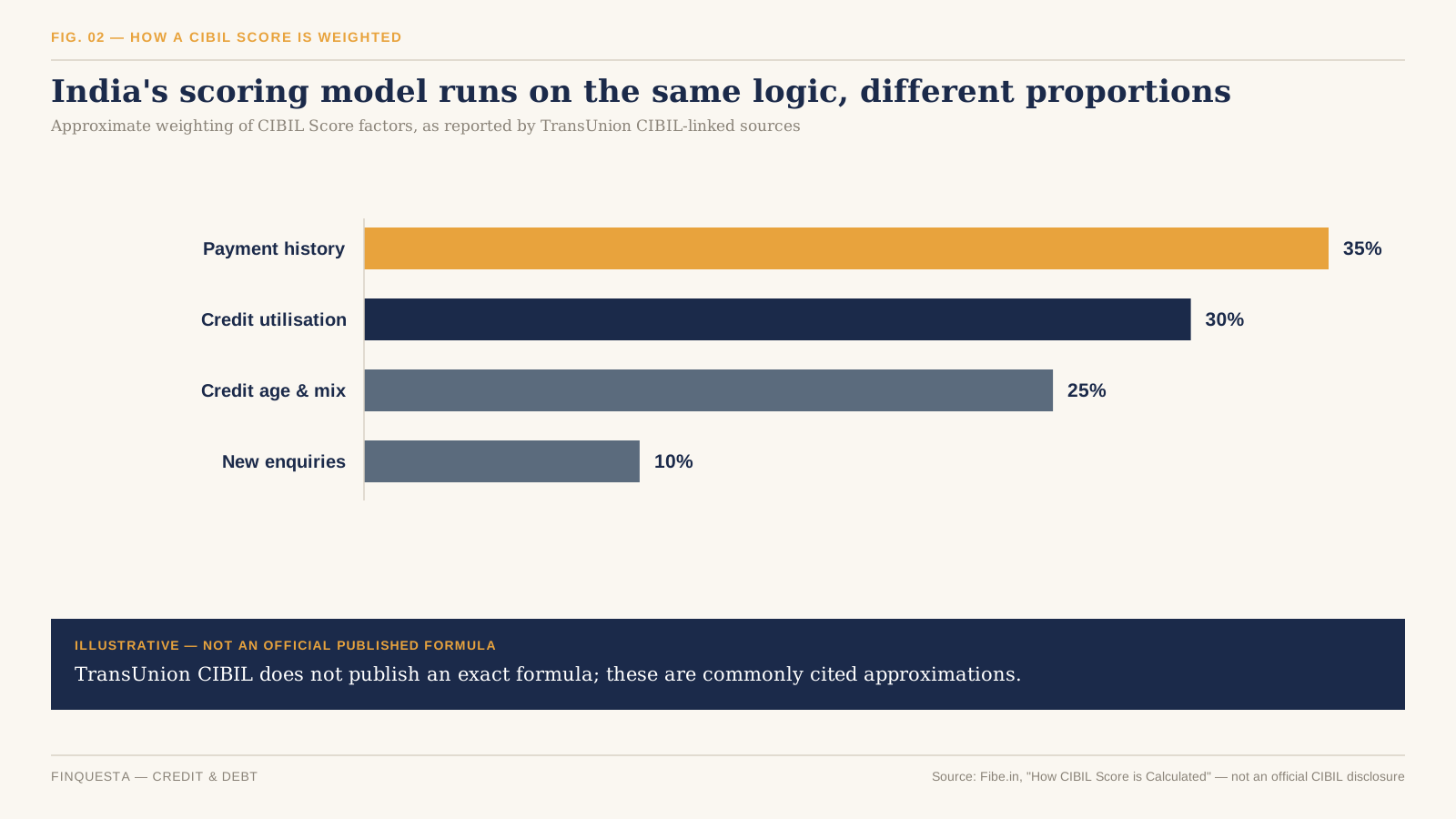
Tier I vs Tier II — The NPS Distinction Most Comparisons Skip

Most comparisons like this one talk about “NPS” as if it’s a single account, and quietly gloss over the fact that it’s actually two. Tier I is the pension account — the one that carries every tax benefit discussed in this guide, and the one locked in until 60. Tier II is a voluntary add-on savings account with no lock-in at all; you can withdraw from it any working day, like a mutual fund folio.

The catch is that Tier II carries no tax deduction for most subscribers — you don’t get a Section 123 or Section 124 benefit for money parked there, with a narrow exception for certain government employees under a separate scheme. For everyone else, Tier II functions as a flexible, market-linked savings account that happens to sit inside the NPS ecosystem, not a tax-saving vehicle in its own right.

This matters for the comparison because every NPS figure elsewhere in this guide — the lock-in until 60, the ₹50,000 deduction, the 80%/60% withdrawal question — refers specifically to Tier I. If you ever see NPS Tier II pitched to you as a tax-saving option the way PPF or ELSS is, that’s worth double-checking against the current rules before you assume it works the same way.

PPF vs ELSS vs NPS: Lock-In and Liquidity Compared

Lock-in is where these three instruments stop looking like three flavors of the same thing and start looking like genuinely different financial products. ELSS lets go of you after three years. PPF holds on for fifteen, with a partial-withdrawal escape hatch from year seven. NPS Tier I doesn’t really let go until you turn 60, full stop.

That gap is the first filter worth applying to your own decision, well before you get to returns or risk: if there’s a real chance you’ll need this money in the next five years, NPS is disqualified before the conversation even starts, and PPF only clears the bar if year seven onward lines up with your plans. For a deeper look at how fund structure affects access to your money, explains how open-ended mutual funds like ELSS differ from other pooled investments more broadly.

How the New Income Tax Act, 2025 Renames (But Doesn’t Remove) These Deductions

Here’s something most PPF vs ELSS vs NPS comparisons published before mid-2026 won’t tell you, simply because it hadn’t happened yet when they were written: the Income-tax Act, 1961 has been replaced. The Income-tax Act, 2025 took effect on April 1, 2026, and governs Tax Year 2026-27 onward — the year most readers of this guide are currently investing for.

Under the new Act, familiar section numbers have been reorganised into a single sequential system. Section 80C — the ₹1.5 lakh umbrella that PPF and ELSS both sit under — is now Section 123, read with Schedule XV. The NPS-specific deductions that used to live under Section 80CCD are now grouped under Section 124.

None of the deduction amounts changed, and none of the eligible instruments changed — this is a renumbering exercise, not a policy shift. One practical wrinkle is worth flagging anyway: if you’re filing your return for FY 2025-26 in July 2026, you’re still using the old 1961 Act’s section numbers on that form. The new numbers only apply starting with returns for FY 2026-27, filed in 2027 — the kind of gap that trips people up precisely because both systems are technically “current” at once, for different tax years.

How Much Tax Each Instrument Actually Saves You

The honest way to think about the tax benefit here isn’t “PPF vs ELSS vs NPS” — it’s two separate buckets that happen to share a wall.

Bucket one is Section 123 (old 80C), capped at ₹1.5 lakh combined across PPF, ELSS, life insurance premiums, EPF, and a handful of other instruments. Put ₹1.5 lakh into PPF alone, and there’s nothing left for ELSS to add here, even if you invest more in it. Bucket two is the NPS-exclusive ₹50,000 under Section 124’s additional-deduction clause, which doesn’t touch bucket one at all — max out both, and you’ve sheltered ₹2 lakh of income, but only NPS can single-handedly fill bucket two.

For someone in the 30% slab (plus 4% cess), that ₹50,000 NPS-only deduction is worth roughly ₹15,600 in tax saved every year it’s used, at zero extra cost beyond accepting the lock-in. That’s precisely why planners tend to describe it as one of the highest-leverage single moves available under the old regime, even for people who’ve already maxed out their ₹1.5 lakh elsewhere.

There’s a fourth instrument already quietly eating into that same ₹1.5 lakh bucket for most salaried readers, and most comparisons like this one never mention it: EPF (Employee Provident Fund). Your mandatory 12% employee contribution to EPF also falls under Section 123, alongside PPF and ELSS, not in some separate allowance.

For a salaried employee already contributing a meaningful EPF amount every month, the real question usually isn’t “how do I split ₹1.5 lakh across PPF, ELSS and NPS” — it’s “how much of that ₹1.5 lakh does EPF leave for the other two.” Someone with ₹1.2 lakh of annual EPF contribution has only ₹30,000 of Section 123 room left, regardless of how much they’d like to put into PPF or ELSS.

This is worth checking on your payslip or Form 16 before you plan a PPF or ELSS contribution around the full ₹1.5 lakh figure — a number this guide, and most others, uses as a clean round ceiling that assumes you’re starting from zero.

Returns — One Fixed, One Market-Linked, One In Between

PPF’s return isn’t really a forecast — it’s whatever the government notifies each quarter, currently 7.1%, and it moves slowly by design. ELSS has no floor and no ceiling; a strong three-year window can outrun both PPF and NPS by a wide margin, and a weak one can leave you at breakeven or worse. NPS sits between the two by construction — you choose how much of your money sits in equity, corporate debt, and government securities, so its return profile is really a dial you control, not a fixed number.

Resist the urge to rank these three by a single trailing-return number pulled from any one year. A three-year window that happens to end in a market peak makes ELSS look unbeatable, and one that ends in a correction makes it look reckless — neither is the full story. The honest comparison isn’t “which had the best return last year,” it’s “which return profile matches how much volatility you can actually sit through without pulling out at the wrong time.”

Risk — What You’re Actually Signing Up For

PPF’s risk isn’t market risk — it’s the risk that 7.1% quietly loses to inflation over 15 years, since the rate is fixed by notification, not by markets. Nothing about a PPF passbook ever looks alarming, which is exactly why this risk is the easiest of the three to miss.

ELSS carries real, visible volatility: it can be down 15% the year after you invest, which is exactly why the 3-year lock-in exists. It’s a guardrail against panic-selling into a dip, not just a tax rule bolted on for no reason.

NPS’s risk depends entirely on the equity/debt mix you pick. An aggressive allocation behaves like ELSS with extra bureaucracy, and a conservative one behaves closer to PPF, but with market exposure standing in for a fixed rate — meaning “how risky is NPS” doesn’t have one answer until you know which allocation a subscriber actually chose.

The Regime Survivors Test — An Original Finquesta Framework

Most comparisons treat PPF, ELSS, and NPS as three peers standing side by side. They stop being peers the moment you ask a sharper question: if you switched to the new tax regime tomorrow, which part of each instrument’s benefit would actually survive?

Run PPF through the test and the contribution deduction dies instantly — Section 123 doesn’t exist for new-regime filers. But the interest and maturity amount stay tax-free regardless, because that exemption lives under a separate provision that was never regime-gated in the first place. Most people conflate “losing the 80C benefit” with “PPF becomes taxable,” and that’s simply wrong — only the deduction on the way in disappears.

Run ELSS through the same test and the deduction dies the same way, but ELSS loses something PPF doesn’t. Without the tax benefit, there’s no longer any reason to accept a 3-year lock-in over an identical-strategy equity fund with no lock-in at all — under the new regime, “ELSS” as a distinct product effectively stops making sense, even though the underlying fund keeps running fine.

NPS is the only one that comes out ahead. Its employee-side deductions — Section 124’s equivalent of 80CCD(1) and the ₹50,000 top-up — die under the new regime exactly like the others’ do.

But the employer contribution route, under what was Section 80CCD(2), not only survives the new regime, it was expanded: the deductible cap rose to 14% of salary for all employers from FY 2025-26, up from 10% for private-sector staff. If your employer offers NPS through a flexible-benefits structure, that’s a live tax lever whether or not you file Form 10-IEA to opt into the old regime.

The Exemption Gap — NPS’s New 80% Withdrawal Rule vs. Its 60% Tax-Free Ceiling

In December 2025, the PFRDA overhauled NPS exit rules. Non-government subscribers can now withdraw up to 80% of their corpus as a lump sum at retirement, up from 60%, with the mandatory annuity portion falling to a minimum of 20%. Government-sector subscribers stay on the older 60%/40% split. Call the mismatch this creates the Exemption Gap — an original Finquesta framework for a problem that doesn’t have an official name yet.

Here’s the catch almost no one has caught up on yet: the tax exemption under what was Section 10(12A) — the provision that makes your NPS lump sum tax-free — was written around the old 60% ceiling and hasn’t been amended to match. The newly-permitted extra 20%, the slice between 60% and 80%, is therefore taxable at your slab rate rather than automatically tax-free, as things currently stand.

Practically, this means the headline “you can now take out 80%!” is true and slightly misleading at the same time. You can, but doing so without a plan could hand back in tax a chunk of what the new rule just gave you. Anyone retiring in the next few years should model both the 60% and 80% withdrawal scenarios before deciding, rather than assuming more lump sum is automatically the better outcome.
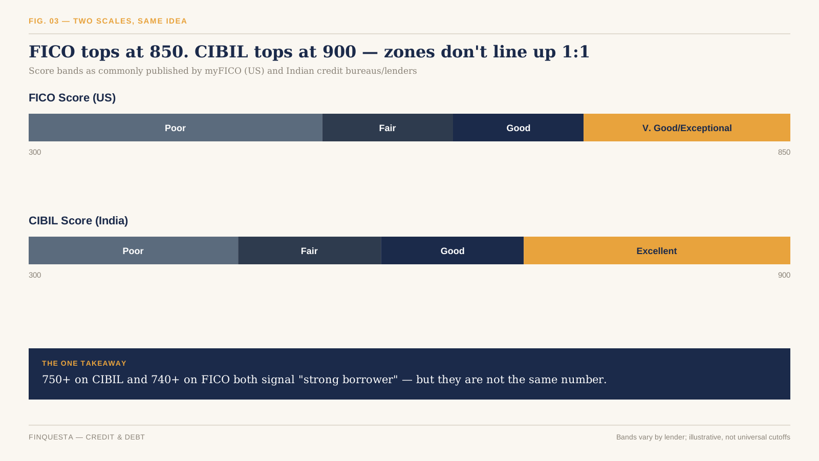
ELSS SIP vs Lump Sum — Does the Lock-In Reset Every Month?

Yes, and this catches people off guard. A lump sum investment locks in for three years from that one date. A SIP is different — each monthly instalment is treated as its own separate investment, so your January instalment unlocks in three years, February’s unlocks a month after that, and so on, all the way through the SIP.

This isn’t a flaw; it’s just how a rolling investment works. In practice it means an ongoing ELSS SIP never fully “unlocks” while you keep contributing, since there’s always a slice still inside its own three-year window. That’s worth knowing before you assume you can redeem the entire pot the moment your very first instalment crosses the three-year mark.

PPF vs ELSS vs NPS for the Self-Employed

Salaried employees get one extra lever the self-employed don’t: the employer NPS route under Section 124 (old 80CCD(2)), which survives in both tax regimes. Without an employer, that lever simply isn’t available, which quietly shifts the self-employed comparison of PPF vs ELSS vs NPS toward the old regime mattering more, not less, since it’s the only place any of the three still offers a deduction.

For self-employed investors, NPS’s own-contribution deduction under Section 124 is capped at 20% of gross total income, versus 10% of salary for the salaried — which can work out to a meaningfully larger number for a high-earning freelancer or business owner than the salaried version of the same rule. PPF and ELSS work identically regardless of employment status, since both are personal accounts with no employer link at all.

Income variability is the other practical factor worth weighing here. PPF’s ₹500 minimum and flexible deposit schedule within the year suit a freelancer’s uneven cash flow better than a fixed monthly SIP commitment might, in a slow month. Neither NPS nor ELSS requires a fixed contribution either, but a lapsed PPF deposit in a given year only needs a small penalty to reactivate, which is a gentler failure mode than letting an NPS account go inactive.

Can You Use All Three Together? A Practical Way to Split ₹2 Lakh

Most people don’t need to pick a single winner — they need a way to fill ₹2 lakh across two buckets without overthinking it. Start with the ₹50,000 NPS-only deduction, since nothing else can fill it, then split the remaining ₹1.5 lakh across PPF and ELSS based on how much volatility you can tolerate and how soon you might need the money.

Someone five-plus years from any major goal, with a stable income and a stomach for equity swings, might lean harder into ELSS for the growth and use PPF as the boring, guaranteed anchor for the rest of the ₹1.5 lakh. Someone closer to a goal, or who knows they’d panic-sell in a downturn, is often better served doing more of that ₹1.5 lakh through PPF and treating ELSS as a smaller, deliberate bet on the side.

Neither answer is wrong — the split should track your own tolerance for watching the number go down, not a generic rule of thumb copied from a friend’s portfolio. walks through a broader framework for matching investment types to specific goals, which extends the same logic beyond just these two instruments.

How Often Do These Rules Change? (And Why That Matters for Your Plan)

If this article feels unusually preoccupied with dates and version numbers, that’s deliberate. In the twelve months before this guide was published, PPF’s rate was reconfirmed quarterly, the entire Income Tax Act was replaced and renumbered, NPS’s withdrawal rules were overhauled by the PFRDA, and the new regime’s rebate threshold was reset by the Union Budget. None of that is unusual — it’s the normal pace of change for these three instruments.

The practical takeaway isn’t to distrust any comparison like this one; it’s to treat the numbers as time-stamped and the mechanics as durable. PPF being a fixed-rate government scheme, ELSS having a 3-year lock-in, and NPS being locked till 60 are structural facts unlikely to change soon. The exact rate, the exact deduction limit, and the exact withdrawal split are exactly the kind of details worth re-checking against an official source before you act on them, even if you read this guide the week it was published.

Common Mistakes Investors Make Between PPF, ELSS and NPS

The single most common one: investing in all three under the new tax regime, for a deduction that no longer exists on the contribution side, purely out of habit from years past. Check your regime before your March tax-saving rush, not after.

A second mistake is treating PPF’s 7.1% as risk-free in every sense. It’s default-risk-free, not inflation-risk-free, and 15 years of a rate that barely beats inflation can quietly underperform a well-chosen ELSS fund by a wide margin, even after accounting for ELSS’s volatility.

A third is assuming NPS’s newly-permitted 80% lump sum is automatically better than 60%. As covered above, the extra 20% currently carries a tax bill the older 60% withdrawal never did, and skipping that math before retirement is an easy way to give back real money.

A fourth, quieter mistake is picking ELSS purely because “it’s the shortest lock-in,” without checking whether a three-year horizon actually suits the goal the money is meant for. A short lock-in that ends in a down market is still a down market — the calendar doesn’t protect you from timing risk the way it protects you from your own impatience.

A fifth is planning a PPF or ELSS contribution around the full ₹1.5 lakh ceiling without first checking how much of it mandatory EPF has already used. It’s an easy number to overlook, since it never shows up as a deliberate “investment decision” the way choosing a fund or opening an account does.

PPF vs ELSS vs NPS: Which One Actually Wins?

There isn’t a single winner, and any comparison of PPF vs ELSS vs NPS that hands you one number as “the answer” is oversimplifying a decision that genuinely depends on your regime, your time horizon, and your tolerance for watching a balance move.

QUICK VERDICT, BY PRIORITY If your single priority is the tax break itself and nothing else, NPS wins — it’s the only instrument with a deduction bucket none of the others can touch. If your priority is capital safety with zero decision-making required, PPF wins, since nothing here is safer or simpler. If your priority is liquidity and growth potential, ELSS wins, by a wide margin, on both counts.

Most people who’ve actually worked through their own regime, horizon, and risk tolerance end up using two of the three, or all three, rather than picking one and walking away. covers how to think about tax-saving investments as part of a wider financial plan, if you’re building that fuller picture from scratch.

Whichever combination you land on, the practical next step is the same: check your current-year Section 123 room against any EPF already deducted, confirm your regime choice for the year, and only then decide how much goes where — in that order, not the reverse.

How to Actually Open Each Account

Opening any of the three is simpler than the tax rules around them suggest. A PPF account can be opened online through most major banks’ net-banking portals, or in person at a post office or bank branch, with basic KYC — PAN, address proof, and a passport-style photo. Most banks let you fund it the same day through net banking, with no separate demat account required.

ELSS works exactly like any other mutual fund purchase: through the fund house’s own website or app, a registered mutual fund distributor, or an aggregator platform, using PAN and a completed KYC check that most investors already have on file from an earlier fund purchase. No demat account is required to hold ELSS units, though one can be used if you prefer.

NPS requires opening an account through the eNPS portal, a bank, or a registered Point of Presence, which issues a Permanent Retirement Account Number (PRAN) — the identifier that follows you across employers and fund manager changes for as long as the account stays open. Choosing a fund manager and an E/C/G allocation (or auto choice) happens at this stage, and both can be changed later within PFRDA’s permitted limits.

Frequently Asked Questions

What is PPF, ELSS, and NPS in simple terms?

PPF is a government savings account with a fixed interest rate and a 15-year term. ELSS is an equity mutual fund with a 3-year lock-in that qualifies for a tax deduction. NPS is a market-linked retirement account locked in until age 60, with an extra deduction no other instrument offers.

Is NPS safe?

NPS is regulated by the PFRDA and invested through licensed pension fund managers, so it carries low regulatory and default risk — there’s no equivalent of a bank run or an AMC shutting down and taking your money with it. Its returns are market-linked, though, meaning your corpus can fall in value in a bad year, especially with a higher equity allocation. Safety here means “well-governed,” not “guaranteed,” which is a different promise than PPF makes.

Can I lose money in ELSS?

Yes. ELSS invests primarily in equities, so its value moves with the stock market, and a three-year window can end lower than it started, especially if that window includes a sharp downturn. The 3-year lock-in doesn’t protect your capital — it only prevents you from selling in a panic before the window closes.

What is the difference between PPF and NPS?

PPF pays a fixed, government-notified interest rate and matures in 15 years, with earlier partial-withdrawal options from year seven. NPS is market-linked, locked in until age 60, and offers an extra ₹50,000 deduction that PPF doesn’t. PPF’s growth is entirely tax-free regardless of regime; NPS’s own-contribution deduction is old-regime-only.

ELSS vs PPF — which is better for tax saving?

Both sit under the same ₹1.5 lakh Section 123 ceiling, so neither gives you more deduction than the other rupee-for-rupee — the difference is what happens to your money after the deduction. ELSS offers a shorter lock-in and higher growth potential with real volatility; PPF offers a fixed, guaranteed return with a much longer commitment.

How many years can I stay invested in NPS?

Your Tier I account stays open until age 60 at minimum. Under current PFRDA rules, you can choose to remain invested and defer withdrawal up to age 75, continuing to benefit from compounding and market exposure throughout that extended window.

Can I invest in PPF, ELSS and NPS in the same year?

Yes, and many people do — there’s no rule against holding all three simultaneously. Just remember that PPF and ELSS draw from the same ₹1.5 lakh Section 123 pool, so investing the full amount in one leaves nothing for the other within that specific ceiling. NPS’s extra ₹50,000 is separate from both and doesn’t share that limit.

What happens to my ELSS and PPF if I switch to the new tax regime?

You stop getting the Section 123 deduction on new contributions going forward, but existing PPF and ELSS holdings aren’t affected retroactively. Your PPF interest stays tax-free, and ELSS units already bought keep their original lock-in and capital-gains treatment. The regime choice only changes what you can newly deduct, not what you already hold.

Which is better for retirement — NPS or PPF?

NPS is purpose-built for retirement, with a lock-in that matches that goal and market-linked growth that has historically outpaced PPF over long periods, though with real year-to-year volatility along the way. It also passes the Regime Survivors Test better than PPF does, thanks to the employer-contribution route. PPF can supplement retirement savings but was never designed as a standalone retirement product, since its 15-year term is shorter than most people’s working life.

Can NRIs invest in PPF, ELSS, or NPS?

NRIs cannot open a new PPF account, though an account opened while resident can run to maturity under specific conditions. NRIs can invest in ELSS through NRE or NRO accounts, subject to fund-house terms, and can open an NPS account as well, though certain withdrawal and repatriation rules differ from those for resident Indians.

How Is Credit Score Calculated? Full Friendly Guide 2026

credit score
WHAT IS A CREDIT SCORE? A credit score is a three-digit number, generated from your credit report, that predicts how likely you are to repay borrowed money on time. In the US, FICO Scores run from 300 to 850; in India, the CIBIL Score runs from 300 to 900. Anyone who has used a credit card, loan, or EMI has one — calculated by a credit bureau, not your bank. Lenders use it to decide whether to approve you and what interest rate to offer. There’s no legal minimum to “have” a score, but most lenders set their own approval cutoffs.

Two people can earn the same salary, hold the same job title, and still get completely different loan offers on the same day. One gets a 9% interest rate; the other gets 14%, or gets turned down outright. The difference usually isn’t their income — it’s a three-digit number neither of them fully understands. That number is built from a handful of specific, mechanical inputs, and once you know what they are, the rest of your credit history stops feeling like a black box.

The Five Things a Score Actually Measures

Credit scoring companies don’t reveal their exact formulas — those are proprietary and closely guarded. But the categories of information that go in, and roughly how much weight each carries, are public. In the US, FICO — used by the large majority of top lenders — groups everything in your credit report into five categories.

According to myFICO, the consumer arm of the Fair Isaac Corporation, those categories are payment history (35%), amounts owed (30%), length of credit history (15%), new credit (10%), and credit mix (10%) — weightings drawn from the general population and calculated only from data in your credit report, not your income or job.

(FIG. 01): Horizontal bar chart of the five FICO Score factors weighted at 35%, 30%, 15%, 10%, and 10%

Payment History: Worth More Than Everything Else Combined

Payment history is the single largest factor in a FICO Score, and myFICO describes it as the strongest available predictor of whether someone will repay future debts as agreed.

This category looks at whether you’ve paid past accounts — credit cards, retail accounts, installment loans, mortgages — on time. It weighs three things about any late payment: how recent it was, how severe it was (30 days late is treated very differently from 90+ days or a collections account), and how often it’s happened.

Experian notes that a single payment made 30 days or more late can cause significant damage, and that the impact compounds the further behind a borrower falls — with a collections account, foreclosure, or bankruptcy causing even deeper and longer-lasting harm.

The reverse is also true, and less widely understood: one or two old late payments don’t cap your score forever. An otherwise strong track record can outweigh a couple of past mistakes, and the negative weight of an old delinquency fades as it ages further into your history.

Amounts Owed — and the Utilization Snapshot Trap

Amounts owed makes up roughly 30% of a FICO Score, and within that category, credit utilization — the share of your available revolving credit you’re actually using — is the single most influential input.

NerdWallet reports that people with the highest scores tend to keep utilization below 30% of their limit, and often well under 10%.

Here’s the part almost no beginner guide explains clearly: your utilization ratio isn’t based on how much you spent, or even how much you currently owe today. It’s based on the balance your card issuer reported to the bureau on your last statement closing date — a single snapshot, once a month.

myFICO confirms this directly: even if you pay your credit card in full every month, your credit report may still show a balance, because the total on your last statement is generally what gets reported.

Call this the Utilization Snapshot Trap — an original Finquesta framework for a mechanism most articles gloss over. Someone who puts a large one-off purchase on a card, then pays it off completely two weeks later, can still get scored on a high balance if that purchase happened to fall right before the statement date. The fix isn’t complicated once you see it: either pay down the balance before the statement closes, or make a mid-cycle payment so the reported figure is lower — not just the amount you eventually pay off.

Length of Credit History: Why Closing Your Oldest Card Can Backfire

Length of credit history accounts for about 15% of a FICO Score and reflects both how long you’ve had credit overall and the average age of your accounts.

This is why a common piece of advice — “cancel the credit card you don’t use” — deserves a caveat. Closing your oldest account can shorten your average credit age and reduce your total available credit, which can push your utilization ratio up even if your spending hasn’t changed. It’s not an automatic disaster, but it’s a trade-off worth knowing about before you make the call, rather than after your score moves.

New Credit and Credit Mix: The Smaller, Easily Misjudged Factors

New credit and credit mix each carry roughly 10% of a FICO Score.

NerdWallet notes that a hard inquiry — the record left when you apply for new credit — can affect your score for up to six months, though most people see the impact fade well before that.

Credit mix rewards having successfully managed a variety of account types — revolving credit like cards, and installment credit like auto loans or mortgages — rather than only ever having one kind. It’s the smallest factor by weight, which is exactly why opening a loan you don’t need purely to “improve your mix” is rarely worth it: the credit-mix upside is small, and a new hard inquiry works against you in the same breath.

How a CIBIL Score Is Calculated in India

India’s most widely used credit bureau, TransUnion CIBIL, runs on the same underlying logic as FICO but with a different range and, per third-party sources, somewhat different weightings.

TransUnion CIBIL’s own site states that a CIBIL Score is calculated mainly from payment history, credit utilization, age of credit, and enquiries, and ranges from 300 to 900.

Fibe.in, a lending platform, cites approximate weightings of 35% for payment history, 30% for credit utilization ratio, 25% combined for credit age and credit mix, and 10% for new enquiries — though TransUnion CIBIL does not publish these exact percentages itself.

(FIG. 02): Horizontal bar chart of approximate CIBIL Score weighting: payment history 35%, credit utilisation 30%, credit age and mix 25%, new enquiries 10%

A useful India-specific detail beginner guides tend to skip: TransUnion CIBIL introduced an updated model, CIBIL Score 2.0, that changed what counts as a strong score for borrowers with a short credit history.

Under this newer model, borrowers with more than six months of credit history are still scored from 300 to 900, but the “ideal” range shifted to roughly 662–697, compared with 751–800 under the earlier model — and applicants with under six months of history are instead placed on a separate 1-to-5 risk index.

FICO vs. CIBIL vs. VantageScore: Comparing the Scales

If you’ve ever moved between countries, or compared notes with a friend who scores well abroad, the numbers alone can be misleading. A 750 on CIBIL and a 750 on FICO are not measuring the same 750.

(FIG. 03): Range comparison of FICO score bands from 300 to 850 against CIBIL score bands from 300 to 900

myFICO’s own consumer guidance treats 670 to 739 as a “good” FICO Score, with 740 and above generally considered very good to exceptional.

For CIBIL, a widely cited industry rule of thumb treats scores above 750 as the range most likely to unlock the best interest rates and fastest approvals, based on lender guidance reported by Finnable, an RBI-licensed NBFC.

There’s also a third model worth knowing: VantageScore, jointly developed by the three major US bureaus as a FICO alternative.

NerdWallet reports that FICO and VantageScore use the same broad set of factors but weight them differently — payment history is 35% of a FICO Score but about 40% of a VantageScore — which is one reason your FICO and VantageScore numbers can differ even when pulled from the exact same credit report.

None of this means the scores disagree about who you are as a borrower — they’re built from similar raw material and tend to move in the same direction. The gap matters mainly when you’re comparing a number against a threshold: “is 700 good?” only makes sense once you know which scale you’re standing on.

The Score Refresh Lag: Why Your Score Doesn’t Update Instantly

Pay off a credit card balance today, and it’s tempting to check your score tomorrow expecting a jump. It usually isn’t there yet — and this is the second original framework worth naming here: the Score Refresh Lag.

A score doesn’t recalculate the moment your bank account changes. It moves through a short chain: you act, your lender reports that action to the bureau (typically once per statement cycle, not in real time), the bureau updates your file, and only then — the next time your score is actually requested — does a new number get generated.

(FIG. 04): Four-step flow diagram showing the Score Refresh Lag: you act, lender reports, bureau updates, score recalculates

The practical takeaway isn’t that paying down debt doesn’t work — it’s that the timing of a score check matters. If you’re managing your score ahead of a specific application (a mortgage, a car loan), the Score Refresh Lag means the moves that matter most need to happen well before you actually apply, not the week of.

Why You Don’t Have Just One Credit Score

The debt-focused financial education site debt.org notes that scores can vary by as much as 40 points between bureaus, because lenders don’t always report to every bureau, and each bureau’s model weighs the same information slightly differently.

In India, TransUnion CIBIL is one of four licensed credit bureaus — alongside Experian, Equifax, and CRIF High Mark — and a borrower can hold meaningfully different scores across them at the same time, reflecting different algorithms and reporting timelines rather than an error in any one report.

This is also why the score a free app shows you and the score your mortgage lender pulls can genuinely differ. Neither is necessarily “wrong” — they’re different models, sometimes built from different bureau data, occasionally pulled on different days within the same reporting cycle.

What Actually Moves the Needle

Given the weightings above, a handful of habits do most of the work, in roughly this order of impact:

  • Pay every account on time, every cycle — this is the single largest lever on both FICO and CIBIL models.
  • Keep credit utilization low relative to your limit, and remember the Utilization Snapshot Trap: what matters is the balance on your statement date, not what you eventually pay off.
  • Avoid closing your oldest active account purely for convenience, since it can shorten your average credit age.
  • Space out new credit applications rather than applying for several cards or loans in a short window.
  • Check your own credit report periodically for errors — a wrong balance or an account that isn’t yours can drag a score down for reasons that have nothing to do with your actual behavior.

None of this is a guarantee of a specific score outcome, and no legitimate service can promise one — anyone claiming to erase accurate negative history overnight is not describing how these systems work.

Common Myths About Credit Scores

“Checking my own score hurts it.”

Checking your own score is a soft inquiry and, per FICO’s own scoring guidance and consumer education sources like MyCreditUnion.gov, does not affect your score at all — only hard inquiries from an actual credit application do that, and even then the effect is typically small.

“Carrying a small balance builds credit faster than paying in full.”

This isn’t supported by how utilization is scored. Paying your statement balance in full each month, and letting the low resulting figure get reported, works at least as well as carrying a balance — and it also means you’re not paying interest.

“A good income guarantees a good score.”

Income isn’t part of the score calculation at all in either the FICO or CIBIL models described above — the score is generated purely from data in your credit report. A high earner with erratic payment history can score lower than a modest earner with a spotless one.

Frequently Asked Questions

What is a good credit score?

On the FICO scale, myFICO generally treats 670–739 as good and 740+ as very good to exceptional; on the CIBIL scale, 750 and above is commonly treated by Indian lenders as the range that unlocks the best rates.

How is credit score calculated, in simple terms?

It’s calculated by a credit bureau’s proprietary formula applied to your credit report — mainly your payment history and how much of your available credit you’re using, with smaller contributions from how long you’ve had credit, how much new credit you’ve recently sought, and the variety of credit types you hold.

Is checking my credit score safe?

Yes — checking your own score is a soft inquiry and doesn’t affect your score, whether you check it through a bank app, a free credit-monitoring service, or directly through the bureau.

Can I lose points just for applying for a new credit card?

Yes, modestly — a hard inquiry from a new application can affect your score, with NerdWallet noting the impact can linger for up to six months, though it’s typically a small dip that fades faster than that for most applicants.

What is the difference between a FICO Score and a CIBIL Score?

They’re built on similar underlying logic but different scales and, per available sourcing, somewhat different factor weightings: FICO runs 300–850 and is used primarily in the US; CIBIL runs 300–900 and is the most widely referenced score among Indian lenders.

FICO vs. VantageScore — which one will my lender use?

It depends entirely on the lender — some pull FICO, some pull VantageScore, and larger lenders sometimes pull both. There’s no way to know for certain which one a specific lender will check without asking them directly.

How many credit accounts should I have?

There’s no fixed number that works for everyone. What matters more than the count is whether every account you do have is paid on time and kept at a reasonable utilization level — a thin file managed well can outperform a thick file managed poorly.

Does my salary affect my credit score?

No — income is not a scoring input in either the FICO or CIBIL models described in this article. Lenders may separately ask about your income when deciding whether to approve a loan, but that’s an underwriting decision layered on top of the score, not part of how the score itself is calculated.

How to Start Trading in India: The Complete Beginner’s Friendly Guide (2026)

How to start trading in india

Most people who tell you they want to “invest in the stock market” are actually describing something closer to trading — checking prices daily, reacting to news, hoping to catch a move within weeks rather than years. Confusing the two isn’t a semantic slip. It’s the single biggest reason beginner trading accounts in India go quiet, or empty, within twelve months of being opened.

This guide is written for the second group — the ones who actually mean trading. It covers what you legally need before your first order, how to read a chart well enough not to be dangerous to yourself, what a trade really costs after brokerage and tax, and the discipline habits that separate people who last from people who don’t.

Table of Contents

What Is Stock Trading, Really?

Stock trading is buying and selling shares of listed companies over a short holding period — anywhere from a few seconds (intraday) to a few weeks (swing trading) — aiming to profit from price movement itself, not the company’s long-term growth. Anyone with a demat account, a trading account, and capital can do it. In India, trading is regulated by the Securities and Exchange Board of India (SEBI), and every share you hold sits in your name at a depository — NSDL or CDSL — which is what actually protects your holdings if your broker runs into trouble.

That single fact — your shares live at the depository, not with your broker — is worth sitting with for a second, because it answers the question most beginners are actually too embarrassed to ask before they open an account: what happens to my money if the broker shuts down. Your cash balance is a different story, which is exactly why the next section exists.

Trading vs Investing: The Difference That Decides Whether You’ll Actually Succeed

Trading and investing use the same app, the same exchange, and often the same stock. That’s exactly why beginners blur them — and why blurring them is expensive. An investor buying Reliance Industries for a ten-year holding period doesn’t care that the stock dropped 3% on results day. A trader holding the same stock overnight cares enormously, because 3% might be their entire risk budget for the week.

Here’s a simple, original framework worth actually using before you place a single order — call it the Time Horizon Test (Original Finquesta framework). Ask yourself three questions about the position you’re about to open:

  1. What’s your exit trigger — a specific price target or date, or “whenever I need the money someday”?
  2. What are you actually evaluating — the chart’s pattern, or the company’s balance sheet and management?
  3. If this position dropped 15% tomorrow morning, would your first move be to check the news, or check your stop-loss?

Two or more answers landing on the first option in each pair means you’re trading, whether you call it that or not — so act like it: use a stop-loss, size the position small, and expect to be wrong close to half the time and still come out ahead on the trades that work. Two or more answers landing on the second option means you’re investing, in which case a single day’s price move barely matters, and a demat account full of trading-app habits (checking it four times an hour) will only cost you sleep and impulsive decisions.

If, honestly, the Time Horizon Test points you toward investing rather than trading, the lower-effort starting point is a systematic monthly investment into a diversified mutual fund rather than picking individual stocks — Finquesta’s guide on how a mutual fund actually works and how to start one walks through that path in full.This guide, from here on, is written for the trading path specifically.

How to Start Trading in India

Fig. 02 — Trading vs investing, compared across exit trigger, evaluation method, and reaction to a 15% drop

How to Start Trading in India: What You Need Before Your First Trade

Three things stand between you and your first order, and none of them are optional.

A PAN card. Every demat and trading account in India is linked to a Permanent Account Number — no PAN, no account, no exceptions, because SEBI requires it for KYC and tax reporting.

A demat account. This is where your shares are held electronically, maintained by a Depository Participant (DP) that’s registered with NSDL or CDSL. Think of it as a bank account, except it holds securities instead of cash.

A trading account. This is the account that actually places buy and sell orders on the exchange — the National Stock Exchange (NSE) or Bombay Stock Exchange (BSE). Your demat account stores what you own; your trading account is how you buy and sell it.

Most brokers today bundle demat and trading into a single “2-in-1” account opened through one online application, so in practice this is one sign-up flow, not three separate ones. You’ll also need a linked bank account for the money to move in and out of, and a mobile number and email registered for OTP-based verification — SEBI’s KYC rules require your identity to be independently verifiable, not just self-declared on a form.

How to Open a Demat and Trading Account in India: Step by Step

The account-opening process itself is almost entirely digital now, and takes most people under thirty minutes if their documents are in order.

Step 1 — Choose a broker. More on how to actually pick one in the next section; for now, know that SEBI-registered brokers all offer largely the same account-opening flow.

Step 2 — Complete e-KYC. You’ll enter your PAN, and the broker verifies it against government records. Aadhaar-based e-KYC, where available, can auto-fill most of your personal details from UIDAI’s records, which is what makes the process fast.

Step 3 — Upload documents. A PAN card copy, an address proof (Aadhaar, passport, voter ID, or a recent utility bill), a cancelled cheque or bank statement for account linking, and a passport-size photo. Most brokers accept phone-camera scans.

Step 4 — In-Person Verification (IPV). SEBI requires a video KYC step — a short live video call or recorded selfie-video confirming you’re a real person matching your documents, not a stolen identity opening an account.

Step 5 — E-sign the account opening agreement. This is done via Aadhaar-linked e-signature (OTP-based), replacing the paper signature process that used to take days.

Step 6 — Fund your account and place your first trade. Once approved — typically same-day to 48 hours — you transfer funds via UPI or net banking, and your trading account is live.

Choosing a Broker: What Actually Matters

The full-service versus discount broker decision gets presented as a beginner’s first big choice, and it’s simpler than it’s made out to be. A full-service broker (typically a bank-affiliated one) bundles research reports, relationship-manager access, and advisory calls into a higher brokerage fee — often a percentage of trade value. A discount broker charges a flat fee per executed order, sometimes near-zero for delivery trades, and gives you the trading platform without the advisory layer.

For a beginner trading their own capital in small size, the maths almost always favours a discount broker: on a modest trade size, a percentage-based brokerage from a full-service broker can eat a meaningfully larger share of your position than a flat ₹20 (or lower) per order. The “research and advice” a full-service broker sells is also something this guide — and Finquesta generally, per Rule 3 of our own editorial policy — won’t substitute with a stock tip either, because the honest answer is that you should be able to explain why you’re in a trade without outsourcing that judgment to anyone’s call.

What genuinely matters more than the full-service/discount label: uptime and order-execution speed during volatile market opens (a platform that lags for ninety seconds at 9:15 AM can cost you more than a year of brokerage savings), the quality of the charting tools built into the app, how clearly the broker discloses charges up front, and whether customer support actually answers when your order is stuck. Read the last three months of app-store reviews before you read a comparison article — including this one.

How to Start Trading in India: Your First 6 Steps

Once your account is live, here’s the sequence that keeps a first trade from becoming an expensive lesson.

1. Fund a small, specific amount — not “whatever’s spare.” Decide the rupee amount you’re willing to lose completely without it affecting your life, and start with that, not your full available capital.

2. Pick one stock you can actually explain. Not a tip from a group chat — a company whose business model you could describe to a friend in two sentences. If you can’t, you’re not ready to size a position in it.

3. Check the chart before you check the price. A stock trading near a level it’s failed at three times before is telling you something a headline won’t. (More on this in the candlestick sections below.)

4. Choose your order type deliberately — not whatever the app defaults to. The next section covers why this single choice is where most beginner losses actually originate.

5. Set your stop-loss the moment you enter, not after the trade starts moving against you. A stop-loss decided in advance is a plan; a stop-loss decided while watching the price fall is usually a rationalisation.
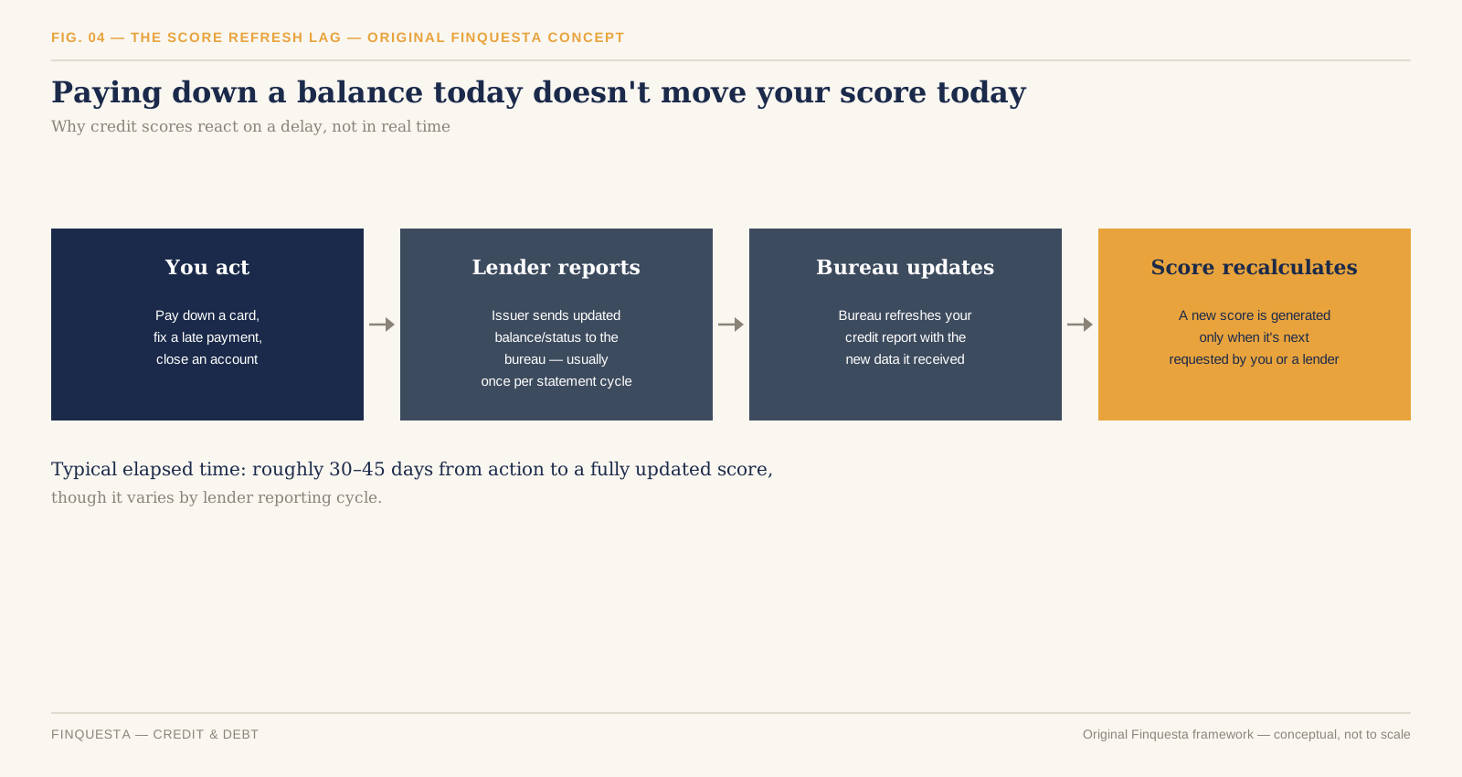
6. Log the trade — entry price, exit price, and the reason you took it — win or lose. This single habit, more than any indicator, is what turns a string of random outcomes into an actual improving process.

Understanding Order Types: Market, Limit, and Stop-Loss

The order type you pick is not a technicality — it’s the single most common place a beginner loses money before the market even moves against them.

A market order executes immediately at the best available price. It guarantees execution, not price — in a fast-moving or thinly traded stock, the price you actually get can differ meaningfully from the price you saw on screen a second earlier. This gap is called slippage, and it’s the quiet tax new traders pay without realising it.

A limit order executes only at your specified price or better. You control the price; you give up the guarantee of execution — your order might simply never fill if the stock never reaches your level.

A stop-loss order sits dormant until the price hits a trigger you set, at which point it converts into a market (or limit) order to exit the position. This is the single most under-used order type among beginners, and the most important one: it’s what makes “I’ll get out if it goes wrong” an actual instruction to the exchange instead of a promise to yourself that panic overrides.

The beginner mistake worth naming directly: placing a market order to enter a volatile, low-liquidity small-cap stock right at market open. Spreads are widest and slippage is worst in the first few minutes of trading, precisely when beginners — excited to place their first order — are most likely to click buy.

How to Read a Stock Chart Before You Trade It

Every price chart is a record of a negotiation — buyers and sellers disagreeing about what a stock is worth, with price as the running scoreboard. Most beginners look at a chart and see a random squiggly line. Traders who last look at the same chart and see a story about who’s currently winning that negotiation, one candle at a time.

Before candlesticks specifically, two things worth knowing about any chart: the timeframe (a 5-minute chart and a weekly chart of the same stock can look like they’re describing two different companies — always check which one you’re looking at), and the volume bars usually printed beneath the price, which tell you how much conviction is behind a given move. A price breakout on low volume is a much weaker signal than the identical breakout on volume triple the recent average.

How to Read Candlestick Charts: The Anatomy of a Single Candle

A candlestick chart looks intimidating the first time you see one — a wall of red and green rectangles that reads like nothing at all. Once you know what a single candle is actually recording, that wall turns into a fairly simple story about who won each round: buyers or sellers.

Each candle represents one fixed period of time (a minute, an hour, a day — set by the chart’s timeframe) and records four numbers: the open (price when the period started), the close (price when it ended), the high (the peak reached), and the low (the trough reached). The thick rectangular part is called the body — it spans from the open to the close. The thin lines above and below the body are the wicks (or shadows) — they mark the high and low, the furthest the price reached before pulling back.

Colour tells you direction at a glance. A green (or unfilled/white) candle means the close was higher than the open — buyers won that round. A red (or filled/black) candle means the close was lower than the open — sellers won. A long body means one side dominated the entire period with conviction; a short body with long wicks on both ends means a genuine tug-of-war, with neither side able to hold control by the close.

This is the entire vocabulary a candlestick chart is written in. Everything else — every named pattern — is just a specific, recognisable arrangement of these same four numbers repeating in a way traders have learned to recognise.

Trading

Fig. 01 — A single candle’s anatomy: open, close, high, low, body, and wick

Five Candlestick Patterns Worth Actually Knowing as a Beginner

Trading blogs love listing forty candlestick patterns. In practice, a beginner who deeply understands five will out-trade someone who’s memorised forty without understanding any of them, because pattern recognition without context is just superstition with better branding.

The Doji. Open and close are nearly identical, producing a candle that’s almost all wick and barely any body. It signals indecision — neither buyers nor sellers won this round — and is far more meaningful after a strong trend than in the middle of a sideways, directionless stretch.

The Hammer. A small body near the top of the candle’s range, with a long lower wick — at least twice the body’s length — and little to no upper wick. After a downtrend, it suggests sellers pushed price down hard during the period, but buyers stepped in and dragged it back up before the close. On its own it’s a hint, not a signal; traders typically wait for the next candle to confirm before acting on it.

The Shooting Star. The Hammer’s mirror image — a small body near the bottom, a long upper wick, appearing after an uptrend. It suggests buyers pushed price up, but sellers overwhelmed them before the close, and is read as a possible reversal signal in the opposite direction from the Hammer.

The Bullish Engulfing pattern. A two-candle pattern: a small red candle followed by a larger green candle whose body completely “engulfs” the prior candle’s body, top to bottom. It suggests a decisive shift in control from sellers to buyers within a single period.

The Bearish Engulfing pattern. The mirror image — a small green candle followed by a larger red candle that fully engulfs it, suggesting sellers just took decisive control from buyers.

The honest caveat every credible source should give you and most don’t: no candlestick pattern is a reliable signal in isolation. Professional traders use them alongside volume, support/resistance levels, and the broader trend — never as a standalone trigger to place a trade. Treat this section as vocabulary, not a system.

Intraday Trading vs Delivery Trading vs F&O: Picking Your Lane

Delivery trading means you buy shares and they land in your demat account — you can hold them for a day, a month, or a decade, and you owe nothing until you sell. It’s the lowest-pressure way to trade, since there’s no same-day deadline forcing a decision.

Intraday trading means you buy and sell (or sell and buy — “short selling”) the same stock within the same trading session, closing the position before the market shuts, without ever taking delivery into your demat account. It typically uses leverage the broker extends for the day, which magnifies both gains and losses, and it’s taxed differently, which the tax section below covers in detail.

Futures & Options (F&O) trading uses derivative contracts whose value is based on an underlying stock or index, rather than the stock itself. It offers the highest leverage of the three — and correspondingly the highest capacity to lose money fast, including in some structures, more than your original capital. SEBI has progressively tightened F&O eligibility and lot-size rules in recent years specifically because retail losses in the segment have been so heavily skewed negative.

For a genuine beginner, delivery trading is the only one of the three with no clock forcing a decision — which makes it the only one where a first mistake is a learning experience rather than a same-day margin call. Intraday and F&O are not “more advanced versions of the same thing you should graduate into” — they’re structurally different risk instruments, and treating them as a natural next step rather than a deliberate, separate decision is exactly how disciplined delivery traders end up in F&O positions they don’t understand.

How Much Money Do You Actually Need to Start Trading in India?

There’s no SEBI-mandated minimum capital to open a demat and trading account, and several brokers let you place your first delivery trade with capital in the low hundreds of rupees, since Indian equities can be bought in single shares rather than fixed lot sizes (unlike F&O, which trades in exchange-defined lot sizes).

The more useful question than “what’s the minimum” is “what makes practising worthwhile.” An amount too small to notice losing teaches you nothing about your own discipline under pressure — the entire point of starting small is to make mistakes that sting just enough to be memorable, without being financially serious. A starting amount you could comfortably lose entirely and still meet next month’s expenses without stress is the right test, not any specific rupee figure a blog gives you.
The Real Cost of Trading: Brokerage, STT, and Other Charges

Every trade costs more than the brokerage fee your app shows you upfront, and understanding the full stack is what separates a trader who tracks real profitability from one who’s quietly losing money to charges while feeling like they’re breaking even.
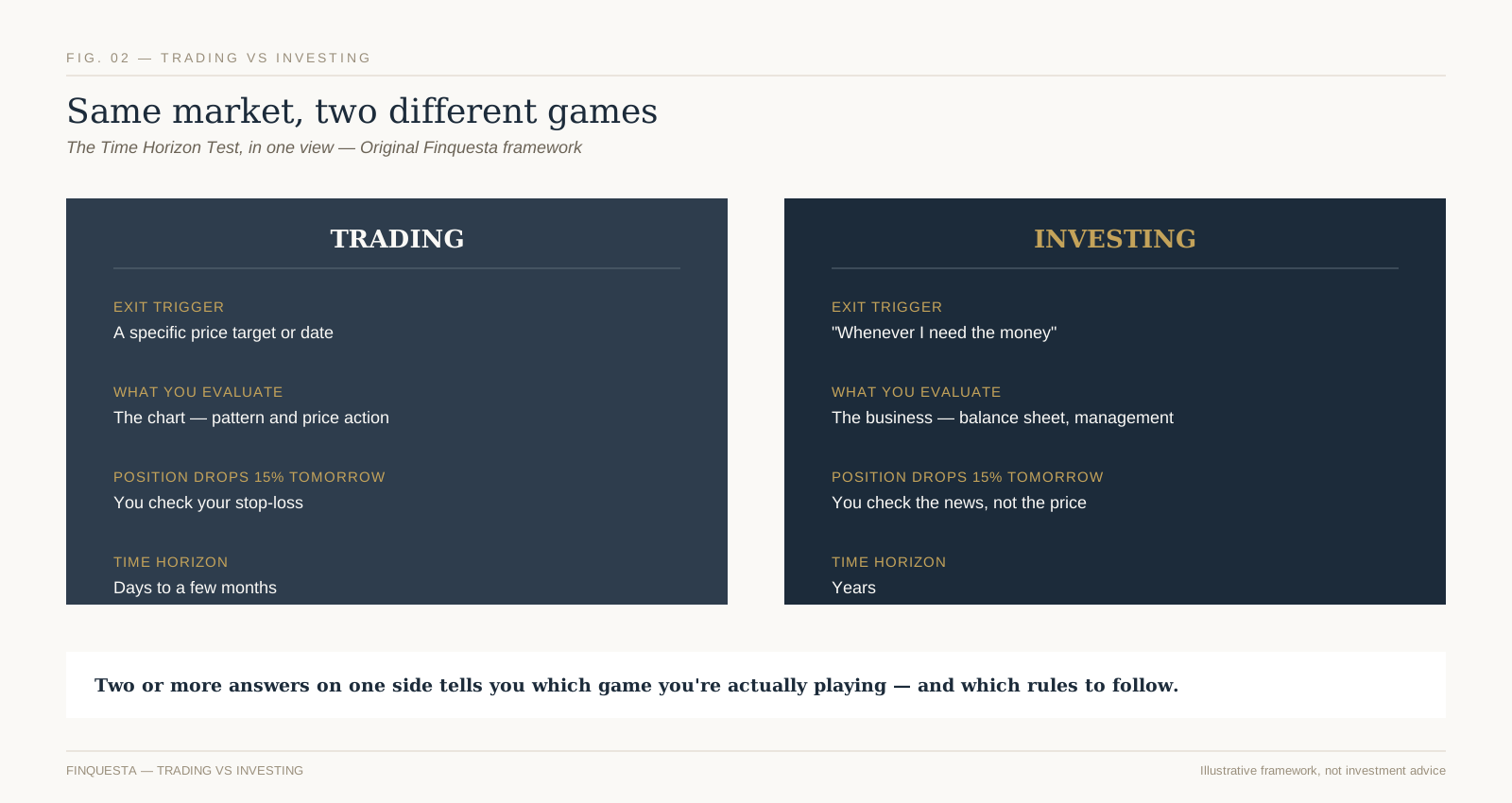
Brokerage. What your broker charges per order — either a flat fee or a small percentage of trade value, capped at a flat maximum by most discount brokers.

Securities Transaction Tax (STT). A tax the government charges automatically at the time of the trade — you don’t calculate or pay it separately; it’s deducted in the contract note. According to Zerodha’s published rate table (current from 1 April 2026, following the Budget 2026–27 revision), STT on equity delivery trades is 0.1% of trade value on both the buy and sell side; on equity intraday trades it’s 0.025% of trade value on the sell side only; and on F&O, futures carry 0.05% on the sell side while options carry 0.15% of either the premium (when sold) or the intrinsic value (when exercised) — all of which rose from the pre-April-2026 rates as part of that Budget’s F&O tax changes.

Exchange transaction charges, SEBI turnover fees, stamp duty, and GST on brokerage. Individually small, collectively real — a full, current breakdown lives on your broker’s own charges page, since exact per-segment figures shift periodically and your broker’s contract note is the authoritative record for what you actually paid.

Depository Participant (DP) charges. A per-scrip charge levied by your DP each time you sell shares out of your demat account (delivery trades only) — separate from brokerage, and easy to forget when estimating a trade’s true cost.

The habit worth building from week one: check your contract note after every trade, not just your profit-and-loss number. A trade that looks like a small win on the price chart can be a net loss once every charge above is subtracted — and you’ll never know that if you’re only ever looking at the price.

Fig. 03 — Securities Transaction Tax by trading segment, effective 1 April 2026

Taxation on Trading Gains in India

This is a section beginners either skip entirely or get wrong in the same predictable way — treating all trading profit as one tax category, when India’s rules split it into genuinely different treatments depending on what kind of trading you did.

Delivery-based trades held over 12 months are taxed as long-term capital gains (LTCG) on listed equity. Delivery-based trades held under 12 months are taxed as short-term capital gains (STCG). Both have specific rates and thresholds set by the current Finance Act, which change with the annual Union Budget — always confirm the figure in effect for the financial year you’re filing before relying on it.

Intraday trading profit is treated entirely differently — not as a capital gain at all, but as speculative business income under Section 43(5) of the Income Tax Act, because you never actually took delivery of the shares. This means it’s taxed at your applicable income-tax slab rate — the same slabs your salary is taxed under — rather than at a flat capital-gains rate, and it’s reported under “Profits and Gains from Business or Profession” on your return, not the capital gains schedule. One rule worth knowing before it costs you a refund: speculative losses can only be set off against speculative gains — not against your salary, other business income, or capital gains from delivery trades — though they can be carried forward for four assessment years if you file your return by the due date.

F&O trading profit is also treated as business income (non-speculative, unlike intraday equity), taxed at slab rate, with its own tax-audit threshold rules depending on turnover.

None of this is a substitute for a chartered accountant once your trading activity is non-trivial — it’s the mental model you need to understand what your CA is actually calculating, and to know which documents (contract notes, the year’s P&L statement from your broker) you need to hand over at filing time.

Risk Management: The Discipline Most Beginners Skip

Every trading guide mentions risk management in a paragraph and moves on. It deserves more than that, because it’s the actual difference between traders who are still trading in three years and the much larger group who aren’t.

Position sizing comes first: never risk more on a single trade than you’re prepared to lose on several trades in a row, because you will lose several in a row — that’s not pessimism, it’s the base rate for anyone trading with a real edge, let alone without one. A common starting discipline is risking no more than 1-2% of total trading capital on any single position’s stop-loss distance, which means a string of five consecutive losses costs you 5-10% of capital, not 50%.

Here’s a second original framework worth adopting outright: the Two-Loss Rule (Original Finquesta framework). After two consecutive stop-losses are hit in the same trading session, you stop trading for the day — full stop, no exceptions, no “one more trade to win it back.” This single rule exists because the psychological state after two losses in a row — the urge to immediately recover the loss — is precisely the state in which traders abandon their own plan and take a third, oversized, poorly-reasoned trade. The Two-Loss Rule isn’t about the third trade being statistically doomed; it’s about removing your own judgement from the decision at the exact moment it’s least trustworthy.

Journaling every trade, mentioned earlier in the six-step sequence, is what makes both of these rules enforceable over time rather than good intentions you abandon after a good week.

Fig. 04 — The Two-Loss Rule: after two consecutive stop-losses in one session, trading stops for the day

Common Beginner Mistakes That Empty Trading Accounts Fast

Trading with money you can’t afford to lose. Not a cliché — the single largest predictor of poor decision-making under pressure, because every trade becomes emotionally loaded when the outcome actually matters to your rent.

Averaging down without a plan. Buying more of a losing position “to lower the average price” can be a deliberate, pre-planned strategy for a long-term investment. For a trade that was supposed to have a stop-loss, it’s usually just a stop-loss you decided not to honour, dressed up as a strategy after the fact.

Overtrading. Placing trades out of boredom or the urge to be “doing something” during flat, directionless market stretches, rather than waiting for a setup that actually matches your plan.

Chasing a stock after a big move. Buying because a stock “already moved 8% today and might keep going” is buying based on the fact that you missed the move, not based on any actual signal that more is coming.

Ignoring position sizing on leveraged products. Treating an F&O lot the same way you’d size a delivery trade, without adjusting for the leverage embedded in the instrument, is how a manageable-looking mistake becomes an account-ending one.

Confusing a broker’s research call with your own analysis. Acting on a tip — from a broker, a friend, or a social media account — without being able to independently explain the trade is the fastest way to hold a position you don’t know how to manage when it moves against you.

Building a Simple First Watchlist and Trading Routine

A watchlist of 40 stocks is not a strategy, it’s noise — you can’t meaningfully track that many companies’ news, charts, and price action at once, and most beginners end up reacting to whichever of the 40 happens to be moving that day rather than trading with any plan. Five to eight stocks, in businesses you can actually explain and sectors you have some genuine familiarity with, is a far more workable starting list.

A simple routine beats an elaborate one you’ll abandon within a month: check your watchlist before market open for overnight news, note which levels (from your charts) matter for the day, place any planned orders with stop-losses attached at entry, and — critically — log the day’s trades that evening while the reasoning is still fresh, not three weeks later when you’re trying to reconstruct why you took a trade from memory. For more on building out a broader investing and market-literacy foundation alongside your trading practice, Finquesta’s guide to understanding the Indian stock market is a useful next stop.

It’s also worth periodically stepping back and revisiting Finquesta’s broader guide to investing in Indian stock markets — not because trading and investing are the same activity, but because understanding the investing side of the market makes you a better-informed trader, not a worse one. Every regulated venue you’ll trade on ultimately answers to SEBI’s investor protection framework, and every order you place is executed on an exchange — primarily the NSE or BSE — whose own published market data is worth getting comfortable reading directly rather than only through your broker’s app.

Frequently Asked Questions About Starting to Trade in India

Yes — stock trading through a SEBI-registered broker on the NSE or BSE is fully legal, and your shares are held safely at an independent depository (NSDL or CDSL) regardless of what happens to your broker. “Safe” refers to the regulatory structure protecting your holdings, not to the trades themselves — trading capital can still be lost through normal market risk and poor decisions.

Can I start trading with ₹500 or ₹1,000?

Yes, for delivery-based equity trading, since Indian shares can be bought individually rather than in fixed lots. Whether that amount is enough to meaningfully practise the habits this guide covers is a separate question — very small amounts make losses too painless to teach real discipline, and gains too small to matter either.

What is the difference between trading and investing?

Trading aims to profit from short-term price movement over days to months, using charts and technical signals; investing aims to build wealth over years by owning a share of a growing business. The Time Horizon Test earlier in this guide is a quick way to work out which one you’re actually doing with any given position.

Do I need a demat account to trade, or just a trading account?

You need both for delivery-based trading — the demat account holds the shares you own, and the trading account executes the buy and sell orders. Most brokers open them together as a single “2-in-1” account. Pure intraday trading, where you never take delivery, still typically requires both to be opened as part of account setup, even though shares never actually settle into the demat account.

How much tax do I pay on trading profits in India?

It depends entirely on what kind of trade it was: delivery trades held over or under 12 months are taxed as long-term or short-term capital gains respectively, at rates set by the current Finance Act; intraday trades are taxed as speculative business income at your regular income-tax slab rate; and F&O trades are taxed as non-speculative business income, also at slab rate.

Can I lose more money than I invested in stock trading?

In plain delivery-based equity trading, no — the most you can lose is what you put in, since you own the shares outright. In leveraged segments like F&O, yes — certain option-selling and futures positions can generate losses larger than your initial margin, which is exactly why this guide treats F&O as a structurally different, higher-risk instrument rather than a natural next step from delivery trading.

Is intraday trading better than delivery trading for beginners?

No — delivery trading is the more forgiving starting point precisely because it has no same-day deadline forcing a decision, which gives a genuine beginner room to learn from a mistake instead of being forced to realise it by 3:30 PM. Intraday’s leverage and time pressure are usually a poor match for someone still building basic chart-reading and order-management skills.

How long does it take to learn how to read candlestick charts?

The core vocabulary — open, close, high, low, body, and wick, plus a handful of patterns like the ones covered in this guide — can genuinely be learned in an afternoon. Reading a chart well enough to trade on it with any consistency is a different, much longer skill, built through logged practice across many real trades, not through memorising pattern names.

What is the minimum capital needed for F&O trading in India?

This varies by contract, since F&O trades in exchange-defined lot sizes rather than individual units, and margin requirements are set per instrument and can change with volatility and SEBI’s evolving retail-suitability rules for the segment

Which is better for beginners: a full-service or a discount broker?

For someone trading their own capital in modest size, a discount broker’s flat, low per-order fee usually beats a full-service broker’s percentage-based brokerage on pure cost — and the “research and advisory” a full-service broker adds is something this guide would encourage you to be able to replicate yourself before you trade on anyone else’s call, including ours.

Compound Interest: How It Builds Wealth in 2026

Compound Interest

Compound interest is what happens when the interest your money earns starts earning interest of its own, instead of being paid out separately. Anyone with a savings account, fixed deposit, PPF account, mutual fund, or retirement account is already using it, knowingly or not — and anyone carrying a credit card or loan balance is subject to the exact same mechanism in reverse. There’s no minimum amount needed for it to work; it applies to ₹500 exactly as it applies to ₹50 lakh. What changes the outcome isn’t the starting amount — it’s the rate, the frequency, and above all, the time you leave it alone.

What Compound Interest Really Means

Most people meet compound interest for the first time through a credit card statement, not a retirement calculator.

You carry forward a balance one month. The next bill is a little higher than what you spent — not just because of new purchases, but because of what you already owed. Leave it a few months longer and the growth isn’t steady anymore; it’s accelerating. A ₹50,000 balance at a fairly typical Indian credit card rate of 36% a year, compounding monthly with no payments at all, would grow past ₹1,00,000 in well under two years. That’s the same mechanism, working in the direction most of us meet it first.

Compound interest, explained without the mythology: your money earns a return, that return gets added to your balance, and the next round of earnings is calculated on the new, larger total. That’s it. Everything else in this guide — the formula, why growth feels slow at first, where compounding actually shows up in your accounts, and where it quietly works against you — is just that one idea, followed through to its real consequences.

In the direction that builds wealth instead of debt, compound interest is simply this: the interest your money earns doesn’t sit off to the side. It gets folded back into the balance, and the next round of interest is calculated on the new, larger number. Then that happens again. And again. Every cycle, the base gets a little bigger, so every subsequent round of interest is calculated on more than the round before it.

You’ll often see this called “the eighth wonder of the world,” usually attributed to Einstein. It’s worth being precise about that, because Finquesta would rather lose a good line than repeat a bad citation: there’s no verified record Einstein ever said it.

Quote Investigator, the reference project that traces misattributed quotations back to their source, found the earliest print appearance in unsigned 1920s bank advertising copy, with the specific Einstein attribution not showing up until 1983 — 28 years after his death, with no citation attached. Princeton’s own edited volume of his quotes files it under “Probably Not By Einstein.”

None of that makes the underlying math less real. It just means you don’t need a borrowed authority to make the point — the numbers do that on their own.

Simple Interest vs. Compound Interest: The Difference That Compounds

Here’s the comparison that actually explains why compounding matters, using a single lump sum so the two methods are directly comparable: ₹1,00,000, at an assumed 8% a year, for 30 years.

Under simple interest, you earn 8% of the original ₹1,00,000 every single year — always ₹8,000, no matter how long the money has been sitting there. After 30 years, that’s ₹1,00,000 principal plus 30 × ₹8,000, or ₹3,40,000 total.

Under compound interest, each year’s 8% is calculated on the current balance, not the original one. Year one looks almost identical to simple interest — ₹1,08,000 either way. By year ten, compound interest has pulled ahead to roughly ₹2.16 lakh against simple interest’s ₹1.8 lakh. By year thirty, compound interest has grown to just over ₹10 lakh — nearly three times what simple interest produced from the exact same starting amount and the exact same rate.

compound interest

FIG. 01 — Simple vs compound growth of the same ₹1,00,000 over 30 years at an assumed 8% p.a.

Nothing changed except how the interest was treated. That gap — roughly ₹6.66 lakh on a ₹1 lakh starting point — is the entire argument for compound interest in one comparison.

The Compound Interest Formula, Broken Down

The standard formula looks intimidating until you see what each piece is actually doing:

A = P (1 + r/n)^(nt)

  • A is the amount you end up with
  • P is your principal — what you start with
  • r is the annual interest rate, written as a decimal (8% becomes 0.08)
  • n is how many times per year the interest compounds (1 for annual, 12 for monthly, 365 for daily)
  • t is the number of years you leave it invested
compound interest

FIG. 05 — Anatomy of the compound interest formula: A = P(1 + r/n)^(nt)

If you’re contributing regularly instead of depositing one lump sum — a monthly SIP, a recurring deposit, a salary-linked retirement contribution — the formula changes shape slightly (it becomes a future-value-of-annuity calculation), but the underlying logic doesn’t change at all: each contribution starts compounding from the day it lands, so your earliest contributions do disproportionately more work than your most recent ones, simply because they’ve had longer to compound. That single fact is the reason the next two sections exist.

Why Compounding Feels Slow at First: The Quiet Decade

ORIGINAL FINQUESTA FRAMEWORK

Take a fairly ordinary example: investing ₹10,000 every month at an assumed 12% average annual return — a commonly used long-term assumption for diversified equity investing in India, though real returns will vary year to year and are never guaranteed. Run that for 30 years and look at what the growth (not the contributions — the growth alone) looks like, broken into three ten-year blocks:

FIG. 02 — The Quiet Decade: growth by decade on a ₹10,000/month SIP at an assumed 12% p.a. (Original Finquesta framework)

  • Years 1–10: you’ve put in ₹12 lakh. The account has grown to about ₹23 lakh. Growth from interest alone: roughly ₹11 lakh — about 3.5% of the growth this plan will eventually produce.
  • Years 11–20: same monthly amount, same rate. Growth from interest alone in this decade: roughly ₹63.9 lakh — about 20.4% of total lifetime growth.
  • Years 21–30: growth from interest alone in this final decade: roughly ₹2.39 crore — about 76.1% of everything this plan will ever earn.

Three equal ten-year stretches. Identical monthly contribution. Identical assumed rate. And the last one does more than three times the work of the first two combined.

We call the first stretch the Quiet Decade — not because nothing is happening (the math is working exactly as designed, every single month), but because almost nothing is visible yet. A chart of this account over its first ten years looks close to a straight line. It’s only once you’re well into the second decade that the curve starts to visibly bend upward, and only in the third decade that it becomes the dramatic, headline-friendly hockey stick every finance article likes to show you.

This is, as far as we can tell, the actual reason most people quit long-term investing early rather than because the maths stopped working: the first several years genuinely do look unimpressive next to the amount you’re putting in, and there’s no visual cue telling you the shape is about to change. If you know the Quiet Decade is coming, you can recognise it for what it is — the unglamorous, unavoidable setup phase — instead of mistaking it for the plan not working.

This is also the direct, quantified answer to a question that comes up constantly: does starting five years late really cost that much? Using the exact numbers above: someone who starts this plan on time reaches roughly ₹3.49 crore at year 30. Someone who starts five years late — same monthly amount, same rate, just beginning at what would have been year six — is only 25 years into their own timeline by that same calendar point, with a corpus of roughly ₹1.88 crore. A five-year delay, on total contributions that differ by only ₹6 lakh, produces a final-corpus gap of roughly ₹1.62 crore — because those five lost years weren’t just five years of missed contributions, they were five years removed from the most productive end of the curve, not the flattest end.

The Crossover Point: When Growth Starts Outpacing Your Own Contributions

ORIGINAL FINQUESTA FRAMEWORK

Here’s a more useful milestone than “the earlier the better,” because it’s specific enough to actually calculate for your own numbers.

Using the same ₹10,000-a-month, 12%-assumed example: for the first several years, whatever you contribute in a given year is larger than whatever the account earns in that same year. You are still doing more work than your money is. Then, at a specific point, that flips — the growth earned in a single year becomes larger than the amount you contributed that year, and from then on, the gap keeps widening in your favour every year that follows.

FIG. 03 — The Crossover Point: annual growth overtakes the annual contribution in year 7 (Original Finquesta framework)

In this example, that point arrives in year 7: the account earns roughly ₹1,39,600 in growth during year 7 alone, against ₹1,20,000 contributed that year. From year 7 onward, your money is contributing more than you are, every single year, by a growing margin.

We call this the Crossover Point, and unlike “start early,” it isn’t just encouragement — it’s a specific, calculable year that changes based on your own contribution amount and assumed rate. A higher assumed return or a smaller monthly contribution pulls the Crossover Point closer; a lower rate or a larger monthly amount pushes it further out. Either way, it turns an abstract concept into a real date on a real calendar you can actually look forward to, which tends to matter more for staying consistent through the Quiet Decade than any encouragement to “just be patient” ever does.

Does Compounding Frequency Actually Matter?

Every compound interest article mentions that more frequent compounding — monthly instead of annual, daily instead of monthly — produces a larger final number. That’s true. What’s less often shown is how much larger, because the honest answer undercuts the drama.

Take ₹1,00,000 at an assumed 8% annual rate for 20 years:

Compounding frequencyFinal amountDifferen Zce vs. annual
Annual₹4,66,096
Monthly₹4,92,680+₹26,584 (5.7%)
Daily₹4,95,216+₹29,121 (6.2%)

Monthly versus daily — the two frequencies most often compared in marketing material — differ by about ₹2,536 over 20 years on a ₹1 lakh base, or roughly 0.5%. Frequency matters, and it’s a real, mathematically legitimate reason to prefer an account that compounds more often, all else equal. But it is a rounding error next to the two variables that actually move the outcome: the rate you’re earning, and the time you stay invested. If a bank’s pitch leans heavily on “daily compounding” as the headline reason to choose it over a comparable option with a better rate, the frequency isn’t the thing worth chasing.

The Rule of 72: A Shortcut, Not a Substitute

The Rule of 72 estimates how many years it takes an amount to double: divide 72 by the annual interest rate. At 8%, that’s 72 ÷ 8 = 9 years. It’s a genuinely useful mental-math shortcut — but it’s an approximation, and it’s worth knowing exactly where it holds up and where it starts to drift, rather than treating it as exact in every context.

RateRule of 72 estimateActual doubling time
6%12.00 years11.90 years
7.1% (PPF, current rate)10.14 years10.11 years
8%9.00 years9.01 years
12%6.00 years6.12 years
18%4.00 years4.19 years
36% (typical Indian credit card rate)2.00 years2.25 years

The rule is nearly exact in the 6–10% range — which happens to be roughly where long-term fixed-income and blended equity-debt returns tend to sit, which is probably why the rule became popular in the first place. Above about 15%, it starts understating the real doubling time, and the gap widens as the rate climbs. At credit-card-level rates, the Rule of 72 tells you your debt doubles in 2 years when the real figure is closer to 2.25 — a meaningful understatement exactly where getting it wrong costs you the most.

When Compound Interest Works Against You: Debt

Every mechanism described so far runs identically in reverse. A credit card issuer isn’t doing anything mathematically different from a bank paying you interest — they’re applying the same formula, with you on the other side of it.

At a representative Indian credit card rate of 36% a year, compounded monthly, an untouched ₹50,000 balance — assuming genuinely no payments are made at all, which is a worst-case illustration, not a typical outcome — grows past ₹1,00,000 in about 23 months, under two years. Real cards require a minimum payment each month, which slows this considerably, but paying only the minimum still leaves the bulk of the balance compounding against you month after month — which is precisely why minimum-payment-only debt is so difficult to work down even when the monthly payment feels manageable.

This is the same mechanism from the earlier sections, in a mirror. The Quiet Decade and the Crossover Point both describe compounding working slowly in your favour, then accelerating. Debt compounds on exactly the same schedule — slowly at first, then faster — except every month it isn’t paid down is a month working against you instead of for you. Understanding the mechanism is what makes the difference obvious: the goal isn’t to fear compound interest, it’s to make sure you’re consistently on the side of it that’s working for you.

The Tax Leak: How Taxation Quietly Slows Down Compounding

ORIGINAL FINQUESTA FRAMEWORK

Almost no beginner explanation of compound interest accounts for tax — but tax changes the compounding math directly, because money paid out in tax each year is money that stops compounding from that point forward.

Compare two ₹1,00,000 deposits, both earning an identical 7.1% a year (the current PPF rate — see below), over 20 years. One compounds completely untouched. The other has its interest taxed away annually at a 30% slab rate, the way a taxable fixed deposit’s interest is treated in India, before the balance is allowed to keep growing.

FIG. 04 — The Tax Leak: identical 7.1% rate, tax-free vs. taxed annually at a 30% slab rate (Original Finquesta framework)

 Untaxed (compounds fully)Taxed annually at 30%
Year 5₹1,40,912₹1,27,446
Year 10₹1,98,561₹1,62,425
Year 15₹2,79,796₹2,07,004
Year 20₹3,94,266₹2,63,818

Same starting amount. Same headline rate. A ₹1,30,448 gap after 20 years — the untaxed corpus ends up 49.4% larger — purely because one version keeps compounding on its full interest and the other has a third of each year’s growth quietly removed before it gets the chance to compound.

This is precisely why India’s EEE (exempt-exempt-exempt) instruments — PPF being the clearest example — are structurally different from a taxable fixed deposit paying a similar headline rate. It isn’t only that PPF is government-backed; it’s that a taxable FD’s real, compounding rate is quietly lower than its advertised rate for anyone in a taxable bracket, every single year, while an EEE instrument compounds on its full, undiminished rate for the entire holding period.

Real Returns vs. Nominal Returns: What Inflation Quietly Takes Back

There’s a second leak that works the same way as tax, and it’s just as easy to miss: inflation.

If your investment grows at 8% a year and inflation runs at 5% a year, your money isn’t really compounding at 8% in terms of what it can actually buy — it’s compounding at closer to 3% in real terms (the precise calculation is (1.08/1.05) − 1 ≈ 2.86%, not a simple 8% − 5% subtraction, though the subtraction is a reasonable quick approximation at low rates). This matters most for anything held for decades, since a rate that comfortably beats inflation in year one can quietly stop doing so if inflation rises and the nominal rate doesn’t. A fixed deposit paying 7% during a period when inflation is running at 7% isn’t growing your money in real terms at all — it’s holding it still, before tax is even considered.

Where Compounding Happens in India

Public Provident Fund (PPF)

PPF currently pays 7.1% per annum, reviewed quarterly by the Ministry of Finance and unchanged for the July–September 2026 quarter. It carries EEE status — contributions up to ₹1.5 lakh a year qualify for deduction, the interest is tax-free, and the maturity amount is tax-free too, with no annual tax leak of the kind described above. The trade-off is liquidity: a 15-year lock-in (extendable in 5-year blocks), with only limited partial withdrawal before that — which is exactly why this kind of long-lock-in compounding should sit on top of an emergency fund, not instead of one.

Fixed Deposits (FDs)

FD interest is fully taxable, added to your total income every year on an accrual basis and taxed at your income tax slab rate, regardless of whether you’ve actually withdrawn it. That’s the Tax Leak from the section above, playing out in the most common savings instrument in the country.

ELSS (Equity-Linked Savings Scheme)

ELSS funds combine a Section 80C deduction (up to ₹1.5 lakh, only under the old tax regime) with equity-market exposure and the shortest lock-in of any 80C instrument, at three years. Gains are taxed as equity long-term capital gains under Section 112A: 12.5% on gains above ₹1.25 lakh in a financial year, since ELSS units are typically held well past the 12-month equity LTCG threshold.

The Equity Tax Picture More Broadly

For equity mutual funds and listed shares generally: short-term gains (sold within 12 months) are taxed at 20% under Section 111A; long-term gains (held over 12 months) are taxed at 12.5% above a ₹1.25 lakh annual exemption under Section 112A, with no indexation benefit. Debt mutual funds purchased on or after 1 April 2023 are taxed at your income slab rate regardless of how long you hold them.

Where Compounding Happens Globally

401(k) and Traditional/Roth IRA (United States)

For 2026, the IRS allows up to $24,500 in employee contributions to a 401(k), up from $23,500 in 2025, with an additional $8,000 catch-up contribution available from age 50. The IRA contribution limit for 2026 is $7,500, up from $7,000 in 2025 . A traditional 401(k) or IRA defers tax until withdrawal — money compounds untaxed for decades and is taxed only when it comes out — while a Roth version is taxed going in and compounds completely tax-free thereafter. Either structure avoids the annual Tax Leak described earlier; a standard taxable brokerage account does not.

High-Yield Savings Accounts and CDs

Outside retirement accounts, interest from a savings account or certificate of deposit is generally taxable in the year it’s earned, functioning much like an Indian fixed deposit: fully taxed, annually, at your marginal rate.

Common Mistakes That Quietly Kill Compound Growth

Interrupting the compounding. Withdrawing gains “just this once,” pausing contributions during a market dip, or closing an account early doesn’t just cost you what you withdraw — it resets part of the compounding clock on everything that would have kept building on top of it.

Chasing frequency over rate. As shown above, the difference between monthly and daily compounding is small. The difference between a 6% rate and a 9% rate, compounded identically, is not.

Ignoring the Tax Leak until it’s too late. Choosing a fully taxable instrument over a comparable tax-advantaged one, purely out of familiarity, quietly gives up a meaningful share of total growth — not through any single bad decision, but through 20 or 30 repeated small ones.

Treating the Quiet Decade as proof it isn’t working. This is arguably the single most common reason people abandon long-term plans at exactly the point where abandoning them costs the most.

Letting debt compound while paying only the minimum. Minimum payments are sized to cover most of a period’s interest, not to meaningfully reduce the principal — which is exactly why balances at 30%+ rates can feel permanent even when payments are being made every month.

How to Actually Start This Month

You don’t need a large amount or a complicated plan to put any of this to work. A recurring monthly contribution — a SIP into a mutual fund, a PPF deposit made before the 5th of the month to maximise that month’s interest, or an automatic transfer into a retirement account — does more than a single large, sporadic deposit, because it starts more money compounding sooner rather than later, and if you’re weighing that against investing a bonus or lump sum in one go, the comparison is its own decision. If you’re still deciding where that monthly amount should actually go, that’s a separate decision with its own trade-offs around risk, liquidity, and goals.

Frequently Asked Questions

What is compound interest in simple terms?

It’s interest calculated on your original amount plus all the interest you’ve already earned, rather than on the original amount alone. Each round of interest becomes part of the base for the next round, which is why growth accelerates over time instead of staying flat.

Is compound interest always in my favour?

No — it’s directionally neutral. It works in your favour on savings, deposits, and investments, and against you on any debt you’re carrying, including credit cards and personal loans. The mechanism is identical either way; only the direction changes.

Can I lose money even when compound interest is working for me?

Yes, if the underlying investment is market-linked. Compound interest describes how returns build on themselves over time — it doesn’t guarantee the return itself will be positive in any given year. Fixed-rate instruments like PPF or a bank FD don’t carry this risk; market-linked instruments like equity mutual funds do.

What is the difference between simple interest and compound interest?

Simple interest is calculated only on the original principal, every period, so it grows in a straight line. Compound interest is calculated on the principal plus all previously earned interest, so it grows on an accelerating curve. Over long periods, the gap between the two becomes substantial even at identical rates.

Monthly compounding vs. annual compounding — which is better?

Monthly is mathematically better, but usually only by a few percentage points over long periods — roughly 5–6% more than annual compounding over 20 years at a typical rate, based on the calculation above. It’s worth a slight preference, not a decision-changing one; the interest rate itself matters far more.

How long does it take to double my money with compound interest?

Roughly 72 divided by your annual interest rate, in years — the Rule of 72. At 8%, that’s about 9 years. The shortcut is accurate in the 6–10% range and increasingly understates the real doubling time above about 15%.

Does compound interest apply to SIPs and mutual funds?

Yes, in the form of compound returns rather than compound interest specifically — each year’s gains (or losses) are calculated on the full current value of your holdings, including all prior growth, not just your original contributions. The mechanism is the same idea; the underlying return isn’t fixed or guaranteed the way bank interest is.

Is compound interest income taxable in India?

It depends entirely on the instrument. PPF interest is completely tax-free (EEE status). Fixed deposit interest is fully taxable every year at your income tax slab rate. Equity mutual fund gains are taxed under the capital gains rules described above, not as interest income.

The Bottom Line

Compound interest isn’t a trick, a secret, or a wonder of the world attributed to a physicist who probably never said the line. It’s arithmetic that rewards two things above all else: staying invested through the Quiet Decade, when the results don’t yet look like much, and keeping as much of your growth as possible actually compounding — instead of leaking out annually to tax, sitting idle at a rate that barely beats inflation, or working against you in an unpaid balance somewhere. None of that requires predicting the market. It mostly requires not interrupting a process that was already working.

Disclaimer This article is for informational and educational purposes only and does not constitute financial, investment, tax, or legal advice. Figures, rates, and regulations mentioned are subject to change; please verify current details with official sources (RBI, SEBI, the Income Tax Department, IRS, or a licensed financial advisor) before making financial decisions. Finquesta may earn a commission from affiliate links in this article at no extra cost to you.