
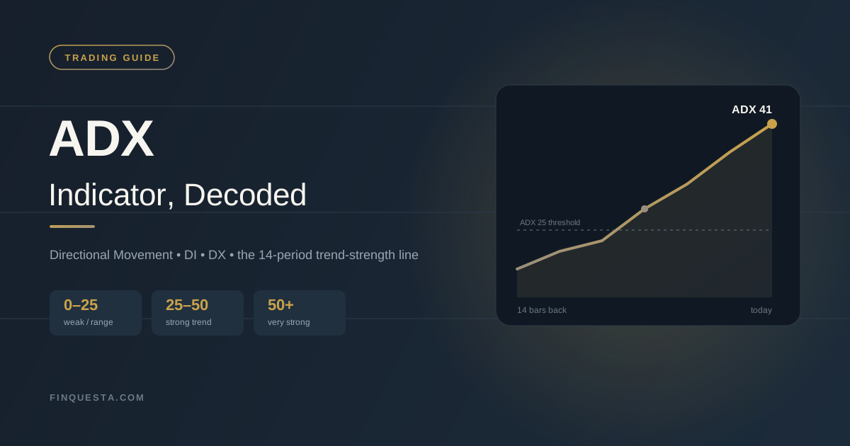
Aakash watched the ADX on his Bank Nifty chart cross above 25 and bought call options within the minute — a strong trend, he figured, was a strong trend. Twenty minutes later he was stopped out, because the ADX had never once told him which way that trend was pointing. That mix-up — mistaking strength for direction — is one of the most common, costly misreadings in technical analysis, and untangling it is the whole point of this guide.
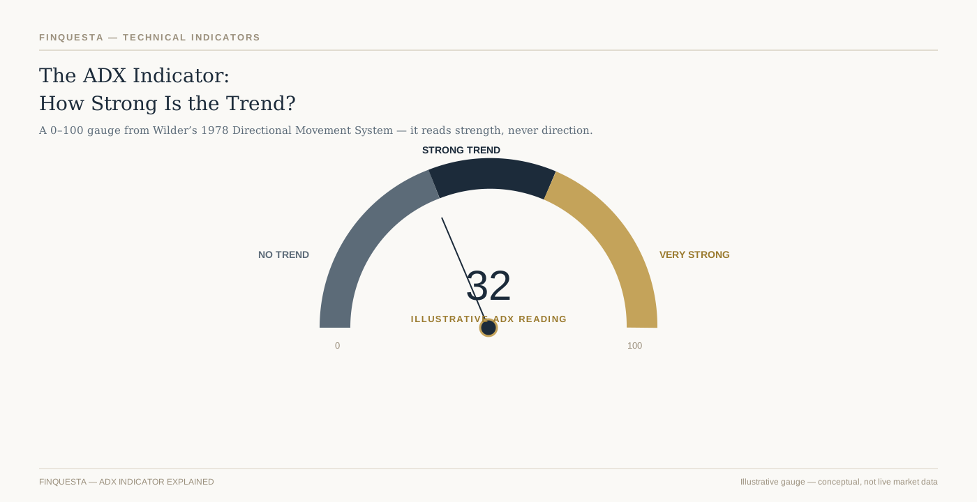
The ADX indicator in one picture: a 0–100 gauge that reads how strong a trend is, never which way it points.
What Is the ADX Indicator?
| WHAT IS THE ADX INDICATOR? The Average Directional Index, or ADX indicator, is a technical analysis tool that measures how strong a price trend is, on a scale of 0 to 100. It was developed by J. Welles Wilder Jr. and published in 1978. Traders across stocks, forex, commodities, and index derivatives use it to judge whether a market is trending or moving sideways, typically over a 14-period lookback. On its own, the ADX indicator says nothing about direction — a rising line only confirms that a move, up or down, has real conviction behind it. |
The ADX indicator never travels alone. It’s the headline output of a three-line system Wilder called the Directional Movement System, which also includes a Plus Directional Indicator (+DI) and a Minus Directional Indicator (−DI). Those two lines carry the direction; the ADX line carries the conviction. Most charting platforms plot all three together in a separate pane below the price chart.
That separation is exactly what tripped Aakash up. He read “ADX above 25” as “get in,” when the honest translation is closer to “something real is happening — go check the DI lines before you decide what it is.” A trending market and a tradeable market aren’t automatically the same thing, and the rest of this guide is about learning to tell them apart.
Who Created the ADX Indicator, and Why a 1978 Book Still Runs on Every Terminal
J. Welles Wilder Jr. trained as a mechanical engineer at North Carolina State University, then spent years in real estate development before his business partners bought him out in 1972. Public biographical records place his birth on 11 June 1935 in Norris, Tennessee, and his later home in Greensboro, North Carolina. He turned that 1972 buyout into trading capital and a new obsession: could market behaviour be reduced to the same kind of measurable, testable rules an engineer would use on a bridge?
The answer, published in 1978 as a slim, spiral-bound volume called New Concepts in Technical Trading Systems, introduced the Relative Strength Index, Average True Range, Parabolic SAR, and the Directional Movement System that produces the ADX indicator — all in the same book, all worked out by hand with a calculator before spreadsheets existed. Wilder self-published it through his own company, Trend Research, in Greensboro. Four indicators out of one self-published book is not a common batting average in this field.
What’s easy to miss almost fifty years later is how mechanical Wilder’s approach really was. He wasn’t trying to describe markets poetically — he was trying to build a rules-based system an engineer could run without emotion getting in the way, and the ADX indicator was his answer to a specific, narrow question: is there enough directional conviction here to justify following a trend at all. Every major charting platform still ships it as a standard tool, essentially unchanged, because that narrow question never stopped being useful.
The Three Lines Inside the ADX Indicator: ADX, +DI, and −DI
Open the ADX indicator on any charting platform and you’ll typically see three lines sharing one pane beneath the price chart, not one. Untangling what each line is actually doing is the single biggest unlock for using this tool correctly.
The +DI line measures upward directional pressure — how much of recent price movement has come from higher highs. The −DI line does the same job for downward pressure, tracking lower lows. When +DI sits above −DI, buyers have the upper hand; when −DI sits on top, sellers do.
The ADX line is different in kind, not just in colour. It’s built from the gap between +DI and −DI, smoothed over time, so it never tells you who’s winning — only how decisively one side is winning. A market can have +DI comfortably above −DI (a clear uptrend) while ADX sits at 15, because the margin between the two lines is still thin and unconvincing.
Think of +DI and −DI as two boxers scoring points, and ADX as the judge’s read on how one-sided the fight has become. The scorecard (DI) tells you who’s ahead. The one-sidedness reading (ADX) tells you whether it’s worth staying to watch the rest of the fight.
How the ADX Indicator Is Calculated, Step by Step
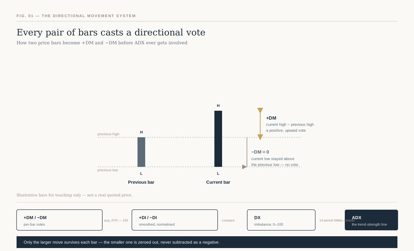
Fig. 1 — Every bar casts a directional vote: only the larger of the two competing moves survives each period.
The formula looks intimidating written out in full, but the underlying logic is simple enough to hold in your head: only the bigger of two competing price moves counts each period, and everything downstream is that idea, smoothed.
Start with two consecutive price bars. UpMove is today’s high minus yesterday’s high. DownMove is yesterday’s low minus today’s low. Whichever one is bigger — and positive — becomes that period’s Directional Movement; the smaller one is zeroed out entirely, not recorded as a negative number.
Whichever move is larger between the two — and only if it’s actually positive — becomes that bar’s directional movement. When the up-move wins and is positive, +DM takes its value and −DM drops to zero for that bar; when the down-move wins instead, the roles simply flip. A bar can register a +DM or a −DM, but structurally never both — every bar casts exactly one directional vote, or none at all.
From there, +DM and −DM get divided by the Average True Range and multiplied by 100, turning raw price gaps into the normalised +DI and −DI percentages. The DX value is the absolute difference between +DI and −DI, expressed as a percentage of their sum — a single number capturing how lopsided that gap is on any given day. ADX is simply DX, smoothed using Wilder’s own averaging method over the chosen period, traditionally 14.
That smoothing step matters more than it looks like it should, and it’s the subject of a later section — because it’s also the most commonly skipped detail in every ADX explainer you’ll find.
A Worked Example: Calculating +DI, −DI, and DX by Hand
Most ADX indicator explainers show the formula and stop there. Watching it run on real numbers, even over a short illustrative stretch, makes the mechanism concrete in a way the formula alone doesn’t.
| Day | High | Low | Close | +DM | −DM | TR |
| 1 | 101.0 | 98.5 | 100.0 | — | — | — |
| 2 | 102.5 | 99.5 | 102.0 | 1.5 | 0 | 3.0 |
| 3 | 103.0 | 100.5 | 101.5 | 0.5 | 0 | 2.5 |
| 4 | 102.0 | 99.0 | 99.5 | 0 | 1.5 | 3.0 |
| 5 | 104.5 | 101.0 | 104.0 | 2.5 | 0 | 5.0 |
| 6 | 106.0 | 103.0 | 105.5 | 1.5 | 0 | 3.0 |
Table 1 — Six illustrative sessions used to walk through the +DM / −DM / TR calculation by hand.
Five illustrative sessions, tracked day by day: Day 2 makes a higher high than Day 1, so +DM = 1.5 and −DM = 0 for that day. Day 4 breaks the pattern with a lower high and a lower low than Day 3, so that day −DM = 1.5 and +DM = 0. Every other day in this stretch registers an up-vote, the same one-sided pattern Figure 1 walked through earlier.
Summing the five days: total +DM comes to 6.0, total −DM to 1.5, and total True Range to 16.5. Dividing each directional sum by the True Range sum and multiplying by 100 gives +DI = 36.4 and −DI = 9.1 — this stretch leaned firmly upward. Plugging those into the DX formula, 100 × |36.4 − 9.1| ÷ (36.4 + 9.1), returns a DX of 60.0 for this window.
That DX of 60 describes only these five sessions — it isn’t a finished ADX reading. A real ADX needs a full 14-period run of DX values, smoothed Wilder’s way, before it becomes a usable number, and the Warm-Up Window covered next still applies on top of that. This is exactly why virtually every trader lets software run the calculation rather than doing it by hand daily, but knowing what’s happening underneath the line is what lets you trust, or question, what your charting platform shows you.
The Warm-Up Window: An Original Finquesta Concept on Why Fresh ADX Readings Mislead You
Here’s what almost nobody mentions when they teach the ADX indicator: the number on your screen might not be trustworthy yet, even if the maths is correct.
Wilder’s smoothing technique doesn’t behave like a simple moving average, where old data drops out cleanly after a fixed number of periods. Instead it decays gradually, giving old values a shrinking but never-quite-zero weight forever. Because ADX applies this smoothing twice — once to build +DI and −DI, and again to smooth DX into ADX — StockCharts’ own production notes point out that roughly 150 periods of data are needed before the smoothing effects are fully absorbed and the reading stabilises.
We call this the Warm-Up Window — the stretch of early data over which an ADX reading is technically calculable but not yet reliable, because it’s still carrying the distortion of wherever your dataset happened to start. StockCharts’ notes make the point concretely: an ADX line calculated from only 30 periods of history will not match one calculated from 150 periods on the very same instrument, even though both are “correct” by the formula.
This isn’t a rounding error you can shrug off. It matters most exactly when Indian retail traders are most tempted to check it: a stock that listed six months ago, a newly launched sectoral index, or any instrument where your charting software only has a short price history loaded. A confident-looking ADX reading on thin history deserves real suspicion, not trust.
The practical fix is unglamorous but reliable: load more history than you think you need before you act on an ADX reading, and treat any reading built on fewer than roughly 150 bars as provisional rather than final.
Reading the ADX Indicator Scale: 0 to 100, Zone by Zone
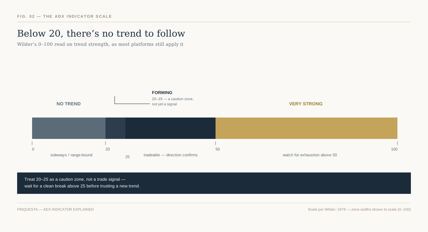
Fig. 2 — Wilder’s 0–100 scale: below 20 is treated as no trend, above 25 as tradeable, above 50 as very strong.
Wilder built the ADX indicator on a 0–100 scale, and the zones traders use today are close to how he originally framed them, refined slightly by decades of collective charting practice.
Below 20, most practitioners read the market as directionless — a range, a chop, a stretch where trend-following systems tend to bleed money on false starts. Between 20 and 25 sits a genuine grey zone: a trend may be forming, but treating it as confirmed this early is how most whipsaw losses happen.
Above 25 is where most trend-following approaches switch on, because the reading now suggests real, tradeable directional conviction rather than noise. Above 50 signals a very strong trend — but strong and tired often arrive together, and a reading up there is as much a caution flag about a stretched move as it is a green light.
None of these thresholds are laws of physics, and treating them that way is the single most common misuse of this indicator. They’re a starting heuristic Wilder built from commodity price data in the 1970s — which is exactly the problem the next section exists to unpack.
The Borrowed Twenty-Five: An Original Finquesta Concept on Why One Threshold Doesn’t Fit Every Market
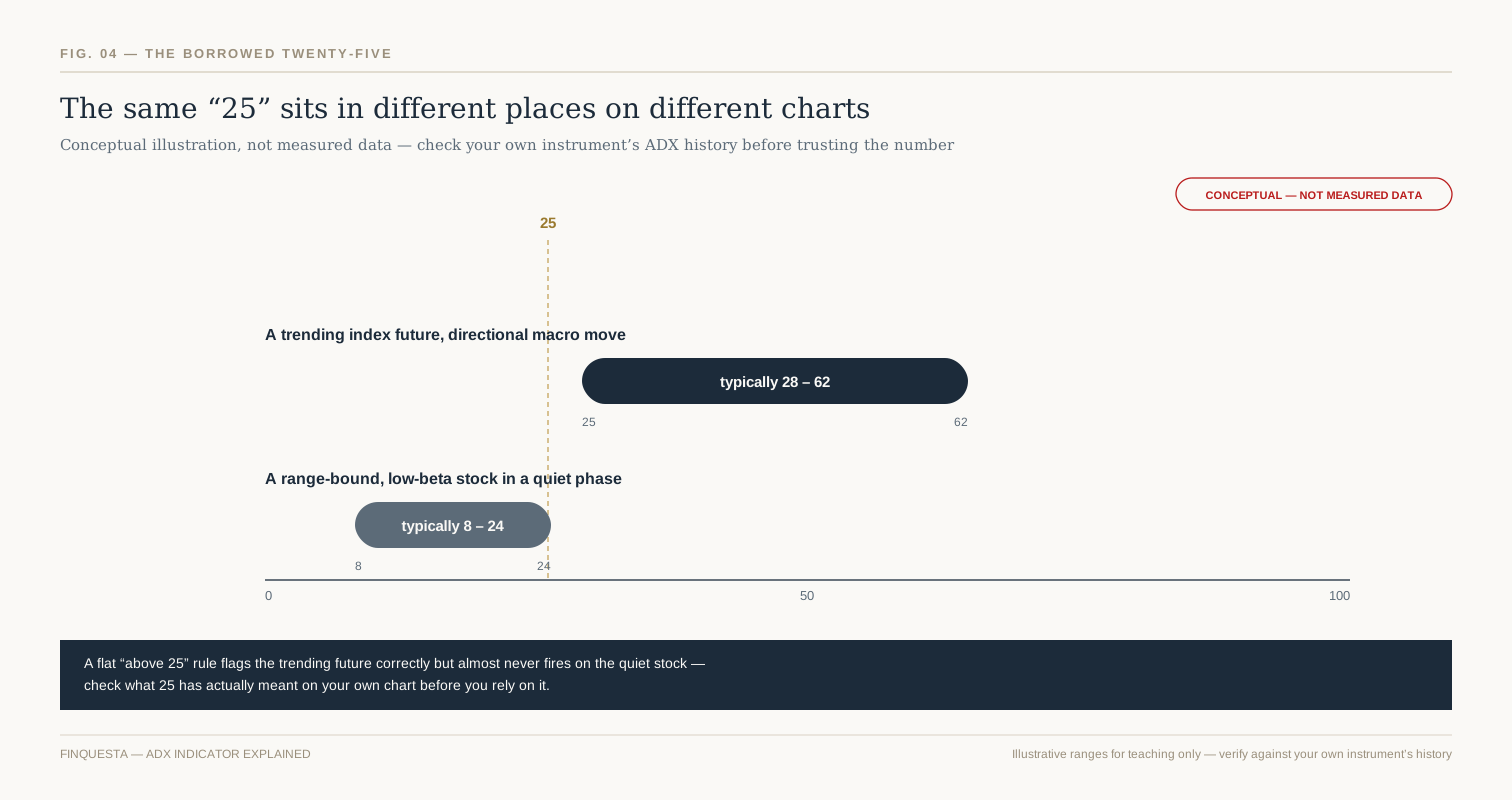
Fig. 4 — The same “25” sits near the floor of one instrument’s typical range and near the ceiling of another’s.
Every ADX explainer repeats “above 25 means a strong trend” as though 25 were a universal constant, like freezing point. It isn’t. It’s a number Wilder backed into from commodity futures data half a century ago, and different instruments today spend their time in genuinely different parts of the 0–100 scale.
We call this the Borrowed Twenty-Five — the habit of applying Wilder’s original threshold to every chart without ever checking whether that specific instrument’s own ADX history supports it. A trending index future in a strong macro move might spend most of its time comfortably above 25. A quiet, low-beta, range-bound stock might rarely cross into the 20s at all, even during its most “trending” stretches — meaning 25 is functionally too high a bar for it to ever clear.
The fix isn’t a different magic number — it’s a habit. Before leaning on the 25 threshold for a specific stock, index, or contract, look back at where that instrument’s own ADX has actually spent most of its time over the last year or two. If it rarely goes near 25, either the threshold needs recalibrating for that instrument, or ADX genuinely isn’t a useful filter there.
This is exactly why a systematic or algorithmic approach to trend-following — the kind covered in Finquesta’s guide to building rule-based trading systems — usually calibrates its own thresholds per instrument rather than hard-coding Wilder’s original number everywhere.
Rising ADX vs. Falling ADX: The Direction Matters More Than the Level
Most beginners fixate on where the ADX line is sitting right now. More experienced traders watch where it’s going.
A rising ADX indicator reading means the current trend, whatever direction it’s pointed, is picking up conviction. A falling ADX means it’s losing conviction — even if the number is still technically “above 25.” An ADX reading of 22 and climbing is often more actionable than a reading of 30 that’s been sliding for the past week, because the first describes momentum building and the second describes momentum draining.
This is where the level-only reading fails traders most often: a market can sit above the 25 threshold for weeks while its ADX quietly rolls over, and a trader watching only the absolute number never gets the early warning that the trend is fading. Watching the slope catches that shift days before the level alone would.
Reading +DI and −DI Crossovers for Trend Direction
Once ADX confirms real conviction exists, the +DI and −DI lines are what tell you which way to lean.
A +DI line crossing above −DI suggests buying pressure has taken control, and the reverse crossover suggests selling pressure has. On its own, a DI crossover in a low-ADX environment is weak evidence — the two lines cross constantly during a range, throwing off signal after signal that goes nowhere. That’s precisely why experienced traders wait for ADX to confirm strength before treating any DI crossover as meaningful.
The strongest combined read isn’t a DI crossover or a rising ADX — it’s both arriving close together: direction and conviction showing up at roughly the same time, rather than one lagging the other by weeks.
A Real Chart Walkthrough: ADX and DI Together
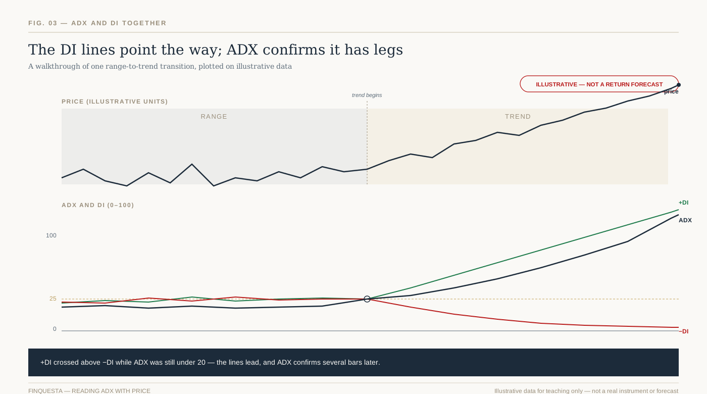
Fig. 3 — Illustrative walkthrough: the DI lines separate first; ADX confirms above 25 several sessions later.
Picture a stock chopping sideways for two weeks, doing nothing decisive, before breaking into a clean uptrend. Overlaying ADX and the DI lines on that same stretch tells a specific, teachable story.
During the sideways period, +DI and −DI cross back and forth repeatedly, and ADX stays pinned under 20 — the indicator correctly reading “nothing worth trading here” even while price bounces around enough to tempt a discretionary trader into acting anyway. Once the breakout begins, +DI pulls decisively ahead of −DI within the first few sessions.
ADX, true to its nature as a lagging, doubly-smoothed line, doesn’t cross above 25 until several sessions after that DI separation has already happened. That gap between the DI lines settling into a clear order and ADX confirming it isn’t a flaw in the indicator — it’s the indicator doing exactly what a smoothed, conviction-measuring tool is supposed to do. Traders who understand that lag use the DI crossover as an early alert and the ADX confirmation as permission to size up, rather than expecting both to arrive on the same candle.
Best ADX Indicator Settings for Scalping, Day Trading, Swing, and Positional Trades
| Trading style | Typical period | Why |
| Scalping (1–5 min charts) | 7–9 | Faster reaction; accepts more noise |
| Intraday / day trading | 9–14 | Balances responsiveness with reliability |
| Swing trading (daily charts) | 14 (Wilder’s original) | The most widely tested, most widely charted setting |
| Positional / long-term | 20–25 | Smoother line; fewer whipsaws, more lag |
Table 2 — Starting points, not fixed rules. Test against your own instrument before relying on any of these.
Adjusting the period is standard practice across all of Wilder’s studies, the ADX indicator included — traders commonly test values anywhere from single digits up to the low 20s, the same way they would tune an RSI period to a specific timeframe. Shortening the period makes the line more sensitive and faster to react, at the direct cost of more false signals; lengthening it smooths out noise at the cost of more lag. There’s no universally optimal number — only a trade-off that should match how long you actually intend to hold a position.
Scalpers and very short-timeframe intraday traders often shorten the period into single digits to get a faster read, accepting that some of those faster signals will be noise. Swing traders on daily charts generally have little reason to deviate from Wilder’s original 14, which remains the most widely tested, most widely charted version across every platform. Position traders sometimes stretch the period past 20 for a smoother, slower line that filters out short-term wobble entirely.
Whatever period you choose, treat it as a starting point to test against your own instrument and timeframe — per the Borrowed Twenty-Five concept above, the threshold you apply matters at least as much as the period you calculate it over.
Using the ADX Indicator on Nifty and Bank Nifty Intraday Charts
Indian F&O traders lean on the ADX indicator constantly, usually without necessarily naming it — it’s one of the standard filters built into screeners like Chartink, sitting alongside RSI, MACD, and moving average crossovers as a stock-scanning criterion. A scan for “ADX above 25 and rising” is a common way traders narrow a universe of NSE stocks down to the handful actually worth watching on a given morning.
On five-minute or fifteen-minute Nifty and Bank Nifty charts specifically, the Warm-Up Window problem from earlier becomes very real: intraday data resets its context every session, so an ADX reading calculated from only the first hour of trading is exactly the kind of thin-history number this guide has already warned you to treat with suspicion. Many intraday traders wait until well into the session, once enough bars have accumulated, before trusting the ADX reading at all.
Options traders watching Bank Nifty specifically tend to combine ADX with implied volatility context rather than reading it alone, since a “strong trend” reading during an unusually high-IV session can mean something quite different from the same reading on a quiet day. The indicator’s core job doesn’t change — it still separates trending conditions from chop — but what counts as a useful trending reading shifts with the backdrop.
Weekly and monthly F&O expiries add another wrinkle worth flagging. Nifty and Bank Nifty often see compressed, pinned price action in the final sessions before expiry, which can drag ADX down even during what was, days earlier, a genuine trend. Reading that expiry-week dip as “the trend is over,” without accounting for the seasonal compression behind it, is a false read specific to Indian index derivatives that’s easy to avoid once you know to look for it.
The ADX Indicator as a Regime Filter in Systematic and Algorithmic Trading
Most retail explainers frame the ADX indicator as a discretionary tool you glance at before clicking buy. Quant and algorithmic traders tend to use the ADX indicator differently: as a regime filter that switches an entire strategy on or off.
The logic is straightforward. Trend-following systems — moving average crossovers, breakout strategies, Supertrend-based entries — perform well in trending conditions and poorly in choppy, range-bound ones, while mean-reversion systems tend to do the opposite. Rather than running a trend-following strategy at all times and eating losses during its bad regime, a systematic trader can code ADX directly into the entry logic: only take trend-following signals when ADX is above a chosen threshold, and stand aside or switch to a different strategy entirely when it isn’t.
Backtesting this kind of filter properly means testing the ADX threshold itself as a parameter — not assuming 25 is correct just because Wilder used it, per the Borrowed Twenty-Five concept — and being honest about the Warm-Up Window when validating results on any instrument with a short listed history. A regime filter built on an unstable early-window ADX reading will look better in a backtest than it performs in live trading, which is a subtle but common way systematic strategies quietly overstate their own edge.
There’s a specific failure mode worth naming for anyone building a machine-learning classifier on top of a trend-versus-range regime label. If that label was itself derived from an ADX threshold, the model is implicitly learning Wilder’s 1978 cutoff as ground truth, Borrowed Twenty-Five problems included. Testing the label’s sensitivity to the threshold — not just the model’s accuracy against one fixed label — is what separates a genuinely robust regime classifier from one that has simply memorised a single cutoff.
For traders building this kind of rule-based system on Indian markets specifically, Finquesta’s deeper guide to algorithmic trend-following walks through backtesting a filter like this properly, walk-forward validation included.
ADX vs. RSI vs. MACD: What Each One Actually Measures
| ADX | RSI | MACD | |
| What it measures | Trend strength, not direction | Speed and size of recent price moves | Relationship between two moving averages |
| Scale | 0 to 100 | 0 to 100 | Unbounded, centred on zero |
| Best used for | Deciding whether to trend-follow at all | Spotting overbought/oversold extremes | Spotting momentum shifts and crossovers |
| Common blind spot | Says nothing about direction | Can stay “overbought” for weeks in a strong trend | Lags in choppy, low-volatility markets |
Table 3 — Three different questions, not three competing answers to the same question.
These three indicators get lumped together constantly because they all live in a pane below the price chart, but they’re answering three genuinely different questions, and confusing them is a common source of contradictory-feeling signals.
The ADX indicator asks whether a trend exists and how strong it is, without any opinion on direction. RSI asks how fast and how far price has moved recently, which is really a momentum and overbought/oversold question, not a trend-strength one. MACD asks whether two moving averages are converging or diverging, blending a trend read with a momentum read into one line.
A market can show a rising ADX — a genuinely strengthening trend — while RSI sits in an unremarkable middle range for weeks, because a steady, orderly trend doesn’t need extreme momentum readings to stay intact. That’s not a contradiction between the two indicators; it’s each one correctly answering a different question. For a full breakdown of the overbought and oversold mechanics this comparison only touches on, Finquesta’s RSI guide goes deeper — traders who expect all three indicators to agree constantly are usually the ones who end up distrusting all three.
Common Mistakes Traders Make With the ADX Indicator
The single most common mistake is the one that cost Aakash his trade in the opening story: reading a high or rising ADX indicator as a buy signal by itself, with no reference to the DI lines or price direction at all. ADX has no opinion on direction, ever — treating it like it does is the fastest way to get the strength right and the direction wrong.
A close second is chasing the 25 crossover the instant it happens, without waiting for confirmation, in fast-moving intraday conditions where the reading can flicker back below the threshold within a few bars. A third is applying the same 25 threshold to every instrument without checking that instrument’s own typical range, which is the Borrowed Twenty-Five problem showing up in live trading decisions rather than just theory.
A fourth, subtler mistake is trusting an ADX reading calculated on a short price history — a recently listed stock, a fresh contract, or the first hour of an intraday session — without accounting for the Warm-Up Window. The number will display cleanly on the screen either way; only one of those readings deserves your confidence.
A fifth mistake shows up specifically around results and news events: a sudden earnings gap or macro headline can spike ADX rapidly without representing the kind of sustained, tradeable trend the indicator was originally built to describe. A one-day volatility shock and a genuine multi-week trend can produce a superficially similar ADX reading, even though only one of them is what most trend-following strategies are actually designed to catch.
Limitations of the ADX Indicator Every Trader Should Know
Sideways, choppy conditions are where the ADX indicator misleads most often. The line can tick upward on nothing more than short-term volatility inside a range, tempting a trader into reading a new trend that was never really there — precisely the whipsaw pattern this guide has already flagged more than once. Acting on those false starts is a common way trend-following systems bleed small losses repeatedly during a listless market.
The ADX indicator is also structurally a lagging one. Because it’s built from smoothed averages of smoothed averages, it confirms that a trend exists well after that trend has already begun, never before. Traders expecting it to anticipate a move rather than confirm one are asking it to do a job it was never built for.
Finally, ADX is entirely non-directional by design, which bears repeating one last time given how often it trips traders up: a rising ADX during a sharp downtrend is just as “strong” a reading as a rising ADX during a sharp rally. Every limitation on this list connects back to the same root cause — ADX is a measurement of conviction, built from history, and nothing more.
One more mix-up is worth naming, because it’s common even among traders who’ve used both tools for years. Average True Range (ATR) and the Average Directional Index (ADX) are different Wilder indicators measuring completely different things, sharing only an author and the word “Average.” ATR measures how much an instrument typically moves in absolute terms, useful for setting stop-losses; ADX measures how directionally consistent those moves have been. Confusing the two in conversation, or worse, in a coded strategy, is a fast way to build something other than what you intended.
How to Add the ADX Indicator on Popular Charting Platforms
MetaTrader 4 ships the ADX indicator built in as standard, filed under the Trend folder of its indicator library, with no separate download required. TradingView and most Indian broker platforms — including the charting tools bundled into Zerodha Kite and similar apps — ship it as a standard built-in indicator as well, typically searchable by typing “ADX” or “Average Directional Index” into the indicator search box.
Once added, it renders in its own pane below the price chart rather than overlaying the candles directly, which is the expected behaviour — if your ADX appears drawn on top of price itself, it’s very likely a different indicator or a misconfigured overlay setting. Most platforms let you adjust the period (14 by default) and choose whether to display the +DI and −DI lines alongside it, which should stay switched on: the ADX indicator without its DI lines is only telling you half the story.
Frequently Asked Questions About the ADX Indicator
What is the ADX indicator in simple terms?
The ADX indicator is a single number between 0 and 100 that shows how strong a price trend is, regardless of whether that trend is up or down. A reading generally under 20 suggests the market is moving sideways, while a reading above 25 suggests a trend with real conviction behind it. It never indicates direction on its own — for that, you need the +DI and −DI lines that come packaged alongside it.
What is a good ADX value for entering a trade?
There’s no single value that works identically across every instrument and timeframe, which is exactly what the Borrowed Twenty-Five concept above addresses. Many traders treat 25-and-rising as a reasonable starting filter for trend-following setups, while readings above 50 often get read as a mature trend that could be nearing exhaustion. It works best as one filter among several — combined with price action and the DI lines for direction — rather than a standalone trigger. Always check what that specific instrument’s ADX indicator has historically looked like before assuming 25 is meaningful for it.
Is the ADX indicator reliable for intraday trading on Nifty and Bank Nifty?
The ADX indicator can be useful intraday, but it lags more on shorter timeframes because Wilder’s smoothing needs time to stabilise, exactly as the Warm-Up Window concept describes. Many Nifty and Bank Nifty intraday traders shorten the period to roughly 7–10 for faster, more responsive readings, accepting more noise in exchange for speed. It tends to work best paired with price action or a volume-based indicator rather than used alone. Expect more false starts during the opening volatility of a session, while ranges are still forming.
Can I lose money using the ADX indicator alone?
Yes — the ADX indicator doesn’t predict future prices, place trades, or manage risk by itself, and no single indicator removes market risk entirely. It measures trend strength from past price data, which makes it a descriptive, lagging tool rather than a predictive one. How you size positions, place stop-losses, and manage the overall trade matters as much as what any one indicator shows. Treat it as one input into a decision, never the whole decision.
What is the difference between ADX and RSI?
The ADX indicator measures how strong a trend is; RSI measures how fast and how far price has moved recently, which is a different question entirely. A market can show a high ADX — a strong trend — while RSI sits in a normal range for extended stretches, because a steady trend doesn’t need extreme momentum to stay strong. RSI is more commonly used to spot overbought or oversold conditions, while ADX is used to decide whether trend-following makes sense right now. Many traders use both together rather than choosing one over the other.
What is the difference between ADX and the Supertrend indicator?
Supertrend sits directly on the price chart and flips between a buy and sell state, giving a clear directional signal along with a trailing stop level. The ADX indicator sits in a separate pane below the chart and only measures how strong whatever trend exists actually is, without ever flipping to a buy or sell state itself. A common systematic approach uses ADX purely as a filter — only acting on Supertrend’s direction changes when ADX confirms a real trend is present. Finquesta’s guide to building rule-based trading systems covers this combination in more depth.
Does a rising ADX mean I should buy?
No — a rising ADX indicator only means the current trend, whichever direction it’s in, is gaining strength. If the market is falling and ADX is rising, that describes a strengthening downtrend, not a buy signal. Direction has to come from the +DI/−DI lines or from price action itself, never from the ADX line alone. Treating “ADX is rising” as a buy trigger by itself is one of the most common misreadings of this indicator.
What is the best ADX setting for scalping versus swing trading?
Scalpers on very short timeframes often shorten the ADX indicator’s period to around 7–9 for faster, more responsive readings, accepting more false signals in exchange for speed. Swing traders working on daily charts generally stay close to Wilder’s original 14-period setting, still the most widely tested and charted version. Position traders sometimes stretch the period to 20 or beyond for a smoother, slower-moving line. There’s no universally “best” number — it’s a trade-off between responsiveness and reliability that should match your holding period.
Can the ADX indicator predict a trend reversal?
Not directly — the ADX indicator is fundamentally a lagging tool built from smoothed historical price data, so it confirms trends after they’ve developed rather than predicting them in advance. Some traders watch for ADX peaking and rolling over from a high level, often above 50, as a hint that a strong trend may be tiring. That pattern is a caution flag at best, not a reliable reversal signal, and needs confirmation from price action before it means anything actionable.
Where the ADX Indicator Fits in Your Trading Toolkit From Here
The ADX indicator’s whole job is narrower than most traders expect going in: tell you whether the current move has real conviction behind it, and stay silent about everything else. That narrowness is a feature, not a limitation — trying to make it answer questions about direction or timing is what leads to trades like the one that opened this guide.
A reasonable next step is pulling up a chart you already know well and checking where its ADX has actually spent most of its time over the last year, rather than assuming Wilder’s 1978 thresholds transfer over untested. Pair that with a look at how candlestick structure confirms or contradicts what the DI lines are showing, and you have a genuinely combined read — strength from ADX, direction from DI, and context from price action itself — instead of a single line asked to do a job it was never built for.
| DISCLAIMER This article is for informational and educational purposes only and does not constitute financial, investment, tax, or legal advice. Figures, rates, and regulations mentioned are subject to change; please verify current details with official sources (RBI, SEBI, the Income Tax Department, IRS, or a licensed financial advisor) before making financial decisions. Finquesta may earn a commission from affiliate links in this article at no extra cost to you. |